## Line Chart: Accuracy vs. Sample Size (k)
### Overview
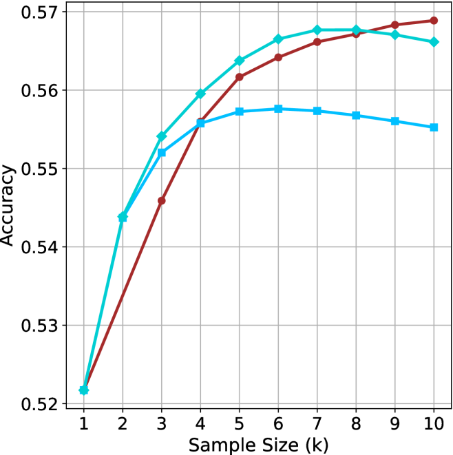
The image displays a line chart illustrating the relationship between "Sample Size (k)" and "Accuracy." The chart features three distinct data series, each represented by a unique color and marker shape. All three series originate from the same starting point at k=1 and diverge as the sample size increases. There is no legend provided in the image to identify the specific models or variables represented by the lines.
### Components/Axes
* **X-Axis:** Labeled "Sample Size (k)". The scale is linear, ranging from 1 to 10 in integer increments.
* **Y-Axis:** Labeled "Accuracy". The scale ranges from 0.52 to 0.57, with grid lines at 0.01 intervals.
* **Data Series (Identified by color and marker):**
* **Series A (Dark Red/Brown):** Circular markers.
* **Series B (Medium Cyan/Teal):** Diamond markers.
* **Series C (Light Blue/Cyan):** Square markers.
### Detailed Analysis
The following table approximates the values for each data series at each sample size (k).
| Sample Size (k) | Series A (Red/Circle) | Series B (Teal/Diamond) | Series C (Light Blue/Square) |
| :--- | :--- | :--- | :--- |
| **1** | ~0.522 | ~0.522 | ~0.522 |
| **2** | ~0.534 | ~0.544 | ~0.544 |
| **3** | ~0.546 | ~0.554 | ~0.552 |
| **4** | ~0.556 | ~0.560 | ~0.556 |
| **5** | ~0.562 | ~0.564 | ~0.557 |
| **6** | ~0.564 | ~0.566 | ~0.558 |
| **7** | ~0.566 | ~0.568 | ~0.557 |
| **8** | ~0.567 | ~0.568 | ~0.556 |
| **9** | ~0.568 | ~0.567 | ~0.555 |
| **10** | ~0.569 | ~0.566 | ~0.554 |
**Trend Verification:**
* **Series A (Red/Circle):** Shows a consistent, monotonic upward trend throughout the entire range (k=1 to k=10). It starts as the lowest performer but becomes the highest performer after k=8.
* **Series B (Teal/Diamond):** Shows a steep upward trend initially, peaking between k=7 and k=8, followed by a slight decline.
* **Series C (Light Blue/Square):** Shows an upward trend that flattens significantly after k=4, peaking at k=6, and then exhibits a steady decline.
### Key Observations
* **Common Origin:** All three series begin at approximately 0.522 at k=1.
* **Crossover Points:**
* Series A (Red) intersects Series C (Light Blue) at approximately k=4.
* Series A (Red) intersects Series B (Teal) at approximately k=8.
* **Performance Divergence:** As the sample size increases beyond k=4, the performance of the three models diverges significantly. Series C (Light Blue) is the first to show signs of performance degradation (at k=6), followed by Series B (Teal) at k=8. Series A (Red) is the only model that continues to improve, albeit at a slower rate, through k=10.
### Interpretation
This chart likely represents a hyperparameter tuning or model evaluation process, possibly related to a k-Nearest Neighbors (k-NN) algorithm or a similar machine learning model where "k" represents the number of neighbors or a similar complexity parameter.
* **Model Robustness:** Series A (Red) appears to be the most robust model, as it does not exhibit the performance degradation seen in the other two models as the sample size increases. It suggests that this model benefits from larger sample sizes without overfitting or introducing noise.
* **Overfitting/Saturation:** Series C (Light Blue) and Series B (Teal) demonstrate clear signs of "peaking." The decline in accuracy after their respective peaks (k=6 for Light Blue, k=8 for Teal) suggests that increasing the sample size beyond these points introduces noise or irrelevant data that negatively impacts the model's predictive accuracy.
* **Strategic Choice:** If the goal is to maximize accuracy, Series A is the superior choice for larger sample sizes (k > 8). However, if computational resources are limited and a smaller sample size is required, Series B (Teal) offers higher accuracy than Series A for sample sizes between k=2 and k=8.