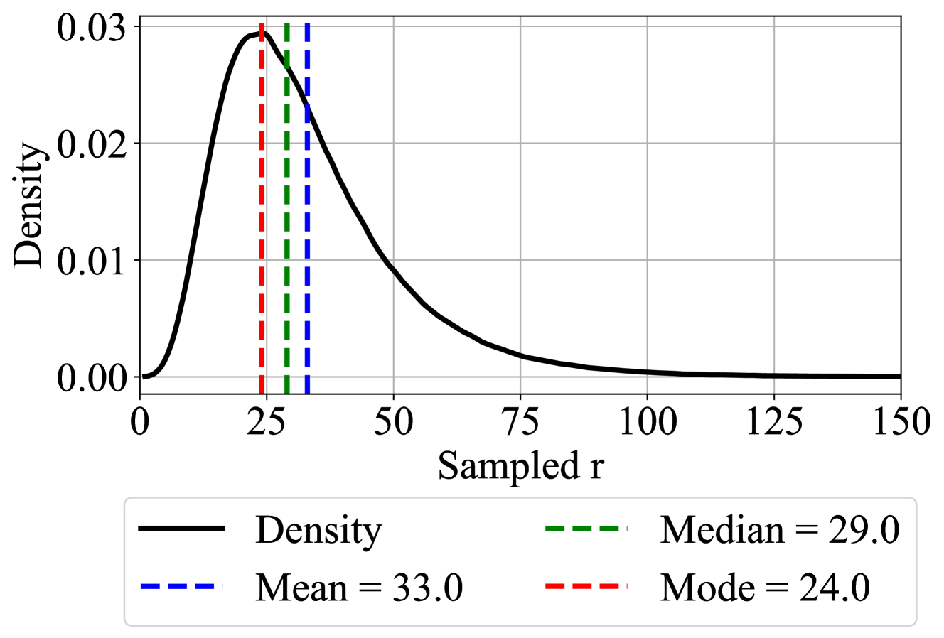
## Density Plot: Distribution of Sampled r
### Overview
The image displays a probability density function plot for a variable labeled "Sampled r". The plot shows a single, continuous, right-skewed distribution. Three vertical dashed lines are overlaid on the plot, marking the mode, median, and mean of the distribution, with their exact values provided in a legend.
### Components/Axes
* **Chart Type:** Density Plot (Probability Density Function).
* **X-Axis:**
* **Label:** "Sampled r"
* **Scale:** Linear scale ranging from 0 to 150.
* **Major Tick Marks:** 0, 25, 50, 75, 100, 125, 150.
* **Y-Axis:**
* **Label:** "Density"
* **Scale:** Linear scale ranging from 0.00 to 0.03.
* **Major Tick Marks:** 0.00, 0.01, 0.02, 0.03.
* **Legend:** Positioned at the bottom center of the chart. It contains four entries:
1. **Black solid line:** "Density"
2. **Blue dashed line:** "Mean = 33.0"
3. **Green dashed line:** "Median = 29.0"
4. **Red dashed line:** "Mode = 24.0"
* **Data Series & Visual Elements:**
* **Density Curve (Black Line):** A smooth, continuous curve representing the probability density of "Sampled r".
* **Mode Line (Red Dashed):** A vertical line intersecting the x-axis at approximately x=24.0, aligning with the peak of the density curve.
* **Median Line (Green Dashed):** A vertical line intersecting the x-axis at approximately x=29.0.
* **Mean Line (Blue Dashed):** A vertical line intersecting the x-axis at approximately x=33.0.
### Detailed Analysis
* **Distribution Shape:** The density curve is unimodal (single peak) and positively skewed (right-skewed). It rises steeply from x=0 to its peak, then descends more gradually, forming a long tail extending towards higher values of "Sampled r".
* **Peak Density:** The maximum density value (the peak of the curve) is approximately 0.03, occurring at the mode (x ≈ 24.0).
* **Central Tendency Measures:**
* **Mode (Red Line):** The most frequent value, located at the distribution's peak. Value: **24.0**.
* **Median (Green Line):** The middle value, dividing the distribution into two equal halves. Value: **29.0**.
* **Mean (Blue Line):** The arithmetic average. Value: **33.0**.
* **Relationship of Measures:** The measures follow the classic order for a right-skewed distribution: **Mode (24.0) < Median (29.0) < Mean (33.0)**. The mean is pulled furthest into the right tail by the higher-value outliers.
* **Spatial Grounding:** The three vertical lines are clustered in the left-center region of the plot (between x=20 and x=35). The red (Mode) line is leftmost, followed by the green (Median), and then the blue (Mean) line on the right. This spatial arrangement visually confirms the numerical order of the statistics.
### Key Observations
1. **Clear Positive Skew:** The long tail to the right and the ordering of Mode < Median < Mean are definitive indicators of a right-skewed distribution.
2. **Concentration of Data:** The majority of the probability mass (the area under the curve) is concentrated between x=0 and x=75. The density becomes very low (approaching zero) for values of "Sampled r" greater than 100.
3. **Visual Confirmation of Statistics:** The plot provides an immediate visual understanding of how the mean, median, and mode relate to the shape of the data distribution. The mean's position further right than the median highlights the influence of the tail.
### Interpretation
This density plot characterizes the distribution of a sampled variable "r". The data is not symmetrically distributed around a central value; instead, it is characterized by a concentration of lower values and a scattering of less frequent, higher values.
* **What the data suggests:** The process generating "Sampled r" likely has a lower bound near zero and produces moderately low values most frequently (around 24). However, there is a significant probability of obtaining higher values, which pulls the average (mean) up to 33. This pattern is common in phenomena like reaction times, income distributions, or the size of natural events (e.g., rainfall, earthquake magnitudes).
* **How elements relate:** The density curve is the fundamental representation of the data's behavior. The vertical lines for Mode, Median, and Mean are summary statistics derived from this distribution. Their placement on the x-axis is directly determined by the shape of the curve. The legend acts as a key to decode these overlaid statistical markers.
* **Notable implications:** For analysis, using the median (29.0) as a measure of central tendency might be more representative of a "typical" value than the mean (33.0), as the mean is inflated by the right tail. Any statistical model applied to this data should account for its skewness rather than assuming a normal (symmetric) distribution.