## Pie Chart Grid: Benchmark Performance (YES/NO)
### Overview
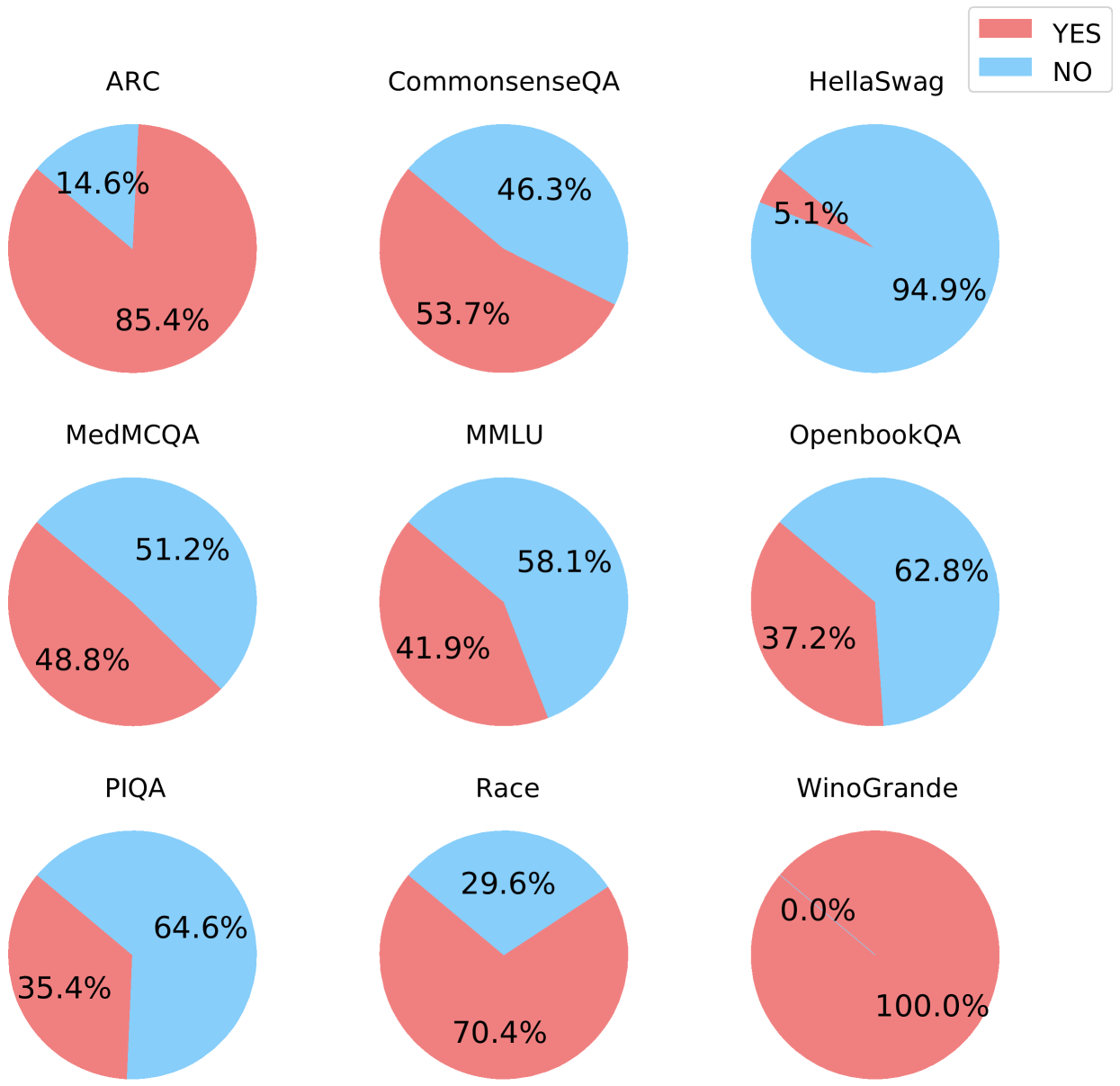
The image displays a 3x3 grid of nine pie charts, each representing the performance distribution (YES vs. NO) on a different natural language processing or reasoning benchmark. A single legend is positioned in the top-right corner of the entire figure.
### Components/Axes
* **Legend:** Located in the top-right corner. It defines two categories:
* **YES:** Represented by a red/salmon color.
* **NO:** Represented by a light blue color.
* **Chart Titles:** Each pie chart has a title directly above it, naming a specific benchmark dataset.
* **Data Labels:** Each pie slice contains a percentage label indicating its proportion of the whole (100%).
### Detailed Analysis
The grid is processed row by row, from left to right.
**Row 1 (Top):**
1. **Top-Left: ARC**
* **YES (Red):** 85.4%
* **NO (Blue):** 14.6%
* *Trend:* The red slice dominates, indicating a high YES rate.
2. **Top-Center: CommonsenseQA**
* **YES (Red):** 53.7%
* **NO (Blue):** 46.3%
* *Trend:* The slices are nearly equal, with a slight majority for YES.
3. **Top-Right: HellaSwag**
* **YES (Red):** 5.1%
* **NO (Blue):** 94.9%
* *Trend:* The blue slice overwhelmingly dominates, indicating a very low YES rate.
**Row 2 (Middle):**
4. **Middle-Left: MedMCQA**
* **YES (Red):** 48.8%
* **NO (Blue):** 51.2%
* *Trend:* The slices are nearly equal, with a slight majority for NO.
5. **Middle-Center: MMLU**
* **YES (Red):** 41.9%
* **NO (Blue):** 58.1%
* *Trend:* The blue slice is larger, indicating a majority NO rate.
6. **Middle-Right: OpenbookQA**
* **YES (Red):** 37.2%
* **NO (Blue):** 62.8%
* *Trend:* The blue slice is significantly larger, indicating a strong majority NO rate.
**Row 3 (Bottom):**
7. **Bottom-Left: PIQA**
* **YES (Red):** 35.4%
* **NO (Blue):** 64.6%
* *Trend:* The blue slice is significantly larger, indicating a strong majority NO rate.
8. **Bottom-Center: Race**
* **YES (Red):** 70.4%
* **NO (Blue):** 29.6%
* *Trend:* The red slice is dominant, indicating a high YES rate.
9. **Bottom-Right: WinoGrande**
* **YES (Red):** 100.0%
* **NO (Blue):** 0.0%
* *Trend:* The pie is entirely red, indicating a perfect or near-perfect YES rate. The blue slice is not visible.
### Key Observations
* **Extreme Performance Spread:** The YES rates vary dramatically across benchmarks, from 0.0% (WinoGrande NO) to 100.0% (WinoGrande YES).
* **High-YES Benchmarks:** ARC (85.4%), Race (70.4%), and WinoGrande (100.0%) show strong performance (high YES).
* **Low-YES Benchmarks:** HellaSwag (5.1%), PIQA (35.4%), and OpenbookQA (37.2%) show weak performance (low YES).
* **Balanced Benchmarks:** CommonsenseQA (53.7% YES) and MedMCQA (48.8% YES) are close to a 50/50 split.
* **Visual Consistency:** All charts correctly use the red color for YES and blue for NO as defined in the legend.
### Interpretation
This grid visualizes the performance of a system (likely an AI model) across nine distinct evaluation benchmarks. The "YES" and "NO" labels most likely correspond to correct and incorrect answers, respectively, making these charts a representation of accuracy rates.
The data demonstrates that the system's capability is highly benchmark-dependent. It excels at tasks represented by ARC, Race, and especially WinoGrande, suggesting strength in areas like commonsense reasoning or specific linguistic patterns tested by those datasets. Conversely, it struggles significantly with HellaSwag and shows below-average performance on PIQA and OpenbookQA, indicating potential weaknesses in the skills those benchmarks target, such as narrative completion or physical reasoning.
The near-even splits on CommonsenseQA and MedMCQA suggest these are challenging benchmarks where the system's performance is essentially at chance level. The stark contrast between 100% on WinoGrande and 5.1% on HellaSwag highlights the importance of evaluating AI models across a diverse suite of tests, as performance on one task does not generalize to another. This visualization effectively communicates the model's profile of strengths and weaknesses.