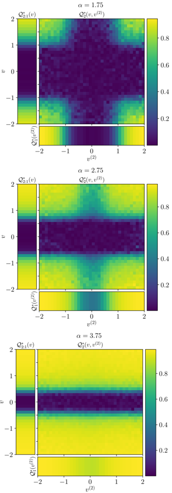
## Heatmaps: Q2*(v, v^(2)) vs. v^(2) and Q2:1*(v) vs. v
### Overview
The image presents three heatmaps arranged vertically, each displaying the relationship between Q2*(v, v^(2)) and v^(2), along with an adjacent plot of Q2:1*(v) vs. v. Each heatmap corresponds to a different value of α (1.75, 2.75, and 3.75). The heatmaps use a color gradient to represent the magnitude of Q2*(v, v^(2)) and Q2:1*(v), ranging from dark purple (low values) to bright yellow (high values).
### Components/Axes
Each heatmap has the following components:
* **Title:** Indicates the value of α for that specific heatmap (α = 1.75, α = 2.75, α = 3.75).
* **Main Heatmap:** Displays Q2*(v, v^(2)) as a function of v and v^(2).
* X-axis: v^(2), ranging from -2 to 2.
* Y-axis: v, ranging from -2 to 2.
* **Side Plot:** Displays Q2:1*(v) as a function of v.
* Y-axis: v, ranging from -2 to 2.
* X-axis: Q2:1*(v).
* **Bottom Plot:** Displays Q1*(v^(2)) as a function of v^(2).
* X-axis: v^(2), ranging from -2 to 2.
* Y-axis: Q1*(v^(2)).
* **Colorbar:** Located on the right side of each heatmap, indicating the mapping between color and value. The colorbar ranges from approximately 0.2 (dark purple) to 0.8 (bright yellow).
### Detailed Analysis
**Heatmap 1: α = 1.75**
* **Main Heatmap:** The central region around (0,0) is dark purple, indicating low values of Q2*(v, v^(2)). The corners and the edges tend to be more yellow/green, indicating higher values.
* **Side Plot:** Q2:1*(v) shows higher values (yellow/green) at the extremes (v ≈ -2 and v ≈ 2) and lower values (purple) around v = 0.
* **Bottom Plot:** Q1*(v^(2)) shows higher values (yellow/green) at the extremes (v^(2) ≈ -2 and v^(2) ≈ 2) and lower values (purple) around v^(2) = 0.
**Heatmap 2: α = 2.75**
* **Main Heatmap:** A horizontal band around v = 0 is dark purple, indicating low values of Q2*(v, v^(2)). The regions above and below this band are more yellow/green.
* **Side Plot:** Q2:1*(v) shows low values (purple) around v = 0 and higher values (yellow/green) at the extremes.
* **Bottom Plot:** Q1*(v^(2)) shows higher values (yellow/green) at the extremes (v^(2) ≈ -2 and v^(2) ≈ 2) and lower values (purple) around v^(2) = 0.
**Heatmap 3: α = 3.75**
* **Main Heatmap:** Similar to α = 2.75, a horizontal band around v = 0 is dark purple, but the band is wider. The regions above and below are yellow/green.
* **Side Plot:** Q2:1*(v) shows low values (purple) around v = 0 and higher values (yellow/green) at the extremes. The difference between the high and low values is more pronounced than in the previous heatmaps.
* **Bottom Plot:** Q1*(v^(2)) shows higher values (yellow/green) at the extremes (v^(2) ≈ -2 and v^(2) ≈ 2) and lower values (purple) around v^(2) = 0.
### Key Observations
* As α increases, the dark purple band in the main heatmap becomes wider, indicating a stronger suppression of Q2*(v, v^(2)) around v = 0.
* The side plots consistently show that Q2:1*(v) is suppressed around v = 0 and enhanced at the extremes, regardless of the value of α.
* The bottom plots consistently show that Q1*(v^(2)) is suppressed around v^(2) = 0 and enhanced at the extremes, regardless of the value of α.
### Interpretation
The heatmaps illustrate how the parameter α influences the distribution of Q2*(v, v^(2)). The increasing suppression of Q2*(v, v^(2)) around v = 0 as α increases suggests that α plays a role in shaping the relationship between v and v^(2). The consistent behavior of Q2:1*(v) and Q1*(v^(2)) across different values of α indicates that these functions may be less sensitive to changes in α, or that their behavior is intrinsically linked to the underlying system being modeled. The data suggests that α is a parameter that controls the correlation or interaction between v and v^(2), with higher values of α leading to a stronger decoupling or suppression of Q2*(v, v^(2)) when v is close to zero.