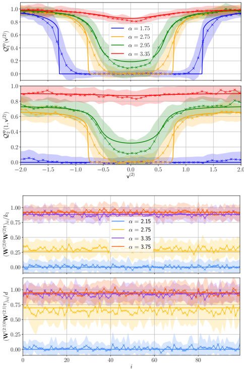
## Chart: Spectral Properties vs. Parameter α
### Overview
The image presents four line charts arranged in two pairs. The top two charts display the spectral properties Q1 and Q2 as a function of v^(2) for different values of parameter α. The bottom two charts show the normalized quantities (W^(2)0 W^(2)τ)i/k1 and (W^(2:1)0 W^(2:1)τ)i/d as a function of index i, also for different α values. Each line is accompanied by a shaded region indicating uncertainty.
### Components/Axes
**Top Two Charts (Q1 and Q2 vs. v^(2))**
* **Y-axis (Left):** Q1^(vp)(v^(2)) (Top Chart), Q2^(vp)(1, v^(2)) (Bottom Chart). Scale ranges from 0.0 to 1.0.
* **X-axis (Bottom):** v^(2). Scale ranges from -2.0 to 2.0.
* **Legend (Top-Right):**
* Blue: α = 1.75
* Orange: α = 2.75
* Green: α = 2.95
* Red: α = 3.35
**Bottom Two Charts (Normalized W vs. i)**
* **Y-axis (Left):** (W^(2)0 W^(2)τ)i/k1 (Top Chart), (W^(2:1)0 W^(2:1)τ)i/d (Bottom Chart). Scale ranges from 0.00 to 1.00.
* **X-axis (Bottom):** i. Scale ranges from 0 to 100.
* **Legend (Right):**
* Blue: α = 2.15
* Orange: α = 2.75
* Purple: α = 3.35
* Red: α = 3.75
### Detailed Analysis
**Top Chart: Q1^(vp)(v^(2)) vs. v^(2)**
* **α = 1.75 (Blue):** The line is approximately 1.0 from v^(2) = -2.0 to approximately -1.0. It then drops sharply to approximately 0.0 between v^(2) = -1.0 and v^(2) = -0.5. It remains at approximately 0.0 until v^(2) = 0.5, then rises sharply back to approximately 1.0 between v^(2) = 0.5 and v^(2) = 1.0, and remains at 1.0 until v^(2) = 2.0.
* **α = 2.75 (Orange):** The line starts at approximately 0.9 at v^(2) = -2.0, decreases gradually to approximately 0.2 at v^(2) = -0.5, reaches a minimum of approximately 0.1 at v^(2) = 0.0, and then increases gradually back to approximately 0.9 at v^(2) = 2.0.
* **α = 2.95 (Green):** The line starts at approximately 0.9 at v^(2) = -2.0, decreases gradually to approximately 0.4 at v^(2) = -0.5, reaches a minimum of approximately 0.3 at v^(2) = 0.0, and then increases gradually back to approximately 0.9 at v^(2) = 2.0.
* **α = 3.35 (Red):** The line remains relatively constant at approximately 0.9 across the entire range of v^(2).
**Second Chart: Q2^(vp)(1, v^(2)) vs. v^(2)**
* **α = 1.75 (Blue):** The line is approximately 0.0 across the entire range of v^(2).
* **α = 2.75 (Orange):** The line starts at approximately 0.1 at v^(2) = -2.0, increases gradually to approximately 0.6 at v^(2) = -0.5, reaches a maximum of approximately 0.7 at v^(2) = 0.0, and then decreases gradually back to approximately 0.1 at v^(2) = 2.0.
* **α = 2.95 (Green):** The line starts at approximately 0.6 at v^(2) = -2.0, increases gradually to approximately 0.8 at v^(2) = -0.5, reaches a maximum of approximately 0.85 at v^(2) = 0.0, and then decreases gradually back to approximately 0.6 at v^(2) = 2.0.
* **α = 3.35 (Red):** The line remains relatively constant at approximately 0.9 across the entire range of v^(2).
**Third Chart: (W^(2)0 W^(2)τ)i/k1 vs. i**
* **α = 2.15 (Blue):** The line fluctuates around approximately 0.1 across the entire range of i.
* **α = 2.75 (Orange):** The line fluctuates around approximately 0.3 across the entire range of i.
* **α = 3.35 (Purple):** The line fluctuates around approximately 0.9 across the entire range of i.
* **α = 3.75 (Red):** The line fluctuates around approximately 0.9 across the entire range of i.
**Fourth Chart: (W^(2:1)0 W^(2:1)τ)i/d vs. i**
* **α = 2.15 (Blue):** The line fluctuates around approximately 0.1 across the entire range of i.
* **α = 2.75 (Orange):** The line fluctuates around approximately 0.7 across the entire range of i.
* **α = 3.35 (Purple):** The line fluctuates around approximately 0.9 across the entire range of i.
* **α = 3.75 (Red):** The line fluctuates around approximately 0.9 across the entire range of i.
### Key Observations
* In the top two charts, as α increases, the dip in Q1 and Q2 around v^(2) = 0 becomes less pronounced.
* In the bottom two charts, as α increases, the normalized quantities (W^(2)0 W^(2)τ)i/k1 and (W^(2:1)0 W^(2:1)τ)i/d tend to increase.
* The shaded regions indicate the uncertainty associated with each line, and the uncertainty appears to be greater in the regions where the lines are changing rapidly.
### Interpretation
The charts illustrate the relationship between the parameter α and various spectral properties (Q1, Q2) and normalized quantities (W). The top two charts suggest that higher values of α lead to a more uniform spectral distribution, as the dip around v^(2) = 0 diminishes. The bottom two charts indicate that higher values of α are associated with larger normalized quantities (W), suggesting a stronger correlation or interaction. The uncertainty regions highlight the variability in the data, which is particularly noticeable in regions where the spectral properties are changing rapidly. Overall, the data suggests that α plays a significant role in shaping the spectral characteristics and correlations within the system being studied.