## Heatmap: Value Distribution Across Layers and Steps
### Overview
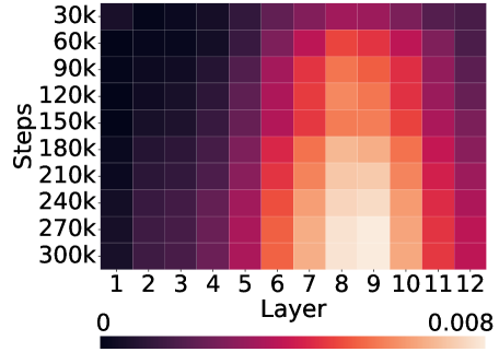
The image is a heatmap visualizing the distribution of values across 12 layers (x-axis) and 9 step increments (y-axis). Colors transition from dark purple (low values) to light yellow (high values), with a color bar indicating a scale from 0 to 0.008. The data suggests a spatial relationship between step progression and layer-specific value intensity.
### Components/Axes
- **Y-Axis (Steps)**: Labeled in increments of 30k (30k, 60k, ..., 300k).
- **X-Axis (Layer)**: Labeled 1 to 12.
- **Color Bar**: Horizontal bar at the bottom with values from 0 (dark purple) to 0.008 (light yellow).
- **Legend**: Implicit via color bar; no explicit legend present.
### Detailed Analysis
- **Step 30k**: All layers show dark purple (values near 0).
- **Step 60k**: Layers 1–4 remain dark purple; layers 5–12 transition to purple-red.
- **Step 90k**: Layers 5–7 shift to red-orange; layers 8–10 become orange.
- **Step 120k**: Layers 6–10 exhibit orange-yellow gradients; layers 1–5 and 11–12 remain darker.
- **Step 150k**: Layers 7–9 peak at light orange; layers 6 and 10 show moderate orange.
- **Step 180k**: Layers 8–10 reach light yellow (highest values); layers 7 and 11 show orange.
- **Step 210k**: Layers 8–10 maintain light yellow; layers 7 and 11 transition to orange.
- **Step 240k**: Layers 8–10 remain light yellow; layers 7 and 11 shift to orange-red.
- **Step 270k**: Layer 9 peaks at light yellow; layers 8 and 10 show orange.
- **Step 300k**: Layers 8–10 revert to orange-red; layers 7 and 11 return to dark purple.
### Key Observations
1. **Peak Value**: The highest value (light yellow) occurs at **Step 270k, Layer 9** (≈0.008).
2. **Trend**: Values increase with steps up to 270k, then decline at 300k.
3. **Layer-Specific Patterns**:
- Layers 8–10 consistently show higher values in the middle steps (180k–270k).
- Layers 1–5 and 11–12 exhibit lower values across most steps.
4. **Anomaly**: Layer 12 shows a sudden drop to dark purple at 300k steps, contrasting with its moderate values at earlier steps.
### Interpretation
The heatmap suggests that **Layer 9** is the most critical or efficient layer, achieving the highest value at Step 270k. The trend indicates diminishing returns after 270k steps, possibly due to saturation or system limitations. Layers 8–10 dominate the high-value region, implying their importance in the process. The anomaly in Layer 12 at 300k steps may reflect an outlier or a design flaw. The color gradient confirms that value intensity correlates with step progression, peaking mid-process before declining.