TECHNICAL ASSET FINGERPRINT
e4f510b8764a4b6d1bf57fa9
Click to view fullscreen
Press ESC or click to close
FOUND IN PAPERS
EXPERT: gemini-2.0-flash VERSION 1
RUNTIME: nugit/gemini/gemini-2.0-flash
INTEL_VERIFIED
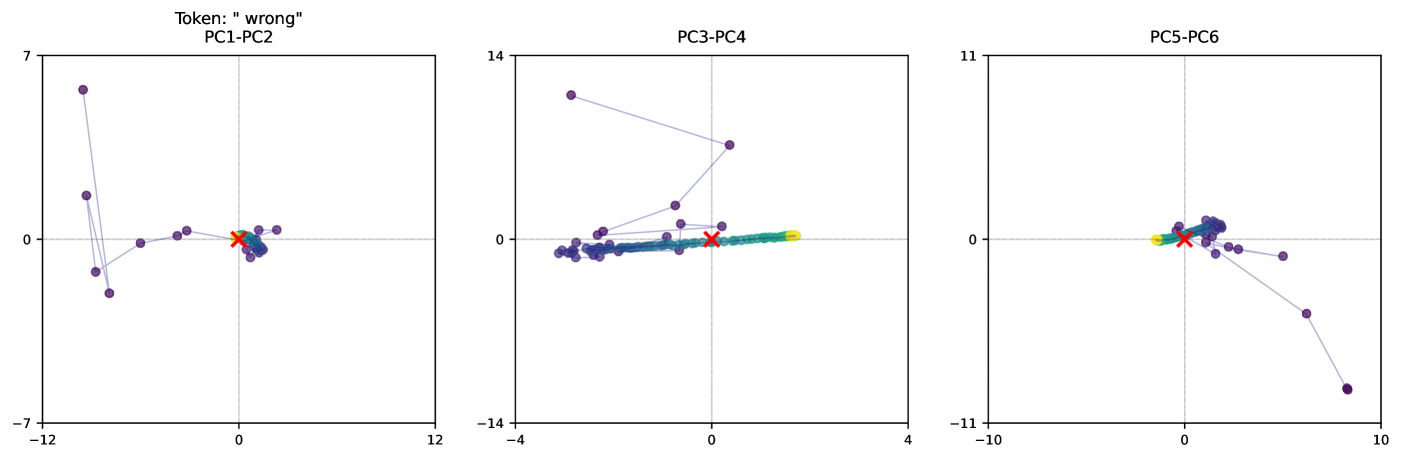
## Scatter Plot: Principal Component Analysis of "wrong" Token
### Overview
The image presents three scatter plots, each displaying the relationship between two principal components (PCs) derived from the analysis of the token "wrong". The plots show the trajectory of data points, with each point connected by a line, and colored from purple to yellow. A red 'X' marks the approximate center of the final cluster of points. The plots are labeled PC1-PC2, PC3-PC4, and PC5-PC6, indicating the principal components being compared in each plot.
### Components/Axes
* **Titles:**
* Top-center: "Token: "wrong""
* Left Plot: "PC1-PC2"
* Middle Plot: "PC3-PC4"
* Right Plot: "PC5-PC6"
* **Axes:**
* Left Plot:
* X-axis: PC1, ranges from approximately -12 to 12
* Y-axis: PC2, ranges from approximately -7 to 7
* Middle Plot:
* X-axis: PC3, ranges from approximately -4 to 4
* Y-axis: PC4, ranges from approximately -14 to 14
* Right Plot:
* X-axis: PC5, ranges from approximately -10 to 10
* Y-axis: PC6, ranges from approximately -11 to 11
* **Axis Markers:**
* Left Plot: X-axis: -12, 0, 12; Y-axis: -7, 0, 7
* Middle Plot: X-axis: -4, 0, 4; Y-axis: -14, 0, 14
* Right Plot: X-axis: -10, 0, 10; Y-axis: -11, 0, 11
* **Data Points:** Each plot contains a series of data points connected by a line. The points are colored along a spectrum from purple to yellow, indicating a progression or sequence.
* **Red 'X':** Each plot has a red 'X' marking a central location, likely representing a mean or final state.
### Detailed Analysis
* **PC1-PC2 Plot (Left):**
* The data points start in the top-left quadrant and move towards the center, clustering around the origin (0,0).
* The initial points are more scattered, while the later points (yellowish) are tightly clustered.
* The red 'X' is located near the origin, approximately at (0,0).
* **PC3-PC4 Plot (Middle):**
* The data points start in the top-left quadrant and move horizontally towards the right, forming a line along the x-axis.
* The color gradient transitions from purple to yellow as the points move rightward.
* The red 'X' is located near the origin, approximately at (0,0).
* **PC5-PC6 Plot (Right):**
* The data points start near the origin, move slightly to the left, and then curve downward and to the right.
* The color gradient transitions from purple to yellow as the points move along the curve.
* The red 'X' is located near the origin, approximately at (0,0).
### Key Observations
* All three plots show a convergence or clustering of data points towards a central location, indicated by the red 'X'.
* The color gradient from purple to yellow suggests a temporal or sequential aspect to the data.
* The PC3-PC4 plot shows a strong linear trend along the x-axis, indicating a dominant influence of PC3.
* The PC1-PC2 and PC5-PC6 plots show more complex trajectories, suggesting a more balanced influence of the respective principal components.
### Interpretation
The plots visualize the trajectory of the "wrong" token in a reduced-dimensional space defined by principal component analysis. The convergence of data points towards the origin in all three plots suggests that the token's representation stabilizes or reaches a steady state over time or iterations. The color gradient indicates a progression, possibly representing the learning or adaptation process of a model. The different patterns observed in each plot (linear vs. curved) reflect the varying degrees of influence and interaction between the different principal components. The red 'X' likely represents the final or average state of the token's representation after the process has converged.
DECODING INTELLIGENCE...
EXPERT: gemma-3-27b-it-free VERSION 1
RUNTIME: google-free/gemma-3-27b-it
INTEL_VERIFIED
## Scatter Plots: Principal Component Analysis (PCA) Visualizations
### Overview
The image presents three scatter plots, each representing a Principal Component Analysis (PCA) projection of data. Each plot displays data points projected onto two principal components. The plots are labeled "PC1-PC2", "PC3-PC4", and "PC5-PC6", indicating the principal component pairs used for each projection. A token "wrong" is present above the first plot. There are several data points in each plot, colored differently (purple, cyan, orange, red, and green). One plot also contains a single data point marked with an 'x' in red.
### Components/Axes
Each plot has two axes: a horizontal axis (x-axis) and a vertical axis (y-axis). The scales vary for each plot:
* **PC1-PC2:** X-axis ranges from approximately -12 to 12, Y-axis ranges from approximately -7 to 7.
* **PC3-PC4:** X-axis ranges from approximately -4 to 4, Y-axis ranges from approximately -14 to 14.
* **PC5-PC6:** X-axis ranges from approximately -10 to 10, Y-axis ranges from approximately -11 to 11.
There is no explicit legend, but the colors of the data points are consistent across all three plots.
### Detailed Analysis or Content Details
**PC1-PC2:**
* **Purple Data Points:** A cluster of approximately 7 purple points are located in the bottom-left quadrant, with x-values ranging from approximately -11 to -2 and y-values ranging from approximately -6 to -1. A single purple point is located near the origin (x ≈ 0, y ≈ 0). Another purple point is located at approximately (2, 1).
* **Cyan Data Points:** Two cyan points are present. One is near the origin (x ≈ 0, y ≈ 0), and the other is at approximately (1, 0).
* **Orange Data Points:** Two orange points are present. One is at approximately (-1, -1) and the other is at approximately (0, 0).
* **Red Data Points:** One red point is located at approximately (0, 0).
* **Green Data Points:** One green point is located at approximately (-1, 1).
**PC3-PC4:**
* **Purple Data Points:** A cluster of approximately 6 purple points are located near the origin, with x-values ranging from approximately -1 to 1 and y-values ranging from approximately -1 to 1. One purple point is located at approximately (0, 12).
* **Cyan Data Points:** Two cyan points are present, both near the origin (x ≈ 0, y ≈ 0).
* **Orange Data Points:** Two orange points are present, both near the origin (x ≈ 0, y ≈ 0).
* **Red Data Points:** One red point, marked with an 'x', is located at approximately (0, 0).
* **Green Data Points:** One green point is located at approximately (0, 0).
**PC5-PC6:**
* **Purple Data Points:** A cluster of approximately 5 purple points are located in the top-right quadrant, with x-values ranging from approximately 2 to 8 and y-values ranging from approximately 2 to 8. One purple point is located at approximately (-8, -8).
* **Cyan Data Points:** Two cyan points are present. One is near the origin (x ≈ 0, y ≈ 0), and the other is at approximately (8, -6).
* **Orange Data Points:** Two orange points are present. One is at approximately (0, 0) and the other is at approximately (2, 2).
* **Red Data Points:** One red point is located at approximately (0, 0).
* **Green Data Points:** One green point is located at approximately (0, 0).
### Key Observations
* The purple data points consistently show the most spread across the principal components.
* The cyan, orange, red, and green data points are often clustered near the origin in each plot.
* The red 'x' in PC3-PC4 is an outlier, as it is explicitly marked and distinct from the other points.
* The token "wrong" above the PC1-PC2 plot suggests a potential issue or labeling error related to that projection.
### Interpretation
These plots visualize the results of a PCA, a dimensionality reduction technique. Each point represents a data sample, and its position in the plot indicates its projection onto the selected principal components. The principal components are ordered by the amount of variance they explain in the data.
The spread of the purple points suggests that this group exhibits the most variance across the principal components, meaning it contains the most information. The clustering of the other colors near the origin suggests they have less variance and may be more similar to each other.
The "wrong" token above the PC1-PC2 plot is significant. It implies that the projection or the data used for that specific PCA might be flawed or mislabeled. This could be due to errors in data preprocessing, feature selection, or the PCA algorithm itself. The red 'x' in PC3-PC4 could represent an outlier or an error in the data.
The different PCA projections (PC1-PC2, PC3-PC4, PC5-PC6) provide different perspectives on the data's structure. Analyzing these projections together can help identify underlying patterns and relationships within the data. The fact that the cyan, orange, red, and green points are often clustered near the origin in each plot suggests they may represent a relatively homogeneous group.
DECODING INTELLIGENCE...
EXPERT: healer-alpha-free VERSION 1
RUNTIME: free/openrouter/healer-alpha
INTEL_VERIFIED
## [Scatter Plot Array]: Principal Component Analysis of Token "wrong"
### Overview
The image displays three horizontally arranged scatter plots, each representing a two-dimensional projection of data onto different principal component (PC) axes. The overall title indicates the analysis pertains to the token "wrong". The plots visualize the distribution and trajectory of data points (likely embeddings or model states) across six principal components (PC1 through PC6). The data points are connected by faint lines, suggesting a sequence or progression. A prominent red 'X' marks the origin (0,0) in each plot.
### Components/Axes
* **Overall Title:** `Token: "wrong"` (Top-left, above the first plot).
* **Plot 1 (Left):**
* **Title:** `PC1-PC2`
* **X-axis (PC1):** Linear scale, range approximately -12 to 12. Major tick marks at -12, 0, 12.
* **Y-axis (PC2):** Linear scale, range approximately -7 to 7. Major tick marks at -7, 0, 7.
* **Data Points:** Primarily dark purple circles, with a cluster of yellow/green circles near the origin. A red 'X' is at (0,0).
* **Plot 2 (Center):**
* **Title:** `PC3-PC4`
* **X-axis (PC3):** Linear scale, range approximately -4 to 4. Major tick marks at -4, 0, 4.
* **Y-axis (PC4):** Linear scale, range approximately -14 to 14. Major tick marks at -14, 0, 14.
* **Data Points:** Primarily dark purple circles, with a distinct linear cluster of yellow/green circles along the positive X-axis (PC3). A red 'X' is at (0,0).
* **Plot 3 (Right):**
* **Title:** `PC5-PC6`
* **X-axis (PC5):** Linear scale, range approximately -10 to 10. Major tick marks at -10, 0, 10.
* **Y-axis (PC6):** Linear scale, range approximately -11 to 11. Major tick marks at -11, 0, 11.
* **Data Points:** Primarily dark purple circles, with a tight cluster of yellow/green circles near the origin. A red 'X' is at (0,0).
### Detailed Analysis
**PC1-PC2 Plot:**
* **Trend:** The data shows a central cluster near the origin with several outlier points forming a loose, irregular loop or path extending primarily into the negative PC1 and positive/negative PC2 quadrants.
* **Key Points (Approximate):**
* Central Cluster: Dense grouping around (0, 0).
* Outlier Path: Points trace a path including coordinates near (-10, 6), (-10, 2), (-9, -1), (-8, -2), (-5, 0), (-3, 0.5), (-1, 0.5).
* The red 'X' is precisely at (0,0).
**PC3-PC4 Plot:**
* **Trend:** This plot shows the most distinct separation. A tight, linear cluster of yellow/green points lies along the positive PC3 axis (y≈0). The purple points are scattered, with a notable outlier high on the negative PC4 axis and a general spread along the PC4 axis near PC3=0.
* **Key Points (Approximate):**
* Yellow/Green Cluster: Linear from approximately (0.5, 0) to (3, 0).
* Purple Outlier: A point near (-3, 12).
* Other Purple Points: Scattered around the origin, with some forming a vertical spread near PC3=0 (e.g., points near (0, 1), (0, -1), (0.5, 0.5)).
* The red 'X' is precisely at (0,0).
**PC5-PC6 Plot:**
* **Trend:** Most data is tightly clustered near the origin. One significant outlier extends into the positive PC5, negative PC6 quadrant.
* **Key Points (Approximate):**
* Central Cluster: Very dense grouping around (0, 0), including the yellow/green points.
* Major Outlier: A point near (9, -10).
* Minor Outliers: A few points near (2, -1), (4, -1), (6, -4).
* The red 'X' is precisely at (0,0).
### Key Observations
1. **Color-Coded Subgroups:** Two distinct subgroups are visible: a majority of dark purple points and a minority of yellow/green points. The yellow/green points are consistently located near the origin in PC1-PC2 and PC5-PC6, but form a distinct linear feature along the PC3 axis in the PC3-PC4 plot.
2. **Origin Marker:** The red 'X' at (0,0) in all plots serves as a consistent reference point, likely representing the mean or a baseline state.
3. **Variance Distribution:** The spread of data differs significantly across component pairs. PC3-PC4 shows the largest range of values (especially on PC4), indicating this pair captures a major axis of variance in the data. PC5-PC6 shows the least variance, with most points tightly clustered.
4. **Trajectory Lines:** The faint lines connecting points suggest the data represents a sequence (e.g., layers in a neural network, time steps, or optimization steps). The path is most complex and loop-like in PC1-PC2.
### Interpretation
This visualization performs a Principal Component Analysis (PCA) on representations associated with the token "wrong". PCA reduces high-dimensional data (like neural network activations) into principal components that capture the directions of greatest variance.
* **What the data suggests:** The analysis reveals the internal geometric structure of how the model processes or represents the concept of "wrong". The separation of the yellow/green points, especially their linear arrangement along PC3, indicates a specific, consistent sub-feature or state within the data that is strongly aligned with that principal direction.
* **How elements relate:** The six components (PC1-PC6) are orthogonal axes of variance. The plots show pairwise relationships. The fact that the yellow/green cluster is prominent only in PC3-PC4 suggests that the feature it represents is primarily captured by the variance along PC3 and is orthogonal to the features captured by PC1, PC2, PC5, and PC6.
* **Notable patterns/anomalies:**
* The **outlier in PC5-PC6 (9, -10)** is a significant anomaly, representing a data point with an extreme value in a combination of the 5th and 6th most important variance directions. This could be an edge case, an error, or a particularly salient example.
* The **vertical outlier in PC3-PC4 (-3, 12)** is similarly extreme on the PC4 axis.
* The **looping trajectory in PC1-PC2** suggests a non-linear progression or transformation in the primary dimensions of variance, possibly indicating a complex processing pathway for the token.
* **Underlying information:** Without the source data, the exact meaning of each PC is unknown. However, the plots confirm that the representation of "wrong" is not a single point but a structured distribution with distinct subgroups and outliers. The analysis helps identify which directions of variation (PCs) are most important for distinguishing between different instances or aspects related to the token. The red 'X' at the origin likely represents the average representation, against which all other points are compared.
DECODING INTELLIGENCE...
EXPERT: nemotron-free VERSION 1
RUNTIME: free/nvidia/nemotron-nano-12b-v2-vl:free
INTEL_VERIFIED
## Scatter Plots: Principal Component Analysis (PCA) Visualization
### Overview
The image contains three scatter plots labeled **PC1-PC2**, **PC3-PC4**, and **PC5-PC6**, each visualizing data points in a 2D PCA space. The plots include labeled axes, a red "X" marker, and colored data points (yellow, green, blue). The red "X" appears to represent a reference or target point, while the colored points may indicate clusters or categories.
---
### Components/Axes
#### Axis Labels and Ranges
- **PC1-PC2 Plot**:
- X-axis: **PC1** (range: -12 to 12)
- Y-axis: **PC2** (range: -7 to 7)
- **PC3-PC4 Plot**:
- X-axis: **PC3** (range: -14 to 4)
- Y-axis: **PC4** (range: -14 to 14)
- **PC5-PC6 Plot**:
- X-axis: **PC5** (range: -11 to 10)
- Y-axis: **PC6** (range: -11 to 11)
#### Legends and Markers
- **Red "X" Marker**: Positioned near the origin (0,0) in all plots, likely indicating a reference or target value.
- **Colored Points**:
- **Yellow**: Appears in PC1-PC2 and PC3-PC4 plots.
- **Green**: Appears in PC3-PC4 and PC5-PC6 plots.
- **Blue**: Appears in PC5-PC6 plot.
- No explicit legend is visible, but colors likely correspond to distinct data categories or error types.
---
### Detailed Analysis
#### PC1-PC2 Plot
- **Data Points**:
- A cluster of purple points (likely representing the majority of data) is centered near the origin.
- A single yellow point is located at approximately **(0.5, 0.5)**.
- A red "X" is positioned at **(0, 0)**.
- **Trend**: Points form a loose cluster with a slight upward trajectory from the lower left to upper right.
#### PC3-PC4 Plot
- **Data Points**:
- A dense cluster of purple points spans from **(-10, -10)** to **(2, 10)**.
- A yellow point is at **(1, 2)**, and a green point is at **(3, 4)**.
- A red "X" is at **(0, 0)**.
- **Trend**: Points show a linear gradient from lower left to upper right, with the red "X" acting as a focal point.
#### PC5-PC6 Plot
- **Data Points**:
- A tight cluster of purple points near the origin.
- A yellow point at **(0.5, 0.5)** and a green point at **(1, 1)**.
- A red "X" at **(0, 0)**.
- **Trend**: Points are tightly grouped, with minimal spread.
---
### Key Observations
1. **Red "X" Consistency**: The red "X" is consistently placed at the origin (0,0) across all plots, suggesting it represents a baseline or target value.
2. **Colored Points**:
- Yellow and green points are positioned near the red "X" in all plots, possibly indicating anomalies or specific categories.
- Blue points appear only in the PC5-PC6 plot, suggesting a distinct subgroup.
3. **Cluster Distribution**:
- PC1-PC2 and PC3-PC4 show broader spreads, while PC5-PC6 has a more concentrated cluster.
- The red "X" is often surrounded by colored points, implying it may be a central or critical data point.
---
### Interpretation
- **PCA Context**: The plots likely represent principal component analysis, where PC1-PC6 are derived features explaining variance in the data. The red "X" could denote the mean or a ground-truth value.
- **Colored Points**: The yellow and green points may represent errors, outliers, or specific subgroups. Their proximity to the red "X" suggests they are closely related to the reference value.
- **Trends**: The linear trajectories in PC3-PC4 and PC5-PC6 indicate potential relationships between components, while the tighter clustering in PC5-PC6 suggests lower variability in that subspace.
- **Anomalies**: The single yellow point in PC1-PC2 and the spread in PC3-PC4 may highlight data points that deviate from the majority.
---
**Note**: No explicit legend or textual explanation is provided in the image. The interpretation assumes standard PCA conventions and color-coding practices.
DECODING INTELLIGENCE...