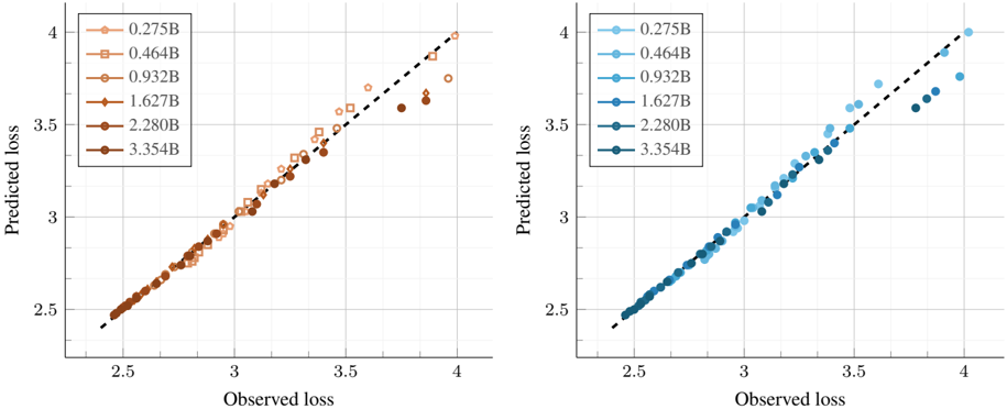
## Line Chart: Observed vs Predicted Loss for Different Model Sizes
### Overview
The image contains two side-by-side scatter plots comparing **observed loss** (x-axis) and **predicted loss** (y-axis) for six model sizes (0.275B to 3.354B parameters). Each panel uses distinct colors and markers to differentiate model sizes, with a dashed line indicating perfect correlation (y = x).
### Components/Axes
- **X-axis (Observed Loss)**: Ranges from 2.5 to 4.0 in increments of 0.5.
- **Y-axis (Predicted Loss)**: Ranges from 2.5 to 4.0 in increments of 0.5.
- **Legend**: Located in the top-right corner of each panel. Model sizes are color-coded:
- 0.275B: Light orange circles
- 0.464B: Orange squares
- 0.932B: Orange diamonds
- 1.627B: Dark orange circles
- 2.280B: Dark orange squares
- 3.354B: Dark orange diamonds
- **Dashed Line**: Represents the line of perfect prediction (y = x).
### Detailed Analysis
#### Left Panel (Model Sizes 0.275B–2.280B)
- **0.275B (Light Orange Circles)**:
- Data points cluster tightly around the dashed line.
- Example points: (2.5, 2.5), (3.0, 3.0), (3.5, 3.5).
- **0.464B (Orange Squares)**:
- Slightly more spread than 0.275B but still close to the dashed line.
- Example points: (2.6, 2.6), (3.2, 3.2), (3.8, 3.8).
- **0.932B (Orange Diamonds)**:
- Moderate spread; some points deviate slightly above/below the line.
- Example points: (2.7, 2.7), (3.4, 3.4), (3.9, 3.9).
- **1.627B (Dark Orange Circles)**:
- Increased spread; points scatter more widely.
- Example points: (2.8, 2.8), (3.5, 3.5), (4.0, 4.0).
- **2.280B (Dark Orange Squares)**:
- Largest spread among smaller models; points near (3.0, 3.0) to (4.0, 4.0).
#### Right Panel (Model Sizes 0.275B–3.354B)
- **0.275B (Light Blue Circles)**:
- Tight clustering around the dashed line.
- Example points: (2.5, 2.5), (3.0, 3.0), (3.5, 3.5).
- **0.464B (Light Blue Squares)**:
- Slight spread; points near (2.6, 2.6) to (3.8, 3.8).
- **0.932B (Light Blue Diamonds)**:
- Moderate spread; points near (2.7, 2.7) to (3.9, 3.9).
- **1.627B (Dark Blue Circles)**:
- Spread increases; points near (2.8, 2.8) to (4.0, 4.0).
- **2.280B (Dark Blue Squares)**:
- Points near (3.0, 3.0) to (4.0, 4.0).
- **3.354B (Dark Blue Diamonds)**:
- Widest spread; points extend to (4.0, 4.0) with significant deviation.
### Key Observations
1. **Accuracy**: All model sizes show strong correlation with the dashed line, indicating accurate predictions.
2. **Spread**: Larger models (e.g., 3.354B) exhibit greater variance in predictions, with points deviating more from the dashed line.
3. **Consistency**: Smaller models (0.275B–0.932B) demonstrate tighter clustering, suggesting more reliable predictions.
4. **Panel Similarity**: Both panels share identical trends, implying consistent behavior across datasets or experimental conditions.
### Interpretation
The charts demonstrate that model predictions align closely with observed losses, validating their reliability. However, larger models (e.g., 3.354B) show increased prediction variability, which could indicate overfitting or sensitivity to input noise. This trend suggests a trade-off between model size and prediction stability, critical for applications requiring consistent performance. The dashed line serves as a benchmark, emphasizing that deviations grow with model complexity.