\n
## Line Chart: Distribution Comparison
### Overview
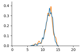
The image presents a line chart comparing two distributions. The chart displays values on the y-axis ranging from 0.0 to 0.4, and values on the x-axis ranging from 0 to 20. Two lines, one blue and one orange, are plotted, showing the distribution of data across the x-axis.
### Components/Axes
* **X-axis:** Ranges from 0 to 20, with tick marks at intervals of 5. The axis is not explicitly labeled.
* **Y-axis:** Ranges from 0.0 to 0.4, with tick marks at intervals of 0.1. The axis is not explicitly labeled.
* **Line 1:** Blue line.
* **Line 2:** Orange line.
* **Legend:** There is no explicit legend.
### Detailed Analysis
The blue line starts at approximately 0.0 at x=0, increases gradually until x=8, then rises more steeply to a peak around x=12, reaching a maximum value of approximately 0.38. After the peak, the blue line declines rapidly, returning to approximately 0.0 by x=16.
The orange line follows a similar pattern. It starts at approximately 0.0 at x=0, increases gradually until x=8, then rises more steeply to a peak around x=13, reaching a maximum value of approximately 0.35. After the peak, the orange line declines rapidly, returning to approximately 0.0 by x=16.
Here's a breakdown of approximate data points:
**Blue Line:**
* x=0, y=0.0
* x=5, y=0.03
* x=10, y=0.25
* x=12, y=0.38
* x=15, y=0.02
* x=20, y=0.0
**Orange Line:**
* x=0, y=0.0
* x=5, y=0.02
* x=10, y=0.23
* x=13, y=0.35
* x=15, y=0.01
* x=20, y=0.0
### Key Observations
Both lines exhibit a similar distribution shape, peaking between x=12 and x=13. The blue line has a slightly higher peak value (approximately 0.38) compared to the orange line (approximately 0.35). The distributions are roughly symmetrical around their peaks.
### Interpretation
The chart likely represents the distribution of some continuous variable. The two lines could represent distributions from two different groups or conditions. The similarity in shape suggests that the underlying processes generating these distributions are similar, but the slight difference in peak height indicates a potential difference in the magnitude or intensity of the variable being measured. Without knowing what the x and y axes represent, it's difficult to draw more specific conclusions. The data suggests a unimodal distribution, with a concentration of values around the peak. The rapid decline after the peak suggests that values beyond a certain point are rare.