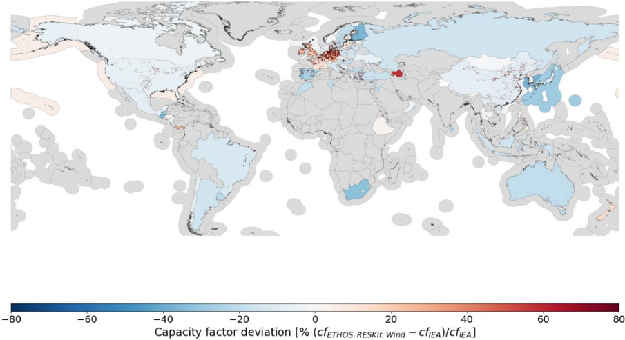
## Heatmap: Global Wind Energy Capacity Factor Deviation
### Overview
A choropleth world map visualizing deviations in wind energy capacity factors between two datasets: `cf_ETHOS_RESKI_Wind` and `cf_EIA`. The map uses color gradients to represent percentage deviations, with blue indicating negative deviations (lower actual capacity) and red indicating positive deviations (higher actual capacity). The legend quantifies deviations relative to the EIA baseline.
### Components/Axes
- **Legend**: Horizontal bar at the bottom labeled "Capacity factor deviation [% (cf_ETHOS_RESKI_Wind – cf_EIA)/cf_EIA]".
- Scale: -80% (dark blue) to +80% (dark red), with intermediate steps:
- Dark blue (-80% to -60%)
- Medium blue (-60% to -40%)
- Light blue (-40% to -20%)
- Gray (-20% to +20%)
- Light orange (+20% to +40%)
- Orange (+40% to +60%)
- Red (+60% to +80%)
- **Map**: Countries shaded according to deviation magnitude. No explicit axis labels, but spatial grounding aligns with standard geographic coordinates.
### Detailed Analysis
- **Color Distribution**:
- **Negative Deviations (Blue)**: Dominant in North America, South America, Australia, and parts of Asia.
- **Positive Deviations (Red/Orange)**: Concentrated in Europe, North Africa, and the Middle East.
- **Neutral (Gray)**: Scattered across Africa, Central Asia, and Oceania.
- **Notable Regions**:
- **Europe**: High positive deviations (orange/red), suggesting overestimation by EIA or stronger wind resources.
- **North Africa**: Red shading indicates significant positive deviations.
- **Middle East**: A single red dot (likely a data point or outlier) stands out in the Arabian Peninsula.
- **South America**: Predominantly light blue, indicating underestimation by EIA.
### Key Observations
1. **Europe’s High Deviations**: Multiple countries (e.g., Germany, Spain) show red/orange shading, implying actual capacity factors exceed EIA estimates by 20–80%.
2. **Middle Eastern Outlier**: The red dot in the Arabian Peninsula suggests an extreme deviation (>60%), requiring further investigation.
3. **South America’s Underestimation**: Most countries (e.g., Brazil, Argentina) show light blue shading, indicating actual capacity factors are 20–40% lower than EIA estimates.
4. **Asia’s Mixed Trends**: East Asia (e.g., China) has light blue shading, while parts of Central Asia are neutral.
### Interpretation
The map highlights systemic discrepancies between EIA wind energy capacity estimates and ETHOS_RESKI_Wind data. Positive deviations in Europe and North Africa may reflect:
- **Improved Wind Resource Assessment**: ETHOS_RESKI_Wind could incorporate higher-resolution wind data or updated turbine efficiency models.
- **Policy Overestimations**: EIA might have conservative estimates due to regulatory or funding constraints.
Negative deviations in South America and parts of Asia suggest:
- **Underestimated Wind Potential**: ETHOS_RESKI_Wind may use more accurate local wind data, revealing lower-than-expected capacity factors.
- **Data Gaps**: Sparse monitoring infrastructure in these regions could lead to EIA overestimations.
The Middle Eastern red dot warrants scrutiny—it could indicate a data anomaly, localized wind resource variability, or a methodological error in either dataset.
### Spatial Grounding & Validation
- The legend’s color coding aligns spatially: red regions cluster in high-latitude areas (Europe, North Africa), while blue regions dominate tropical and subtropical zones.
- Cross-referencing legend colors with map shading confirms consistency (e.g., red in Europe matches the +40%–80% range).
### Limitations
- **Resolution**: Country-level shading may obscure subnational variations.
- **Temporal Scope**: No timeframe is specified for the capacity factors (e.g., annual averages vs. peak seasons).
- **Data Sources**: Unclear if `cf_ETHOS_RESKI_Wind` and `cf_EIA` use identical methodologies (e.g., turbine height, wind speed thresholds).