\n
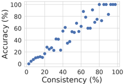
## Scatter Plot: Accuracy vs. Consistency
### Overview
The image presents a scatter plot illustrating the relationship between Accuracy and Consistency, both measured as percentages. The plot displays a generally positive correlation, with accuracy increasing as consistency increases.
### Components/Axes
* **X-axis:** Labeled "Consistency (%)", ranging from 0% to 100%. The axis is marked with increments of 20%.
* **Y-axis:** Labeled "Accuracy (%)", ranging from 0% to 100%. The axis is marked with increments of 20%.
* **Data Points:** A series of blue circular data points are scattered across the plot.
* **Gridlines:** A light gray grid is present to aid in reading values.
### Detailed Analysis
The data points show a clear trend: as Consistency increases, Accuracy also tends to increase.
Here's a breakdown of approximate data points, reading from left to right:
* At approximately 10% Consistency, Accuracy is around 5%.
* At approximately 20% Consistency, Accuracy is around 10-15%.
* At approximately 30% Consistency, Accuracy is around 20-25%.
* At approximately 40% Consistency, Accuracy is around 40%.
* At approximately 50% Consistency, Accuracy is around 50-60%.
* At approximately 60% Consistency, Accuracy is around 60-70%.
* At approximately 70% Consistency, Accuracy is around 70-80%.
* At approximately 80% Consistency, Accuracy is around 80-90%.
* At approximately 90% Consistency, Accuracy is around 90-100%.
* At approximately 100% Consistency, Accuracy is consistently around 95-100%.
The data points are relatively sparse at lower consistency values (below 30%) and become more densely populated as consistency increases.
### Key Observations
* **Positive Correlation:** A strong positive correlation exists between Consistency and Accuracy.
* **Non-Linearity:** The relationship appears to be non-linear. The rate of increase in Accuracy slows down as Consistency approaches 100%.
* **Threshold Effect:** Accuracy remains low (below 20%) until Consistency reaches approximately 30%, after which it begins to increase more rapidly.
* **Saturation:** Accuracy seems to plateau around 90-100% as Consistency reaches 100%.
### Interpretation
This data suggests that a higher degree of consistency is strongly associated with higher accuracy. This could represent a system or process where reliable, repeatable results (high consistency) lead to more correct outcomes (high accuracy). The non-linear relationship indicates that there's a threshold effect – a certain level of consistency must be achieved before significant gains in accuracy are observed. The saturation effect at high consistency suggests that there are diminishing returns; further improvements in consistency may not yield substantial improvements in accuracy.
This plot could be illustrating the performance of a machine learning model, a quality control process, or any system where both consistency and accuracy are important metrics. The data implies that focusing on improving consistency is a key strategy for enhancing accuracy, but that there may be a point of diminishing returns.