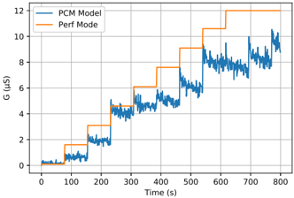
## Line Chart: Performance Comparison Over Time
### Overview
This image presents a line chart comparing the performance of two modes, "PCM Model" and "Perf Mode," over a period of 800 seconds. The y-axis represents a performance metric labeled "G (µs)", likely representing latency or execution time. The x-axis represents time in seconds.
### Components/Axes
* **X-axis:** Time (s), ranging from 0 to 800 seconds. Marked at intervals of 100 seconds.
* **Y-axis:** G (µs), ranging from 0 to 12 µs. Marked at intervals of 2 µs.
* **Legend:** Located in the top-left corner.
* "PCM Model" - represented by a blue line.
* "Perf Mode" - represented by an orange line.
* **Grid:** A light gray grid is present, aiding in reading values.
### Detailed Analysis
**PCM Model (Blue Line):**
The blue line representing "PCM Model" starts at approximately 0.2 µs at time 0 seconds. It initially fluctuates slightly, then exhibits a series of step-like increases.
* At approximately 100 seconds, the value increases to around 1.8 µs.
* Around 200 seconds, it rises to approximately 4.5 µs.
* At 300 seconds, it increases to around 5.8 µs.
* Around 400 seconds, it rises to approximately 6.2 µs.
* At 500 seconds, it increases to around 7.5 µs.
* Around 600 seconds, it rises to approximately 8.5 µs.
* At 700 seconds, it increases to approximately 9.5 µs.
* Finally, at 800 seconds, it ends at approximately 10.5 µs.
Throughout the entire duration, the line exhibits some degree of fluctuation around these step-like increases.
**Perf Mode (Orange Line):**
The orange line representing "Perf Mode" starts at approximately 0.1 µs at time 0 seconds. It also exhibits step-like increases, but generally at a higher level than the "PCM Model".
* At approximately 100 seconds, the value decreases to around 0.8 µs.
* Around 200 seconds, it rises to approximately 2.5 µs.
* At 300 seconds, it increases to around 7.5 µs.
* Around 400 seconds, it rises to approximately 7.8 µs.
* At 500 seconds, it increases to around 10.2 µs.
* Around 600 seconds, it rises to approximately 10.8 µs.
* At 700 seconds, it rises to approximately 11.5 µs.
* Finally, at 800 seconds, it ends at approximately 12 µs.
Similar to the "PCM Model", the "Perf Mode" line also shows fluctuations around these step-like increases.
### Key Observations
* "Perf Mode" consistently exhibits higher values of "G (µs)" than "PCM Model" for most of the duration, indicating potentially higher latency or execution time.
* Both modes show a general increasing trend in "G (µs)" over time, suggesting a performance degradation or increased load.
* The step-like increases in both lines suggest discrete changes in operating conditions or workload.
* The fluctuations around the step-like increases indicate variability in performance within each mode.
### Interpretation
The chart demonstrates a performance comparison between two modes, "PCM Model" and "Perf Mode," over time. The increasing trend in "G (µs)" for both modes suggests a potential performance bottleneck or increasing load on the system. The consistently higher values for "Perf Mode" could indicate that this mode is more resource-intensive or has inherent performance limitations. The step-like increases suggest that the system is transitioning between different states or handling different workloads. The fluctuations within each mode could be due to variations in input data, background processes, or other factors.
The data suggests that while "Perf Mode" might offer certain advantages, it comes at the cost of increased latency or execution time. Further investigation is needed to understand the root cause of the performance degradation and the reasons for the step-like increases. The chart provides valuable insights into the behavior of the two modes and can be used to optimize system performance.