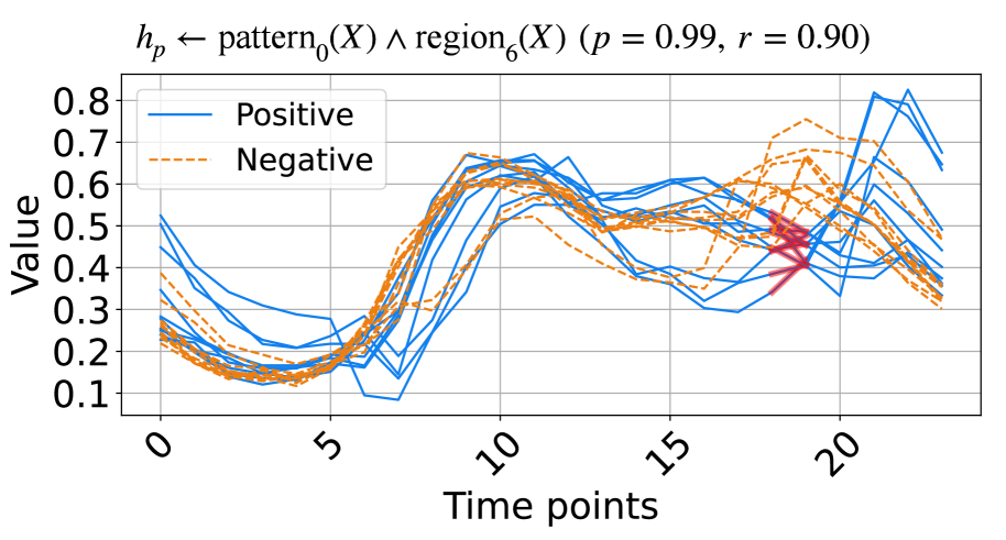
## Line Chart: Pattern and Region Analysis
### Overview
The image is a line chart comparing "Positive" and "Negative" data series over time. Multiple lines are plotted for each category, showing the variation within each group. The chart includes a title indicating the analysis is based on pattern and region, with associated probability (p) and correlation (r) values.
### Components/Axes
* **Title:** `h_p ← pattern_0(X) ∧ region_6(X) (p = 0.99, r = 0.90)`
* **X-axis:** "Time points", ranging from 0 to 20 in increments of 5.
* **Y-axis:** "Value", ranging from 0.1 to 0.8 in increments of 0.1.
* **Legend:** Located in the top-left corner.
* "Positive": Represented by solid blue lines.
* "Negative": Represented by dashed orange lines.
### Detailed Analysis
* **Positive (Blue Lines):**
* General Trend: The "Positive" lines generally start around a value of 0.4-0.5, decrease to around 0.2 between time points 4 and 6, then increase to a peak between time points 10 and 12, reaching values between 0.6 and 0.7. After the peak, the lines generally decrease to values between 0.4 and 0.6 at time point 20.
* Specific Values: At time point 0, the values range from approximately 0.4 to 0.5. At time point 10, the values peak between 0.6 and 0.7. At time point 20, the values range from approximately 0.4 to 0.6.
* **Negative (Dashed Orange Lines):**
* General Trend: The "Negative" lines start around a value of 0.2-0.5, decrease to around 0.2 between time points 4 and 6, then increase to a peak between time points 10 and 12, reaching values between 0.5 and 0.6. After the peak, the lines generally decrease to values between 0.3 and 0.7 at time point 20.
* Specific Values: At time point 0, the values range from approximately 0.2 to 0.5. At time point 10, the values peak between 0.5 and 0.6. At time point 20, the values range from approximately 0.3 to 0.7.
* **Highlighted Region:** There is a region highlighted in red around time point 19, where some of the "Positive" and "Negative" lines intersect or are in close proximity.
### Key Observations
* Both "Positive" and "Negative" series show a similar trend: a decrease in value from time point 0 to around time point 5, followed by an increase to a peak around time point 10-12, and then a decrease towards time point 20.
* The "Positive" series generally has higher values than the "Negative" series, especially around the peak at time points 10-12.
* The highlighted region around time point 19 indicates an area of potential overlap or similarity between the "Positive" and "Negative" series.
### Interpretation
The chart visualizes the behavior of "Positive" and "Negative" patterns over time, likely representing different classes or conditions. The similar trends suggest that both patterns are influenced by the same underlying factors, but the difference in magnitude indicates that the "Positive" pattern is generally stronger or more prevalent. The highlighted region could indicate a point where the two patterns are difficult to distinguish or where their effects converge. The values of p = 0.99 and r = 0.90 suggest a high probability and correlation associated with the pattern and region analysis, indicating a strong relationship between the variables being analyzed.