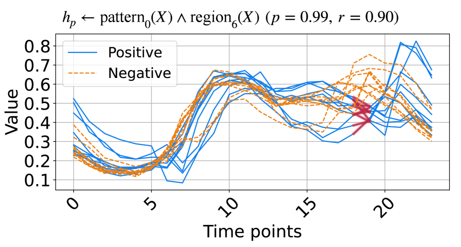
## Line Chart: Pattern and Region Analysis Over Time
### Overview
The image displays a line chart comparing two categories of data series—"Positive" and "Negative"—over a sequence of time points. The chart includes a mathematical title, a legend, labeled axes with grid lines, and multiple data lines for each category. A distinct red marker highlights a specific data point.
### Components/Axes
* **Title (Top Center):** `$h_p \leftarrow \text{pattern}_0(X) \land \text{region}_6(X) \ (p = 0.99, r = 0.90)$`
* This is a mathematical/logical expression. The notation suggests a hypothesis (`h_p`) is derived from the conjunction of `pattern_0(X)` and `region_6(X)`, with associated statistical values: a p-value (`p`) of 0.99 and a correlation coefficient (`r`) of 0.90.
* **Legend (Top-Left Corner):**
* **Positive:** Represented by a solid blue line.
* **Negative:** Represented by a dashed orange line.
* **Y-Axis (Left Side):**
* **Label:** "Value"
* **Scale:** Linear, ranging from 0.1 to 0.8.
* **Major Tick Marks:** 0.1, 0.2, 0.3, 0.4, 0.5, 0.6, 0.7, 0.8.
* **X-Axis (Bottom):**
* **Label:** "Time points"
* **Scale:** Linear, ranging from 0 to 20.
* **Major Tick Marks:** 0, 5, 10, 15, 20.
* **Data Series:** The chart contains multiple lines for each category (approximately 8-10 blue solid lines and 8-10 orange dashed lines), indicating multiple samples or trials for both "Positive" and "Negative" conditions.
* **Highlighted Point (Approx. Coordinates: Time=18, Value=0.45):** A red, star-shaped marker is placed on one of the blue solid lines in the lower-right quadrant of the chart.
### Detailed Analysis
**Trend Verification & Data Point Extraction:**
* **General Trend for Both Series:** All lines begin in a cluster between Values 0.2 and 0.5 at Time point 0. They generally trend downward to a minimum around Time points 4-6 (Values ~0.1-0.25), then rise sharply to a peak or plateau between Time points 8-12 (Values ~0.5-0.7). After Time point 12, the series exhibit more volatility and divergence.
* **"Positive" (Blue Solid Lines) Trend:** After the plateau (~Time 8-12), the blue lines show significant spread. Some lines dip around Time 14-16 (to ~0.3-0.4) before rising sharply again, with several reaching the highest values on the chart (peaking between 0.7 and 0.8+ near Time 20). The overall late-stage trend (Time 15-20) is upward for many blue lines, but with high variance.
* **"Negative" (Orange Dashed Lines) Trend:** The orange lines also plateau around Time 8-12. Afterward, they remain more tightly clustered than the blue lines, generally fluctuating between Values 0.4 and 0.7 through Time point 20. Their late-stage trend is more horizontal or slightly declining compared to the rising blue lines.
* **Key Data Points (Approximate):**
* **Start (Time 0):** Blue lines range ~0.25-0.55. Orange lines range ~0.2-0.4.
* **First Trough (Time ~5):** Blue lines range ~0.1-0.25. Orange lines range ~0.15-0.25.
* **First Peak (Time ~10):** Blue lines cluster ~0.55-0.65. Orange lines cluster ~0.5-0.65.
* **Divergence Zone (Time 15-20):** Blue lines spread widely from ~0.3 to >0.8. Orange lines are concentrated ~0.4-0.7.
* **Highlighted Red Star:** Located at approximately Time point 18, Value 0.45, on a blue line that is in the lower portion of the blue cluster at that time.
### Key Observations
1. **High Correlation & Significance:** The title's `p = 0.99` and `r = 0.90` suggest the relationship between the pattern/region and the observed data is statistically very strong and highly correlated.
2. **Synchronized Early Behavior:** Both "Positive" and "Negative" series follow a very similar pattern of decline and recovery for the first half of the timeline (Time 0-12), suggesting a common underlying process or stimulus.
3. **Late-Stage Divergence:** The primary difference between the categories emerges after Time point 12-15. The "Positive" series exhibits greater volatility and a tendency for some samples to reach much higher values, while the "Negative" series remains more stable and bounded.
4. **Outlier/Event Marker:** The red star at (18, 0.45) singles out a specific data point on a "Positive" line. Its placement in a relatively low-value region for that time point, amidst rising blue lines, may indicate an anomaly, a critical event, or a point of interest for failure/analysis.
### Interpretation
This chart likely visualizes the output of a model or experiment testing a hypothesis (`h_p`) related to a specific pattern (`pattern_0`) within a defined region (`region_6`) of input data `X`. The high `r` value (0.90) indicates that the model's predictions or the measured phenomenon strongly align with the actual data.
The data suggests that the conditions labeled "Positive" and "Negative" are not distinctly different in their initial response (Time 0-12). The critical differentiating factor manifests in the later phase (Time >15), where the "Positive" condition allows for or triggers a much wider range of outcomes, including significantly higher "Value" scores. The "Negative" condition appears to constrain the system, preventing extreme high values.
The red star likely marks a point of investigation—perhaps a sample that behaved unexpectedly (a "Positive" case that yielded a low value late in the sequence) or a timestamp where a specific intervention occurred. The overall narrative is of two processes that start similarly but bifurcate in their potential and stability over time, with the "Positive" class showing greater expressive range or susceptibility to high-value outcomes.