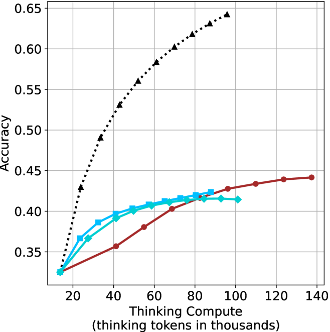
## Line Chart: Accuracy vs. Thinking Compute
### Overview
The image is a line chart plotting model accuracy against computational resources, measured in "thinking tokens." It compares the performance scaling of three distinct methods or models as compute increases. The chart demonstrates a clear divergence in how effectively each method translates additional compute into improved accuracy.
### Components/Axes
* **Chart Type:** Line chart with markers.
* **X-Axis:**
* **Label:** "Thinking Compute (thinking tokens in thousands)"
* **Scale:** Linear, ranging from 0 to 140 (representing 0 to 140,000 tokens).
* **Major Ticks:** 0, 20, 40, 60, 80, 100, 120, 140.
* **Y-Axis:**
* **Label:** "Accuracy"
* **Scale:** Linear, ranging from approximately 0.30 to 0.65.
* **Major Ticks:** 0.35, 0.40, 0.45, 0.50, 0.55, 0.60, 0.65.
* **Legend:** Located in the top-left corner of the plot area. It identifies three data series:
1. **Black dotted line with upward-pointing triangle markers (▲).**
2. **Cyan solid line with square markers (■).**
3. **Red solid line with circle markers (●).**
* **Grid:** A light gray grid is present for both major x and y ticks.
### Detailed Analysis
The chart displays three distinct performance curves:
1. **Black Dotted Line (▲):**
* **Trend:** Shows a steep, near-linear upward slope that begins to curve slightly, suggesting diminishing returns at very high compute. It demonstrates the strongest positive correlation between compute and accuracy.
* **Data Points (Approximate):**
* (10, 0.33)
* (20, 0.43)
* (30, 0.49)
* (40, 0.53)
* (50, 0.56)
* (60, 0.58)
* (70, 0.60)
* (80, 0.62)
* (90, 0.63)
* (100, 0.64)
2. **Cyan Solid Line (■):**
* **Trend:** Increases steadily at low compute but begins to plateau significantly after approximately 60k tokens. The curve flattens, indicating that additional compute yields minimal accuracy gains beyond this point.
* **Data Points (Approximate):**
* (10, 0.33)
* (20, 0.37)
* (30, 0.39)
* (40, 0.40)
* (50, 0.41)
* (60, 0.415)
* (70, 0.42)
* (80, 0.42)
* (90, 0.415)
* (100, 0.415)
3. **Red Solid Line (●):**
* **Trend:** Starts with the lowest accuracy at low compute but maintains a steady, gradual upward slope. It surpasses the cyan line's accuracy at approximately 85k tokens and continues to improve slowly, showing no clear plateau within the plotted range.
* **Data Points (Approximate):**
* (10, 0.33)
* (40, 0.36)
* (55, 0.38)
* (70, 0.40)
* (85, 0.42)
* (100, 0.43)
* (110, 0.435)
* (125, 0.44)
* (135, 0.442)
### Key Observations
* **Common Starting Point:** All three methods begin at nearly the same accuracy (~0.33) with minimal compute (10k tokens).
* **Divergent Scaling:** The primary insight is the dramatic difference in scaling efficiency. The method represented by the black line scales exceptionally well, while the cyan method hits a performance ceiling. The red method scales slowly but consistently.
* **Crossover Point:** The red line overtakes the cyan line at a compute level of approximately 85,000 thinking tokens, suggesting it becomes the more efficient choice for high-compute scenarios within this range.
* **Plateau vs. Continued Growth:** The cyan line's plateau contrasts sharply with the continued (though slow) growth of the red line and the strong growth of the black line.
### Interpretation
This chart likely compares different AI model architectures, training techniques, or inference strategies (e.g., different "chain-of-thought" methods). The data suggests:
1. **Superior Method (Black Line):** The method using the black dotted line is fundamentally more efficient at leveraging additional computational resources ("thinking tokens") to improve accuracy. Its near-linear scaling implies a highly effective use of compute, possibly indicating a more advanced or better-optimized reasoning process.
2. **Early Plateau (Cyan Line):** The method represented by the cyan line benefits from initial compute but quickly saturates. This could indicate a simpler model or a technique with a fixed "reasoning capacity" that cannot be expanded simply by allocating more tokens. It may be efficient for low-compute applications but is outclassed at higher budgets.
3. **Steady Improver (Red Line):** The red line method is less efficient at low compute but demonstrates robust, continued scaling. Its eventual surpassing of the cyan line indicates it has a higher performance ceiling. This might represent a more complex but less sample-efficient approach that requires substantial compute to shine.
4. **Practical Implication:** The choice of method depends on the available compute budget. For very low budgets (<20k tokens), all methods perform similarly. For medium budgets (20k-80k), the black method is best, followed by cyan. For high budgets (>85k), the ranking is black, then red, then cyan. The black method is dominant across the entire observed range.