## Line Chart: Accuracy vs. Thinking Compute
### Overview
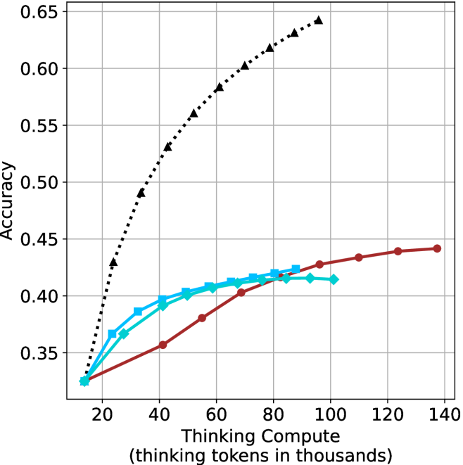
This chart illustrates the relationship between "Thinking Compute" (measured in thousands of thinking tokens) and model "Accuracy." It compares four distinct data series, all originating from a common baseline. The chart demonstrates significant variance in how different models or methods scale their accuracy as they are allocated more thinking compute.
### Components/Axes
* **Y-Axis:** Labeled "Accuracy." The scale ranges from 0.35 to 0.65, with major grid lines at 0.05 intervals.
* **X-Axis:** Labeled "Thinking Compute (thinking tokens in thousands)." The scale ranges from 20 to 140, with major grid lines at 20-unit intervals.
* **Data Series:** There are four distinct series. Note: **There is no legend provided in the image** to identify the specific models or methods associated with each line.
* **Series 1 (Black, dotted line, triangle markers):** The top-performing series.
* **Series 2 (Dark Red, solid line, circle markers):** The longest-running series, extending to the highest compute value.
* **Series 3 (Cyan/Light Blue, solid line, square markers):** Mid-range performance.
* **Series 4 (Cyan/Light Blue, solid line, diamond markers):** Mid-range performance, very similar to Series 3.
### Detailed Analysis
All four data series originate from a common starting point at approximately **(15, 0.325)**.
* **Series 1 (Black, Dotted, Triangle Markers):**
* **Trend:** Steep, positive slope. This series shows the most aggressive scaling.
* **Data Points (Approximate):**
* (25, 0.43)
* (35, 0.49)
* (45, 0.53)
* (55, 0.56)
* (65, 0.585)
* (75, 0.605)
* (85, 0.62)
* (95, 0.635)
* (100, 0.64)
* **Observation:** This series achieves the highest accuracy, reaching ~0.64 at 100k tokens.
* **Series 2 (Dark Red, Solid, Circle Markers):**
* **Trend:** Gradual, positive slope. It exhibits the least steep growth but continues to scale to the highest compute value on the chart.
* **Data Points (Approximate):**
* (40, 0.355)
* (55, 0.38)
* (70, 0.40)
* (85, 0.415)
* (100, 0.425)
* (110, 0.43)
* (125, 0.44)
* (135, 0.44)
* **Observation:** The curve begins to flatten significantly after 100k tokens.
* **Series 3 (Cyan/Light Blue, Solid, Square Markers):**
* **Trend:** Moderate positive slope, showing signs of saturation (diminishing returns) after 60k tokens.
* **Data Points (Approximate):**
* (25, 0.365)
* (35, 0.385)
* (45, 0.40)
* (55, 0.405)
* (65, 0.41)
* (75, 0.415)
* (85, 0.425)
* **Observation:** This series terminates at 85k tokens.
* **Series 4 (Cyan/Light Blue, Solid, Diamond Markers):**
* **Trend:** Moderate positive slope, very similar to Series 3, but with a slightly lower ceiling.
* **Data Points (Approximate):**
* (25, 0.365)
* (40, 0.39)
* (50, 0.40)
* (60, 0.405)
* (70, 0.41)
* (80, 0.415)
* (90, 0.415)
* (100, 0.415)
* **Observation:** This series plateaus at 0.415 accuracy after 80k tokens.
### Key Observations
* **Performance Gap:** There is a massive performance gap between the Black Dotted series and the other three. At 100k tokens, the Black series is at ~0.64 accuracy, while the Red series is at ~0.425 and the Cyan-Diamond series is at ~0.415.
* **Efficiency:** The Black series achieves an accuracy of ~0.43 with only 25k tokens, whereas the Red series requires 110k tokens to reach the same accuracy level.
* **Saturation:** The Cyan and Red series all exhibit clear signs of diminishing returns, where increasing compute yields progressively smaller gains in accuracy. The Black series, while also curving, maintains a much higher trajectory.
### Interpretation
This chart is a classic representation of "scaling laws" applied to reasoning models (likely Chain-of-Thought or test-time compute models).
* **The "Black Line" Advantage:** The black dotted line represents a model or method that is highly efficient at utilizing additional "thinking" time. It suggests that the underlying architecture or training method allows the model to effectively convert compute into reasoning capability.
* **The "Ceiling" Effect:** The other three lines (Red, Cyan-Square, Cyan-Diamond) appear to hit a "reasoning ceiling." This suggests that for these specific models, simply generating more tokens does not help the model solve the problem better; it likely just results in verbose or redundant thinking that does not improve the final answer.
* **Strategic Implication:** The data suggests that the *quality* of the reasoning process (the method) is significantly more important than the *quantity* of compute (the tokens). The black line demonstrates that superior reasoning methods can achieve vastly higher accuracy with significantly less compute than inferior methods.