## Diagram & Chart: Correlation Analysis of a Circuit
### Overview
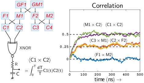
The image presents a combination of a circuit diagram and a correlation chart. The circuit diagram depicts a network of components including XOR gates, resistors, and capacitors. The chart displays the correlation between different signal pairs within the circuit as a function of time. The chart is labeled "Correlation".
### Components/Axes
**Circuit Diagram Components:**
* **Inputs:** C1, C2, C3, C4
* **Intermediate Nodes:** M1, M2, F1, F2
* **Outputs:** GF1, GM1
* **Gate:** XNOR
* **Passive Components:** Resistor (R), Capacitor (C)
* **Equation:** ∫₀ᵀ (d/dt C1(t)C2(t)) dt / T
**Correlation Chart Components:**
* **X-axis:** Time (ns), ranging from 0 to 500.
* **Y-axis:** Correlation value, ranging from approximately 0 to 0.55.
* **Data Series:**
* (M1 x C2) - Green line
* (C1 x C2) - Dark Green line
* (C3 x M1) - Purple line
* (C2 x F2) - Orange line
* (F1 x M2) - Blue line
* **Horizontal dashed lines:** at approximately 0.25 and 0.5.
### Detailed Analysis or Content Details
**Circuit Diagram:**
The circuit diagram shows a network where inputs C1, C2, C3, and C4 feed into intermediate nodes M1, M2, F1, and F2. These nodes are connected to outputs GF1 and GM1 through what appears to be an XNOR gate. A resistor (R) and capacitor (C) are shown connected to ground. The equation below the circuit diagram represents an integral calculation involving the time derivatives of signals C1 and C2.
**Correlation Chart:**
* **(M1 x C2):** The green line starts at approximately 0 at time 0 ns, rises rapidly to around 0.45 by 100 ns, and then plateaus around 0.5, with some fluctuations.
* **(C1 x C2):** The dark green line starts at approximately 0 at time 0 ns, rises rapidly to around 0.5 by 100 ns, and then plateaus around 0.5, with some fluctuations.
* **(C3 x M1):** The purple line starts at approximately 0 at time 0 ns, rises to around 0.3 by 100 ns, and then plateaus around 0.3, with some fluctuations.
* **(C2 x F2):** The orange line starts at approximately 0 at time 0 ns, rises to around 0.25 by 100 ns, and then plateaus around 0.25, with some fluctuations.
* **(F1 x M2):** The blue line starts at approximately 0 at time 0 ns, rises to around 0.1 by 100 ns, and then remains relatively flat around 0.1, with some fluctuations.
### Key Observations
* The correlation between (C1 x C2) and (M1 x C2) is the highest, reaching a plateau around 0.5.
* The correlation between (F1 x M2) is the lowest, remaining near 0.1 throughout the observed time period.
* All correlation curves show an initial rise within the first 100 ns, suggesting an initial correlation development.
* The dashed lines at 0.25 and 0.5 provide reference points for evaluating the correlation strength.
### Interpretation
The image demonstrates the correlation between different signal pairs within a circuit. The circuit appears to be designed to amplify or enhance the correlation between certain signals, as evidenced by the high correlation values between (C1 x C2) and (M1 x C2). The lower correlation between (F1 x M2) suggests a weaker relationship or a different processing path within the circuit. The integral equation likely represents a method for calculating the correlation between signals C1 and C2 over time. The XNOR gate suggests a comparison or difference operation is being performed. The correlation chart provides insight into how signals propagate and interact within the circuit, potentially revealing bottlenecks or areas of strong signal coupling. The time scale (ns) indicates that the circuit operates at a relatively high speed. The horizontal dashed lines may represent thresholds for signal detection or decision-making within the circuit.