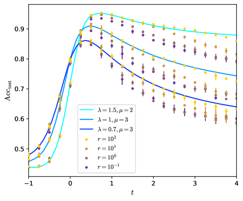
## Line Chart: Accuracy Over Time (Acc_test vs t)
### Overview
The chart displays three distinct data series representing the relationship between time (`t`) and test accuracy (`Acc_test`). Each series is differentiated by parameters `λ` (lambda) and `μ` (mu), with additional markers indicating varying `r` (radix) values. The data points are plotted with error bars, and trend lines are fitted to the series.
---
### Components/Axes
- **X-axis (t)**: Time, ranging from -1 to 4 in increments of 1.
- **Y-axis (Acc_test)**: Test accuracy, ranging from 0.5 to 0.9 in increments of 0.1.
- **Legend**: Located in the bottom-left corner, mapping:
- **Line styles/colors**:
- Cyan: `λ=1.5, μ=2`
- Blue: `λ=1, μ=3`
- Dark blue: `λ=0.7, μ=3`
- **Markers**:
- Yellow: `r=10²`
- Brown: `r=10¹`
- Purple: `r=10⁰`
- Dark purple: `r=10⁻¹`
---
### Detailed Analysis
#### Line Series Trends
1. **Cyan Line (`λ=1.5, μ=2`)**:
- Starts at `Acc_test ≈ 0.45` at `t=-1`.
- Peaks sharply at `t≈0.5` (`Acc_test≈0.9`).
- Declines gradually to `Acc_test≈0.85` at `t=4`.
- Error bars are smallest near the peak, widening as `t` increases.
2. **Blue Line (`λ=1, μ=3`)**:
- Begins at `Acc_test≈0.48` at `t=-1`.
- Peaks at `t≈1` (`Acc_test≈0.88`).
- Declines to `Acc_test≈0.75` at `t=4`.
- Error bars are consistent across the series.
3. **Dark Blue Line (`λ=0.7, μ=3`)**:
- Starts at `Acc_test≈0.47` at `t=-1`.
- Peaks at `t≈1.5` (`Acc_test≈0.82`).
- Declines to `Acc_test≈0.65` at `t=4`.
- Error bars are largest at the peak and smallest at `t=4`.
#### Marker Series Trends
- **Yellow (`r=10²`)**:
- Highest initial `Acc_test` (~0.85 at `t=0`).
- Steepest decline, reaching ~0.6 at `t=4`.
- **Brown (`r=10¹`)**:
- Moderate initial `Acc_test` (~0.75 at `t=0`).
- Gradual decline to ~0.55 at `t=4`.
- **Purple (`r=10⁰`)**:
- Lower initial `Acc_test` (~0.65 at `t=0`).
- Slow decline to ~0.5 at `t=4`.
- **Dark Purple (`r=10⁻¹`)**:
- Lowest initial `Acc_test` (~0.55 at `t=0`).
- Minimal decline, stabilizing near ~0.5 at `t=4`.
---
### Key Observations
1. **Peak Timing**: All lines peak between `t=0.5` and `t=1.5`, with higher `λ` and `μ` values correlating with earlier peaks.
2. **r Value Impact**: Higher `r` values (e.g., `10²`) exhibit higher initial accuracy but steeper declines, while lower `r` values (e.g., `10⁻¹`) show slower degradation.
3. **Error Bars**: Larger error margins are observed near peaks and at extreme `t` values, suggesting greater variability in measurements at these points.
4. **Legend Consistency**: Colors and markers align perfectly with their labels (e.g., cyan line matches `λ=1.5, μ=2`).
---
### Interpretation
The chart demonstrates how test accuracy (`Acc_test`) evolves over time under different parameter configurations:
- **λ and μ**: Higher values of `λ` and `μ` accelerate the rise and fall of accuracy, suggesting they may represent learning rates or decay factors in a dynamic system.
- **r Values**: Higher `r` (e.g., `10²`) implies a stronger initial state or capacity, but this advantage diminishes rapidly over time. Lower `r` values (e.g., `10⁻¹`) indicate a more stable but less performant baseline.
- **Practical Implications**: The trade-off between peak performance and long-term stability is evident. Systems optimized for short-term gains (`high λ, μ, r`) may degrade faster, while conservative configurations (`low λ, μ, r`) prioritize sustainability over peak performance.
This analysis aligns with scenarios in machine learning or resource allocation models, where parameters like `λ` and `μ` control system dynamics, and `r` represents initial resource availability or model complexity.