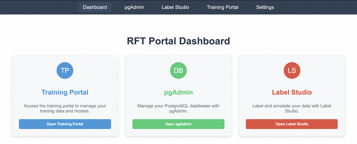
## Screenshot: RFT Portal Dashboard Web Interface
### Overview
This image is a screenshot of a web application dashboard titled "RFT Portal Dashboard." It serves as a central navigation hub, providing access to three distinct tools or modules: a Training Portal, pgAdmin (for database management), and Label Studio (for data annotation). The interface is clean and card-based, with a top navigation bar.
### Components/Axes
**Top Navigation Bar (Dark Blue Background):**
* **Tabs (from left to right):**
1. `Dashboard` (currently selected, indicated by a lighter blue background)
2. `pgAdmin`
3. `Label Studio`
4. `Training Portal`
5. `Settings`
**Main Content Area (Light Gray Background):**
* **Main Title:** `RFT Portal Dashboard` (centered, large, dark blue font).
* **Three Content Cards (arranged horizontally):**
* **Card 1 (Left):**
* **Icon:** Blue circle with white text `TP`.
* **Title:** `Training Portal` (blue font).
* **Description:** `Access the training portal to manage your training data and models.`
* **Button:** Blue button with text `Open Training Portal`.
* **Card 2 (Center):**
* **Icon:** Green circle with white text `DB`.
* **Title:** `pgAdmin` (green font).
* **Description:** `Manage your PostgreSQL databases with pgAdmin.`
* **Button:** Green button with text `Open pgAdmin`.
* **Card 3 (Right):**
* **Icon:** Red/Orange circle with white text `LS`.
* **Title:** `Label Studio` (red/orange font).
* **Description:** `Label and annotate your data with Label Studio.`
* **Button:** Red/Orange button with text `Open Label Studio`.
### Detailed Analysis
The interface is structured for quick access. Each card follows an identical layout pattern: Icon -> Title -> Description -> Action Button. The color scheme is consistent per card, with the icon, title text, and button all sharing the same hue (blue for Training Portal, green for pgAdmin, red/orange for Label Studio). The navigation bar suggests the user is currently on the "Dashboard" view, with other sections available for direct navigation.
### Key Observations
1. **Consistent Card Design:** The three primary tools are presented with equal visual weight, using a consistent template that promotes intuitive understanding.
2. **Color-Coded Functionality:** Each tool is assigned a distinct color (blue, green, red/orange), creating a strong visual association between the icon, title, and action button.
3. **Clear Hierarchy:** The page title is the most prominent element, followed by the card titles, then the descriptive text, and finally the action buttons.
4. **Navigation State:** The "Dashboard" tab in the top bar is visually highlighted, confirming the user's current location within the application.
### Interpretation
This dashboard is the entry point for a workflow likely related to machine learning or data science, given the tools it connects. The "RFT" in the title could stand for "Reinforcement Fine-Tuning" or a similar process. The three modules represent key stages:
* **Training Portal (TP):** For managing the core models and training data.
* **pgAdmin (DB):** For direct database administration, suggesting data is stored in PostgreSQL.
* **Label Studio (LS):** For data labeling and annotation, a critical step in supervised learning.
The design prioritizes clarity and efficiency, allowing a user to jump directly into a specific task without navigating through multiple menus. The separation of concerns (training, data storage, data labeling) into distinct, color-coded portals indicates a structured, modular approach to the underlying project or platform.