\n
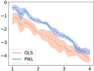
## Line Chart: Comparison of OLS and PIKL Performance
### Overview
This image presents a line chart comparing the performance of two methods, Ordinary Least Squares (OLS) and Policy Iteration with Kernel Learning (PIKL), across a range of values on the x-axis. The y-axis represents a numerical score, likely an error or loss value, with lower values indicating better performance. The chart displays the mean performance of each method as a line, along with a shaded region representing the standard deviation or confidence interval around the mean.
### Components/Axes
* **X-axis:** Labeled with numerical values ranging from approximately 1 to 4, with tick marks at 1, 2, 3, and 4.
* **Y-axis:** Ranges from approximately 0 to -6, with tick marks at 0, -1, -2, -3, -4, -5, and -6.
* **Legend:** Located in the bottom-left corner.
* OLS: Represented by a light orange/peach color.
* PIKL: Represented by a light blue color.
### Detailed Analysis
**OLS (Orange Line):**
The orange line representing OLS exhibits a consistent downward trend across the x-axis.
* At x = 1, the OLS line is approximately at y = -1.5.
* At x = 2, the OLS line is approximately at y = -2.2.
* At x = 3, the OLS line is approximately at y = -3.0.
* At x = 4, the OLS line is approximately at y = -4.5.
The shaded region around the OLS line indicates a relatively wide standard deviation, particularly between x = 1 and x = 2.
**PIKL (Blue Line):**
The blue line representing PIKL also shows a downward trend, but it generally remains above the OLS line.
* At x = 1, the PIKL line is approximately at y = -0.5.
* At x = 2, the PIKL line is approximately at y = -1.3.
* At x = 3, the PIKL line is approximately at y = -2.2.
* At x = 4, the PIKL line is approximately at y = -3.8.
The shaded region around the PIKL line appears slightly narrower than that of OLS, suggesting a smaller standard deviation.
### Key Observations
* Both OLS and PIKL demonstrate decreasing performance (lower scores are better) as the x-axis value increases.
* PIKL consistently outperforms OLS across the entire range of x-values, as indicated by the lower position of the blue line compared to the orange line.
* The standard deviation for OLS is larger than that of PIKL, suggesting that OLS performance is more variable.
### Interpretation
The chart suggests that PIKL is a more effective method than OLS for the task being evaluated. The consistent downward trend for both methods indicates that performance improves with increasing values on the x-axis (which could represent, for example, the number of iterations or the amount of data used). The smaller standard deviation for PIKL suggests that its performance is more reliable and less sensitive to variations in the input data or experimental conditions. The difference in performance between the two methods is noticeable and consistent, indicating a clear advantage for PIKL. Without knowing the context of the x-axis, it is difficult to provide a more specific interpretation, but the data strongly suggests that PIKL is a superior approach.