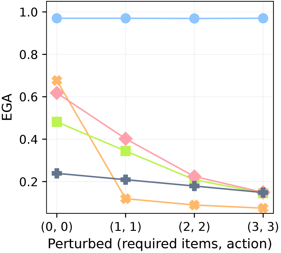
## Line Chart: EGA vs. Perturbation Level
### Overview
This is a line chart plotting the metric "EGA" against increasing levels of perturbation, defined by the tuple "(required items, action)". The chart displays five distinct data series, each represented by a unique color and marker shape, showing how EGA changes as the perturbation parameters increase from (0,0) to (3,3).
### Components/Axes
* **Y-Axis:** Labeled "EGA". The scale is linear, ranging from 0.0 to 1.0, with major tick marks at 0.0, 0.2, 0.4, 0.6, 0.8, and 1.0.
* **X-Axis:** Labeled "Perturbed (required items, action)". It features four discrete, equally spaced categorical points: (0, 0), (1, 1), (2, 2), and (3, 3).
* **Data Series (Identified by Color and Marker):**
1. **Light Blue Line with Circle Markers:** Positioned at the top of the chart.
2. **Orange Line with 'X' (Cross) Markers:** Starts high, drops sharply.
3. **Pink Line with Diamond Markers:** Shows a steady decline.
4. **Light Green Line with Square Markers:** Shows a steady decline.
5. **Dark Gray/Blue Line with Plus (+) Markers:** Starts lowest, shows a gradual decline.
* **Legend:** No explicit legend is present within the chart area. Series are identified solely by their visual properties (color and marker).
### Detailed Analysis
**Data Point Extraction (Approximate Values):**
| Perturbation (x-axis) | Light Blue (Circle) | Orange (X) | Pink (Diamond) | Light Green (Square) | Dark Gray (+) |
| :--- | :--- | :--- | :--- | :--- | :--- |
| **(0, 0)** | ~0.98 | ~0.68 | ~0.62 | ~0.48 | ~0.24 |
| **(1, 1)** | ~0.98 | ~0.12 | ~0.40 | ~0.34 | ~0.21 |
| **(2, 2)** | ~0.98 | ~0.08 | ~0.22 | ~0.18 | ~0.18 |
| **(3, 3)** | ~0.98 | ~0.06 | ~0.15 | ~0.14 | ~0.15 |
**Trend Verification:**
* **Light Blue (Circle):** The line is nearly horizontal, indicating EGA remains stable and high (~0.98) regardless of perturbation level.
* **Orange (X):** The line exhibits a very steep negative slope between (0,0) and (1,1), followed by a continued but shallower decline. It shows the most dramatic sensitivity to initial perturbation.
* **Pink (Diamond):** The line has a consistent, moderately steep negative slope across all points, indicating a steady decrease in EGA with increased perturbation.
* **Light Green (Square):** The line has a consistent negative slope, similar to but slightly less steep than the pink line initially. It converges with the pink and gray lines at higher perturbation levels.
* **Dark Gray (+):** The line has a gentle negative slope, showing the most gradual decline. It starts as the lowest-performing series at (0,0) but converges with the pink and green series by (3,3).
### Key Observations
1. **Performance Hierarchy at Baseline (0,0):** There is a wide spread in initial EGA values, from ~0.98 (Blue) down to ~0.24 (Gray).
2. **Convergence at High Perturbation:** At the highest perturbation level (3,3), four of the five series (Orange, Pink, Green, Gray) converge within a narrow band between approximately 0.06 and 0.15. The Blue series remains an outlier, unaffected.
3. **Differential Sensitivity:** The series demonstrate vastly different sensitivities to perturbation. The Blue series is robust, the Orange series is highly sensitive to the first step of perturbation, and the Pink, Green, and Gray series show varying degrees of linear degradation.
4. **Crossover Point:** The Dark Gray (+) line, which starts lowest, crosses above the Orange (X) line between (0,0) and (1,1) as the Orange series plummets.
### Interpretation
The chart likely illustrates the robustness of different models, algorithms, or system configurations (represented by the colored lines) to increasing levels of a specific type of challenge or noise ("Perturbed (required items, action)").
* The **Light Blue series** represents a highly robust method or a control condition that maintains near-perfect performance (EGA ≈ 1.0) regardless of the perturbation applied.
* The **Orange series** represents a method that performs well under ideal conditions (0,0) but is extremely fragile, suffering a catastrophic performance drop with the slightest perturbation.
* The **Pink, Green, and Gray series** represent methods with varying baseline performance that degrade in a more predictable, linear fashion as the problem difficulty increases. Their convergence suggests that under sufficiently challenging conditions, their performance becomes similarly poor.
* The **x-axis tuple "(required items, action)"** suggests the perturbation involves simultaneously increasing the number of required items and the complexity or number of actions needed. The chart shows that most methods' performance (EGA) is inversely related to this combined difficulty metric.
**In summary, the data demonstrates a clear trade-off between baseline performance and robustness for most methods, with one notable exception (Blue) that achieves both. The visualization effectively argues for the superiority of the approach represented by the Blue line in scenarios where perturbation or difficulty is expected.**