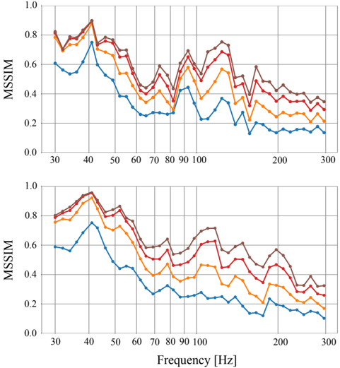
## Line Graphs: MSSIM vs. Frequency
### Overview
The image contains two line graphs, one above the other, both plotting MSSIM (Multi-Scale Structural Similarity Index Measure) against Frequency in Hertz (Hz). Each graph displays four data series, represented by different colored lines: brown, red, orange, and blue. The graphs show how MSSIM values change with increasing frequency. The general trend for all lines is a decrease in MSSIM as frequency increases, with some fluctuations.
### Components/Axes
* **Y-axis (MSSIM):**
* Label: MSSIM
* Scale: 0.0 to 1.0, with increments of 0.2.
* **X-axis (Frequency):**
* Label: Frequency [Hz]
* Scale: 30 to 300 Hz, with marked points at 30, 40, 50, 60, 70, 80, 90, 100, 200, and 300 Hz.
* **Data Series:**
* Brown Line
* Red Line
* Orange Line
* Blue Line
* **Positioning:** The two graphs are stacked vertically, with the top graph directly above the bottom graph.
### Detailed Analysis
**Top Graph:**
* **Brown Line:** Starts at approximately 0.78 at 30 Hz, peaks around 0.88 at 40 Hz, then generally decreases with fluctuations, ending at approximately 0.35 at 300 Hz.
* **Red Line:** Starts at approximately 0.75 at 30 Hz, peaks around 0.85 at 40 Hz, then decreases with fluctuations, ending at approximately 0.30 at 300 Hz.
* **Orange Line:** Starts at approximately 0.72 at 30 Hz, peaks around 0.75 at 40 Hz, then decreases with fluctuations, ending at approximately 0.25 at 300 Hz.
* **Blue Line:** Starts at approximately 0.58 at 30 Hz, peaks around 0.75 at 40 Hz, then decreases with fluctuations, ending at approximately 0.15 at 300 Hz.
**Bottom Graph:**
* **Brown Line:** Starts at approximately 0.78 at 30 Hz, peaks around 0.95 at 40 Hz, then generally decreases with fluctuations, ending at approximately 0.60 at 300 Hz.
* **Red Line:** Starts at approximately 0.75 at 30 Hz, peaks around 0.90 at 40 Hz, then decreases with fluctuations, ending at approximately 0.40 at 300 Hz.
* **Orange Line:** Starts at approximately 0.70 at 30 Hz, peaks around 0.75 at 40 Hz, then decreases with fluctuations, ending at approximately 0.20 at 300 Hz.
* **Blue Line:** Starts at approximately 0.55 at 30 Hz, peaks around 0.70 at 40 Hz, then decreases with fluctuations, ending at approximately 0.10 at 300 Hz.
### Key Observations
* All four data series in both graphs show a general decreasing trend of MSSIM with increasing frequency.
* The brown line consistently has the highest MSSIM values across the frequency range in both graphs.
* The blue line consistently has the lowest MSSIM values across the frequency range in both graphs.
* There is a noticeable peak in MSSIM values for all lines around 40 Hz in both graphs.
* The MSSIM values fluctuate more at lower frequencies (30-100 Hz) compared to higher frequencies (200-300 Hz).
* The bottom graph has higher MSSIM values than the top graph.
### Interpretation
The graphs illustrate the relationship between MSSIM and frequency for four different conditions or settings (represented by the different colored lines). The decreasing trend suggests that as frequency increases, the structural similarity between images or signals decreases. The higher MSSIM values for the brown line indicate that the corresponding condition or setting results in better structural similarity compared to the others. The lower MSSIM values for the blue line indicate the opposite. The peak around 40 Hz suggests a frequency range where structural similarity is relatively high for all conditions. The difference between the top and bottom graphs suggests that the bottom graph has better structural similarity than the top graph. The fluctuations at lower frequencies might indicate more sensitivity or variability in structural similarity at those frequencies.