\n
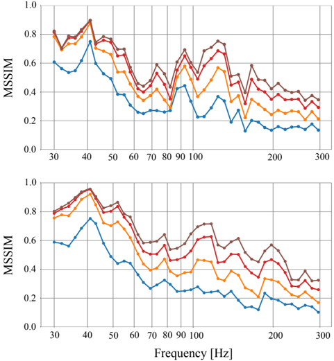
## Line Chart: MSIM vs Frequency
### Overview
The image presents two identical line charts displaying the relationship between MSIM (likely a metric for image similarity) and Frequency in Hertz (Hz). Each chart contains five distinct lines, each representing a different data series. The charts share the same axes and scale.
### Components/Axes
* **X-axis:** Frequency [Hz], ranging from approximately 30 Hz to 300 Hz. Marked at intervals of 10 Hz (30, 40, 50, 60, 70, 80, 90, 100, 200, 300).
* **Y-axis:** MSIM, ranging from 0.0 to 1.0. Marked at intervals of 0.2 (0.0, 0.2, 0.4, 0.6, 0.8, 1.0).
* **Lines:** Five distinct lines are present in each chart, each with a different color. No explicit legend is provided, but the colors are consistent across both charts. The colors are approximately:
* Dark Blue
* Light Blue
* Orange
* Reddish-Orange
* Dark Red
### Detailed Analysis or Content Details
**Chart 1 (Top):**
* **Dark Blue Line:** Starts at approximately 0.78 at 30 Hz, dips to around 0.3 at 40 Hz, fluctuates between 0.3 and 0.6 until 100 Hz, then gradually decreases to approximately 0.25 at 300 Hz.
* **Light Blue Line:** Starts at approximately 0.65 at 30 Hz, dips to around 0.35 at 40 Hz, fluctuates between 0.35 and 0.55 until 100 Hz, then gradually decreases to approximately 0.2 at 300 Hz.
* **Orange Line:** Starts at approximately 0.75 at 30 Hz, dips to around 0.4 at 40 Hz, fluctuates between 0.4 and 0.7 until 100 Hz, then gradually decreases to approximately 0.3 at 300 Hz.
* **Reddish-Orange Line:** Starts at approximately 0.7 at 30 Hz, dips to around 0.35 at 40 Hz, fluctuates between 0.35 and 0.65 until 100 Hz, then gradually decreases to approximately 0.25 at 300 Hz.
* **Dark Red Line:** Starts at approximately 0.8 at 30 Hz, dips to around 0.45 at 40 Hz, fluctuates between 0.45 and 0.75 until 100 Hz, then gradually decreases to approximately 0.35 at 300 Hz.
**Chart 2 (Bottom):**
The lines in the second chart follow the same trends as the first chart, with slight variations in the exact values.
* **Dark Blue Line:** Starts at approximately 0.78 at 30 Hz, dips to around 0.3 at 40 Hz, fluctuates between 0.3 and 0.6 until 100 Hz, then gradually decreases to approximately 0.25 at 300 Hz.
* **Light Blue Line:** Starts at approximately 0.65 at 30 Hz, dips to around 0.35 at 40 Hz, fluctuates between 0.35 and 0.55 until 100 Hz, then gradually decreases to approximately 0.2 at 300 Hz.
* **Orange Line:** Starts at approximately 0.75 at 30 Hz, dips to around 0.4 at 40 Hz, fluctuates between 0.4 and 0.7 until 100 Hz, then gradually decreases to approximately 0.3 at 300 Hz.
* **Reddish-Orange Line:** Starts at approximately 0.7 at 30 Hz, dips to around 0.35 at 40 Hz, fluctuates between 0.35 and 0.65 until 100 Hz, then gradually decreases to approximately 0.25 at 300 Hz.
* **Dark Red Line:** Starts at approximately 0.8 at 30 Hz, dips to around 0.45 at 40 Hz, fluctuates between 0.45 and 0.75 until 100 Hz, then gradually decreases to approximately 0.35 at 300 Hz.
### Key Observations
* All lines exhibit a significant drop in MSIM between 30 Hz and 40 Hz.
* All lines generally fluctuate between approximately 0.3 and 0.7 from 40 Hz to 100 Hz.
* All lines show a gradual decrease in MSIM from 100 Hz to 300 Hz.
* The Dark Red line consistently has the highest MSIM values across the entire frequency range.
* The Dark Blue line consistently has the lowest MSIM values across the entire frequency range.
* The two charts are nearly identical, suggesting the data represents a consistent phenomenon.
### Interpretation
The charts likely represent the performance of an image processing or compression algorithm at different frequencies. The MSIM metric indicates the similarity between the original and processed images. The significant drop in MSIM around 40 Hz suggests that the algorithm struggles to preserve image quality at this frequency. The gradual decrease in MSIM at higher frequencies (above 100 Hz) indicates a general loss of detail as frequency increases.
The consistent ranking of the lines (Dark Red highest, Dark Blue lowest) suggests that different parameters or configurations of the algorithm are being tested. The Dark Red line represents the most effective configuration, while the Dark Blue line represents the least effective.
The fact that the two charts are nearly identical suggests that the observed behavior is robust and not dependent on specific data or conditions. This could indicate a fundamental limitation of the algorithm or a characteristic of the type of images being processed. Further investigation would be needed to determine the root cause of the observed trends and to identify ways to improve the algorithm's performance.