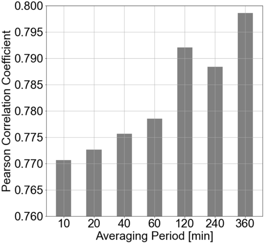
## Bar Chart: Pearson Correlation Coefficient vs. Averaging Period
### Overview
The chart displays a bar graph comparing the Pearson Correlation Coefficient across different averaging periods (in minutes). The x-axis represents averaging periods (10, 20, 40, 60, 120, 240, 360 minutes), and the y-axis shows the Pearson Correlation Coefficient (ranging from 0.760 to 0.800). The bars are gray, with no legend present.
### Components/Axes
- **X-axis (Averaging Period [min])**: Labeled with values 10, 20, 40, 60, 120, 240, 360.
- **Y-axis (Pearson Correlation Coefficient)**: Labeled with values 0.760 to 0.800 in increments of 0.005.
- **Bars**: Seven vertical bars, each corresponding to an averaging period. Heights vary, with the tallest bar at 360 minutes.
- **No legend** is visible in the chart.
### Detailed Analysis
- **10 minutes**: Bar height ≈ 0.770.
- **20 minutes**: Bar height ≈ 0.773.
- **40 minutes**: Bar height ≈ 0.775.
- **60 minutes**: Bar height ≈ 0.778.
- **120 minutes**: Bar height ≈ 0.792.
- **240 minutes**: Bar height ≈ 0.788 (slight dip from 120 minutes).
- **360 minutes**: Bar height ≈ 0.798 (highest value).
### Key Observations
1. **General Trend**: The Pearson Correlation Coefficient increases with longer averaging periods, peaking at 360 minutes.
2. **Anomaly**: A minor decrease is observed at 240 minutes (0.788) compared to 120 minutes (0.792).
3. **Scale**: All values fall within 0.770–0.798, indicating moderate to high correlation.
### Interpretation
The data suggests that longer averaging periods improve the Pearson Correlation Coefficient, likely due to reduced noise or increased signal stability. The dip at 240 minutes may indicate a transient effect or data-specific variability. The highest correlation at 360 minutes implies optimal performance for this metric under the tested conditions. The absence of a legend simplifies interpretation but limits contextual clarity about the data source or methodology.