TECHNICAL ASSET FINGERPRINT
ea8bf36bd7e10806c23f7aeb
Click to view fullscreen
Press ESC or click to close
FOUND IN PAPERS
EXPERT: gemini-2.5-flash-free VERSION 1
RUNTIME: google-free/gemini-2.5-flash
INTEL_VERIFIED
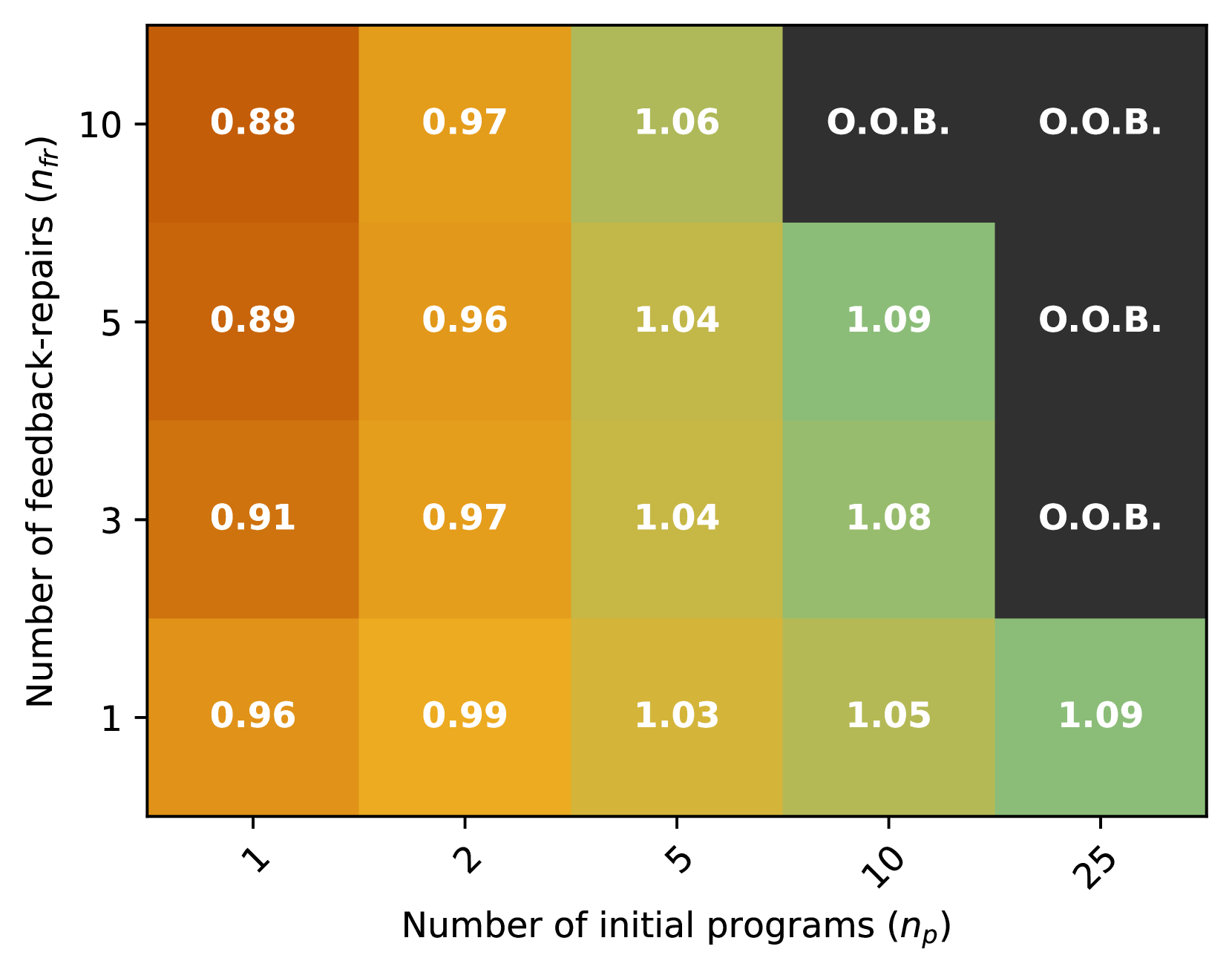
## Chart Type: Heatmap of Performance Metrics
### Overview
This image displays a heatmap or grid table illustrating performance metrics based on two varying parameters: "Number of feedback-repairs ($n_{fr}$)" and "Number of initial programs ($n_p$)". Each cell in the grid contains a numerical value, likely representing a performance score, or the text "O.O.B." (Out Of Bounds/Budget/Bandwidth), and is color-coded to visually represent the magnitude of the numerical values. Lower numerical values are represented by darker orange/brown hues, while higher values transition to yellow-green. "O.O.B." cells are colored dark grey.
### Components/Axes
The chart is structured as a 4x5 grid.
* **Y-axis (left, vertical):** Labeled "Number of feedback-repairs ($n_{fr}$)", oriented vertically reading upwards.
* Tick markers (from bottom to top): 1, 3, 5, 10.
* **X-axis (bottom, horizontal):** Labeled "Number of initial programs ($n_p$)", oriented horizontally.
* Tick markers (from left to right): 1, 2, 5, 10, 25. The tick labels are slightly rotated counter-clockwise.
* **Color Gradient (Implicit Legend):** There is no explicit legend, but the cell colors indicate value ranges:
* Dark orange/brown: Represents the lowest numerical values (e.g., 0.88, 0.89, 0.91).
* Lighter orange/yellow: Represents intermediate numerical values (e.g., 0.96, 0.97, 0.99).
* Yellow-green: Represents the highest numerical values (e.g., 1.03, 1.04, 1.05, 1.06, 1.08, 1.09).
* Dark grey: Represents "O.O.B." (Out Of Bounds/Budget/Bandwidth) condition, indicating that a valid numerical result was not obtained for those parameter combinations.
### Detailed Analysis
The grid presents the following values for each combination of $n_{fr}$ and $n_p$:
| $n_{fr}$ \ $n_p$ | 1 (dark orange) | 2 (orange/yellow) | 5 (yellow-green) | 10 (yellow-green / dark grey) | 25 (yellow-green / dark grey) |
| :--------------- | :-------------- | :---------------- | :--------------- | :---------------------------- | :---------------------------- |
| **10** | 0.88 | 0.97 | 1.06 | O.O.B. | O.O.B. |
| **5** | 0.89 | 0.96 | 1.04 | 1.09 | O.O.B. |
| **3** | 0.91 | 0.97 | 1.04 | 1.08 | O.O.B. |
| **1** | 0.96 | 0.99 | 1.03 | 1.05 | 1.09 |
**Row-wise Trends (increasing $n_p$ for fixed $n_{fr}$):**
* **$n_{fr}=10$ (top row):** Values increase from 0.88 (dark orange) to 0.97 (orange/yellow) to 1.06 (yellow-green), then become O.O.B. (dark grey) for $n_p=10$ and $n_p=25$.
* **$n_{fr}=5$:** Values increase from 0.89 (dark orange) to 0.96 (orange/yellow) to 1.04 (yellow-green) to 1.09 (yellow-green), then become O.O.B. (dark grey) for $n_p=25$.
* **$n_{fr}=3$:** Values increase from 0.91 (dark orange) to 0.97 (orange/yellow) to 1.04 (yellow-green) to 1.08 (yellow-green), then become O.O.B. (dark grey) for $n_p=25$.
* **$n_{fr}=1$ (bottom row):** Values consistently increase from 0.96 (orange/yellow) to 0.99 (orange/yellow) to 1.03 (yellow-green) to 1.05 (yellow-green) to 1.09 (yellow-green). No O.O.B. values are observed in this row.
**Column-wise Trends (increasing $n_{fr}$ for fixed $n_p$):**
* **$n_p=1$ (leftmost column):** Values decrease from 0.96 (orange/yellow) to 0.91 (dark orange) to 0.89 (dark orange) to 0.88 (dark orange).
* **$n_p=2$:** Values decrease from 0.99 (orange/yellow) to 0.97 (orange/yellow) to 0.96 (orange/yellow), then slightly increase to 0.97 (orange/yellow).
* **$n_p=5$:** Values slightly increase from 1.03 (yellow-green) to 1.04 (yellow-green) to 1.04 (yellow-green) to 1.06 (yellow-green).
* **$n_p=10$:** Values increase from 1.05 (yellow-green) to 1.08 (yellow-green) to 1.09 (yellow-green), then become O.O.B. (dark grey) for $n_{fr}=10$.
* **$n_p=25$ (rightmost column):** The value is 1.09 (yellow-green) for $n_{fr}=1$, then becomes O.O.B. (dark grey) for $n_{fr}=3, 5, 10$.
### Key Observations
* **Minimum Value:** The lowest observed numerical value is 0.88, located at ($n_p=1, n_{fr}=10$), colored dark orange.
* **Maximum Value:** The highest observed numerical value is 1.09, appearing at ($n_p=10, n_{fr}=5$) and ($n_p=25, n_{fr}=1$), both colored yellow-green.
* **"O.O.B." Region:** The "O.O.B." condition primarily occurs in the top-right section of the grid, indicating that higher values of "Number of initial programs ($n_p$)" and "Number of feedback-repairs ($n_{fr}$)" lead to this state. Specifically, for $n_p=25$, all $n_{fr}$ values except 1 result in O.O.B. For $n_p=10$, only $n_{fr}=10$ results in O.O.B.
* **Performance Gradient:** Generally, performance (represented by the numerical values) tends to increase as $n_p$ increases, up to a point where it becomes O.O.B.
* **Impact of $n_{fr}$:** For lower $n_p$ values (1 and 2), increasing $n_{fr}$ tends to decrease or stabilize the performance. For higher $n_p$ values (5 and 10), increasing $n_{fr}$ tends to slightly increase performance before hitting the O.O.B. state.
* **Optimal Region (visually):** The yellow-green cells, representing higher performance, are concentrated in the middle-right and bottom-right sections of the numerical results, before the O.O.B. region.
### Interpretation
This heatmap likely represents the outcome of an experiment or simulation where two parameters, "Number of initial programs ($n_p$)" and "Number of feedback-repairs ($n_{fr}$)", are varied to observe their effect on a performance metric. The goal appears to be maximizing this metric, as higher values are indicated by a "better" (yellow-green) color.
The data suggests a complex relationship between the two parameters:
1. **Increasing $n_p$ generally improves performance:** For a fixed number of feedback-repairs, increasing the number of initial programs tends to increase the performance metric. This trend is most consistent when $n_{fr}$ is low (e.g., $n_{fr}=1$).
2. **Too many programs or repairs can lead to instability/failure ("O.O.B."):** The "O.O.B." state indicates a failure to produce a valid result, possibly due to resource exhaustion, computational limits, or an invalid configuration. This occurs when both $n_p$ and $n_{fr}$ are high, or when $n_p$ is very high even with moderate $n_{fr}$. This suggests there's a practical limit to how much one can scale these parameters.
3. **Trade-offs between $n_p$ and $n_{fr}$:**
* At low $n_p$ (e.g., 1), increasing $n_{fr}$ *decreases* performance, suggesting that too many feedback-repairs with few initial programs might be detrimental or inefficient.
* At moderate $n_p$ (e.g., 5), increasing $n_{fr}$ *slightly increases* performance, indicating a beneficial interaction up to a point.
* At high $n_p$ (e.g., 10), increasing $n_{fr}$ *increases* performance but quickly leads to the O.O.B. state.
The "sweet spot" for performance, where values are high and stable (not O.O.B.), appears to be around $n_p=5$ or $n_p=10$ with lower to moderate $n_{fr}$ values (e.g., $n_{fr}=1, 3, 5$). For instance, ($n_p=10, n_{fr}=5$) yields 1.09, and ($n_p=25, n_{fr}=1$) also yields 1.09. However, the latter is very close to the O.O.B. boundary, suggesting it might be less robust. The combination ($n_p=5, n_{fr}=10$) gives 1.06, which is also a good performance without hitting O.O.B.
The chart effectively visualizes the parameter space, allowing identification of regions of optimal performance and regions where the system becomes unstable or fails to produce results. This is crucial for understanding the operational limits and efficiency of the underlying system or algorithm being evaluated.
DECODING INTELLIGENCE...