## Diagram: Causal Inference Methods
### Overview
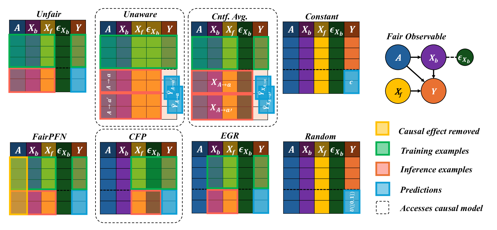
The image presents a comparative diagram illustrating different causal inference methods and their access to causal models. It uses color-coded grids to represent the data used for training, inference, and prediction in each method. A causal diagram is also included to represent the relationships between variables.
### Components/Axes
* **Titles (Top Row):** Unfair, Unaware, Cntf. Avg. (Counterfactual Average), Constant, Fair Observable
* **Titles (Bottom Row):** FairPFN, CFP, EGR, Random
* **Grid Columns:** A, Xb, Xf, εXb, Y (These represent different variables or features)
* **Legend (Right Side):**
* Yellow: Causal effect removed
* Green: Training examples
* Pink: Inference examples
* Light Blue: Predictions
* Dashed Line: Accesses causal model
* **Causal Diagram (Top Right):**
* Nodes: A (blue), Xb (purple), Xf (yellow), Y (orange), εXb (light green)
* Edges: A -> Xb, A -> Y, Xb -> Y, Xf -> Y, Xb --(dashed)--> εXb
### Detailed Analysis
Each method (Unfair, Unaware, etc.) is represented by a grid. The rows of the grid are color-coded to indicate the type of data used (training, inference, prediction).
* **Unfair:**
* Training: Top rows of A, Xb, Xf, and εXb are green.
* Inference: Bottom rows of A, Xb, and Xf are pink.
* Prediction: Bottom rows of Y are light blue.
* **Unaware:**
* Training: Top rows of A, Xb, Xf, and εXb are green.
* Inference: Rows of A, Xb, and Xf are pink, with labels "A -> a" and "A -> a'".
* Prediction: Rows of Y are light blue, with labels "ŶA->a" and "ŶA->a'".
* **Cntf. Avg.:**
* Training: Top rows of A, Xb, Xf, and εXb are green.
* Inference: Rows of Xb and Xf are pink, with labels "XA->a" and "XA->a'".
* Prediction: Rows of Y are light blue, with labels "ŶA->a" and "ŶA->a'".
* **Constant:**
* All rows of A, Xb, Xf, and εXb are filled with a single color.
* Prediction: One row of Y is light blue, labeled "c".
* **FairPFN:**
* Causal effect removed: Top row of A and Xf are yellow.
* Training: Top rows of Xb, Xf, εXb, and Y are green.
* Inference: Bottom rows of A, Xb, and Xf are pink.
* Prediction: Bottom rows of Y are light blue.
* **CFP:**
* Training: Top rows of Xb, Xf, εXb, and Y are green.
* Inference: Bottom rows of A, Xb, and Xf are pink.
* Prediction: Bottom rows of Y are light blue.
* **EGR:**
* Training: Top rows of Xb, Xf, εXb, and Y are green.
* Inference: Bottom rows of A, Xb, and Xf are pink.
* Prediction: Bottom rows of Y are light blue.
* **Random:**
* All rows of A, Xb, Xf, and εXb are filled with a single color.
* Prediction: All rows of Y are light blue, labeled "U({0,1})".
### Key Observations
* Different methods utilize different data for training, inference, and prediction.
* Some methods (e.g., Unaware, Cntf. Avg.) explicitly model counterfactuals.
* The "Constant" method appears to use a constant value for prediction.
* The "Random" method uses a random variable for prediction.
* The dashed lines around each grid indicate that each method accesses the causal model.
### Interpretation
The diagram illustrates how different causal inference methods approach the problem of prediction and inference. The color-coded grids highlight the data used by each method, while the causal diagram provides a visual representation of the underlying causal relationships. The diagram suggests that different methods make different assumptions about the data and the causal structure, which can lead to different predictions and inferences. The "FairPFN" method explicitly removes the causal effect of A and Xf, suggesting an attempt to mitigate bias or confounding. The "Unaware" and "Cntf. Avg." methods explicitly model counterfactuals, which can be useful for estimating causal effects. The "Constant" and "Random" methods serve as baselines, providing a comparison point for the other methods.