\n
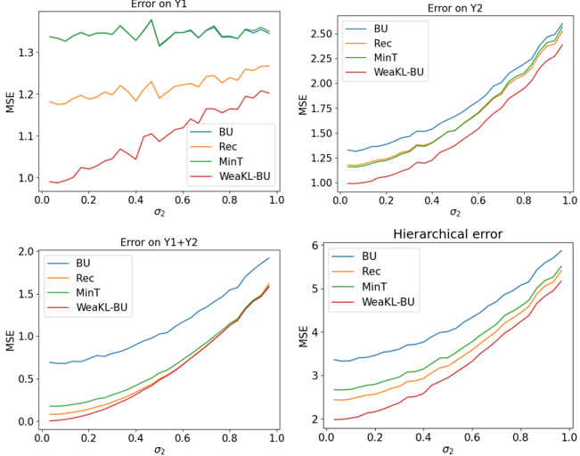
## Charts: Error Analysis with Noise Level
### Overview
The image presents four separate line charts, each depicting the Mean Squared Error (MSE) as a function of the noise level (σ₂). The charts analyze the error performance of four different methods (BU, Rec, MinT, and WeakKL-BU) across various error metrics: Error on Y1, Error on Y2, Error on Y1+Y2, and Hierarchical error.
### Components/Axes
Each chart shares the following components:
* **X-axis:** Labeled "σ₂", representing the noise level, ranging from 0.0 to 1.0 with increments of 0.2.
* **Y-axis:** Labeled "MSE", representing the Mean Squared Error, with varying scales depending on the chart.
* **Legend:** Located in the top-right corner of each chart, identifying the four methods:
* BU (Blue)
* Rec (Orange)
* MinT (Green)
* WeakKL-BU (Red)
The charts are titled as follows:
* Top-left: "Error on Y1"
* Top-right: "Error on Y2"
* Bottom-left: "Error on Y1+Y2"
* Bottom-right: "Hierarchical error"
### Detailed Analysis
**1. Error on Y1:**
* The blue line (BU) shows a relatively flat trend, fluctuating around a MSE of approximately 1.3, with some minor oscillations.
* The orange line (Rec) starts at approximately 1.2 and gradually increases to around 1.35 as σ₂ increases to 1.0.
* The green line (MinT) starts at approximately 1.1 and increases to around 1.25 at σ₂ = 1.0.
* The red line (WeakKL-BU) starts at approximately 1.05 and increases to around 1.2 at σ₂ = 1.0.
**2. Error on Y2:**
* The blue line (BU) exhibits a strong upward trend, starting at approximately 1.0 and increasing to around 2.4 at σ₂ = 1.0.
* The orange line (Rec) shows a similar upward trend, starting at approximately 1.05 and increasing to around 2.3 at σ₂ = 1.0.
* The green line (MinT) also increases, starting at approximately 1.1 and reaching around 2.2 at σ₂ = 1.0.
* The red line (WeakKL-BU) starts at approximately 1.0 and increases to around 1.8 at σ₂ = 1.0.
**3. Error on Y1+Y2:**
* The blue line (BU) shows a strong upward trend, starting at approximately 0.1 and increasing to around 1.6 at σ₂ = 1.0.
* The orange line (Rec) starts at approximately 0.1 and increases to around 0.8 at σ₂ = 1.0.
* The green line (MinT) starts at approximately 0.05 and increases to around 0.5 at σ₂ = 1.0.
* The red line (WeakKL-BU) starts at approximately 0.05 and increases to around 0.4 at σ₂ = 1.0.
**4. Hierarchical error:**
* The blue line (BU) exhibits a strong upward trend, starting at approximately 2.2 and increasing to around 5.5 at σ₂ = 1.0.
* The orange line (Rec) shows a similar upward trend, starting at approximately 2.3 and increasing to around 5.2 at σ₂ = 1.0.
* The green line (MinT) also increases, starting at approximately 2.4 and reaching around 5.0 at σ₂ = 1.0.
* The red line (WeakKL-BU) starts at approximately 2.2 and increases to around 4.5 at σ₂ = 1.0.
### Key Observations
* The "BU" method consistently exhibits the highest MSE values across all error metrics, especially as the noise level (σ₂) increases.
* The "WeakKL-BU" method generally performs the best, with the lowest MSE values across all error metrics.
* The error increases with increasing noise level (σ₂) for all methods and all error metrics.
* The "Error on Y1" chart shows the smallest range of MSE values, while the "Hierarchical error" chart shows the largest.
* The "MinT" and "Rec" methods show similar performance across all charts.
### Interpretation
The charts demonstrate the sensitivity of different methods (BU, Rec, MinT, WeakKL-BU) to noise when estimating errors in Y1, Y2, their combination (Y1+Y2), and a hierarchical error structure. The consistent superior performance of "WeakKL-BU" suggests that this method is more robust to noise than the others. The increasing MSE values with increasing noise level (σ₂) are expected, indicating that the accuracy of all methods degrades as the noise increases.
The differences in the scales of the Y-axes across the charts suggest that the magnitude of the errors varies significantly depending on the error metric. The "Hierarchical error" is substantially larger than the errors in Y1 or Y2 individually, indicating that the hierarchical structure introduces additional complexity and potential for error.
The relatively flat trend of the "BU" method in the "Error on Y1" chart might indicate that this method is less sensitive to noise when estimating errors in Y1 specifically, but it consistently performs poorly in other scenarios. This suggests that the "BU" method might be suitable only for specific applications where noise is minimal and the error metric is limited to Y1. The other methods show a more consistent increase in error with noise, suggesting a more predictable behavior.