## Line Chart: Performance Comparison of Five Methods Over Episodes
### Overview
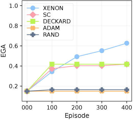
The image is a line chart comparing the performance of five different methods (XENON, SC, DECKARD, ADAM, RAND) across a series of training episodes. The performance metric is labeled "EGA" on the y-axis. The chart demonstrates that one method (XENON) shows significant improvement over time, while two others (SC, DECKARD) show initial improvement before plateauing, and two (ADAM, RAND) show negligible change.
### Components/Axes
* **Chart Type:** Line chart with markers.
* **Y-Axis:**
* **Label:** "EGA"
* **Scale:** Linear, ranging from 0.0 to 1.0.
* **Major Ticks:** 0.0, 0.2, 0.4, 0.6, 0.8, 1.0.
* **X-Axis:**
* **Label:** "Episode"
* **Scale:** Linear, representing discrete episode counts.
* **Major Ticks:** 000, 100, 200, 300, 400.
* **Legend:**
* **Position:** Top-left corner of the plot area.
* **Content:** Maps five distinct line/marker combinations to method names.
1. **XENON:** Light blue line with circular markers.
2. **SC:** Pink line with diamond markers.
3. **DECKARD:** Light green line with square markers.
4. **ADAM:** Orange line with pentagon (house-shaped) markers.
5. **RAND:** Dark grey/blue line with plus-sign (+) markers.
### Detailed Analysis
**Data Series Trends and Approximate Values:**
1. **XENON (Light Blue, Circles):**
* **Trend:** Shows a consistent, near-linear upward trend across all episodes. It is the only series that continues to improve significantly after episode 100.
* **Approximate Data Points:**
* Episode 0: ~0.15
* Episode 100: ~0.35
* Episode 200: ~0.50
* Episode 300: ~0.55
* Episode 400: ~0.62
2. **SC (Pink, Diamonds):**
* **Trend:** Increases sharply from episode 0 to 100, then plateaus, showing very little change from episode 100 to 400.
* **Approximate Data Points:**
* Episode 0: ~0.15
* Episode 100: ~0.38
* Episode 200: ~0.40
* Episode 300: ~0.39
* Episode 400: ~0.40
3. **DECKARD (Light Green, Squares):**
* **Trend:** Follows a nearly identical pattern to SC. Sharp increase to episode 100, followed by a flat plateau.
* **Approximate Data Points:**
* Episode 0: ~0.15
* Episode 100: ~0.42
* Episode 200: ~0.42
* Episode 300: ~0.42
* Episode 400: ~0.42
4. **ADAM (Orange, Pentagons):**
* **Trend:** Essentially flat across all episodes, hovering just above the baseline.
* **Approximate Data Points:** Consistently ~0.15 from Episode 0 to 400.
5. **RAND (Dark Grey/Blue, Plus Signs):**
* **Trend:** Also essentially flat, overlapping closely with ADAM.
* **Approximate Data Points:** Consistently ~0.16 from Episode 0 to 400.
### Key Observations
* **Performance Hierarchy:** At the final episode (400), the clear performance order is: XENON (~0.62) > DECKARD (~0.42) ≈ SC (~0.40) > RAND (~0.16) ≈ ADAM (~0.15).
* **Convergence Point:** All five methods start at approximately the same performance level (~0.15) at Episode 0.
* **Plateau Behavior:** SC and DECKARD reach their maximum performance by Episode 100 and show no further learning. ADAM and RAND show no learning at all.
* **Divergence:** The XENON series diverges positively from the others starting at Episode 100, and the gap widens with each subsequent episode.
### Interpretation
This chart likely visualizes the results of a machine learning or reinforcement learning experiment. "EGA" is the performance metric being optimized, and "Episode" represents training iterations.
* **What the data suggests:** The method named "XENON" is demonstrably more effective and scalable for this task than the other four methods. It continues to learn and improve over a longer timeframe (400 episodes), whereas the next-best methods (SC, DECKARD) quickly reach a performance ceiling. ADAM and RAND appear to be ineffective baselines or random agents, as they show no improvement.
* **Relationship between elements:** The chart is designed to highlight the superiority of XENON. The use of a bright, distinct color (light blue) and a rising line draws the eye. The plateau of SC/DECKARD and the flatlines of ADAM/RAND serve as critical points of comparison, emphasizing that XENON's continued growth is significant and non-trivial.
* **Notable anomalies:** The near-perfect overlap of the ADAM and RAND lines is striking. It suggests that the ADAM method performs no better than a random (RAND) strategy for this specific task and metric. The very similar performance and trend of SC and DECKARD might indicate they are related algorithms or share a fundamental limitation.
**Language:** All text in the chart (labels, legend, axis ticks) is in English. No other languages are present.