## Scatter Plot: Accuracy vs. EOpp
### Overview
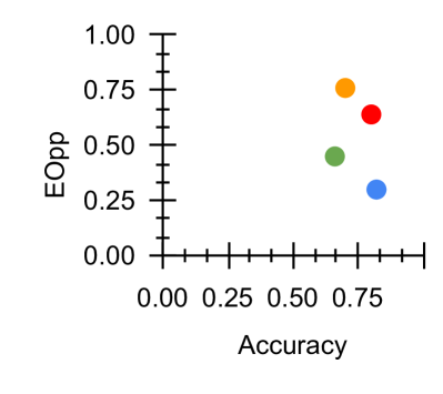
The image is a scatter plot showing the relationship between "Accuracy" on the x-axis and "EOpp" on the y-axis. There are four data points, each represented by a colored circle: orange, red, green, and blue. The plot visualizes the distribution of these points in a two-dimensional space defined by accuracy and EOpp.
### Components/Axes
* **X-axis:** "Accuracy", ranging from 0.00 to approximately 0.85, with tick marks at intervals of 0.25.
* **Y-axis:** "EOpp", ranging from 0.00 to 1.00, with tick marks at intervals of 0.25.
* **Data Points:** Four colored circles (orange, red, green, and blue) representing different data points. There is no legend.
### Detailed Analysis
* **Orange Data Point:** Located at approximately (0.70, 0.75).
* **Red Data Point:** Located at approximately (0.75, 0.65).
* **Green Data Point:** Located at approximately (0.65, 0.45).
* **Blue Data Point:** Located at approximately (0.75, 0.30).
### Key Observations
* All data points have an accuracy greater than 0.60.
* The EOpp values are spread between 0.30 and 0.75.
* There is no clear linear correlation between Accuracy and EOpp based on these four points.
### Interpretation
The scatter plot visualizes the trade-off between accuracy and EOpp (Equality of Opportunity). Each colored point likely represents a different model or configuration. The plot suggests that while all models have relatively high accuracy, they differ in their EOpp values. The choice of which model to use would depend on the relative importance of accuracy versus equality of opportunity in the specific application. The absence of a legend makes it impossible to determine what each color represents.