## Line Graph: Similarity Analysis of Picture_4 and Picture_8
### Overview
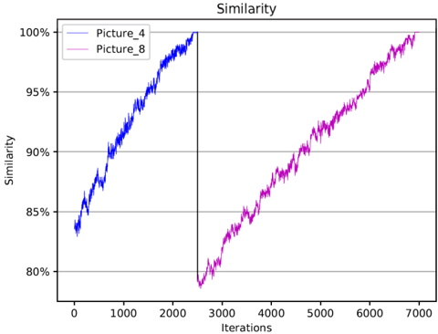
The image is a line graph comparing the similarity scores of two datasets, "Picture_4" (blue line) and "Picture_8" (pink line), across 7,000 iterations. Similarity is measured on the y-axis (80%–100%), while iterations are plotted on the x-axis (0–7,000). Both lines show upward trends, but with distinct trajectories.
---
### Components/Axes
- **Title**: "Similarity" (centered at the top).
- **X-axis**:
- Label: "Iterations" (black text).
- Scale: 0 to 7,000 in increments of 1,000.
- **Y-axis**:
- Label: "Similarity" (black text).
- Scale: 80% to 100% in 5% increments.
- **Legend**:
- Position: Top-left corner.
- Entries:
- Blue line: "Picture_4".
- Pink line: "Picture_8".
- **Additional Elements**:
- Vertical dashed line at ~3,000 iterations (black, unlabeled).
---
### Detailed Analysis
1. **Picture_4 (Blue Line)**:
- **Starting Point**: ~83% similarity at 0 iterations.
- **Trend**: Steady, linear increase with minor fluctuations.
- **Key Milestones**:
- Reaches ~95% similarity by ~2,000 iterations.
- Achieves 100% similarity by ~2,000 iterations (plateaus).
2. **Picture_8 (Pink Line)**:
- **Starting Point**: ~79% similarity at ~3,000 iterations (delayed start).
- **Trend**: Gradual increase with sharper fluctuations early on.
- **Key Milestones**:
- Reaches ~95% similarity by ~6,000 iterations.
- Achieves 100% similarity by ~7,000 iterations.
3. **Vertical Dashed Line**:
- Positioned at ~3,000 iterations.
- Aligns with the start of Picture_8's data, suggesting a potential phase shift or initialization point.
---
### Key Observations
- **Convergence Speed**: Picture_4 achieves maximum similarity (100%) significantly faster (~2,000 iterations) than Picture_8 (~7,000 iterations).
- **Initial Delay**: Picture_8's data begins at ~3,000 iterations, implying a lag or preprocessing phase.
- **Fluctuations**: Picture_8 exhibits more variability in its early growth phase compared to Picture_4's smoother trajectory.
- **Vertical Line Significance**: The dashed line at 3,000 iterations may mark a critical threshold (e.g., algorithm activation, data loading).
---
### Interpretation
The graph demonstrates that Picture_4's similarity metric converges rapidly and stably, while Picture_8 experiences a delayed start and slower, noisier progression. The vertical dashed line at 3,000 iterations likely indicates when Picture_8's processing began, highlighting a potential inefficiency or resource constraint in its workflow. The stark difference in convergence times suggests differing algorithmic efficiencies or data complexities between the two datasets. The anomaly in Picture_8's initial dip (below 80%) could reflect transient noise or initialization artifacts. Overall, the data underscores the importance of optimizing processing pipelines to minimize delays and variability in similarity-based tasks.