## Chart/Diagram Type: Line Graph with Histogram and Image Grid
### Overview
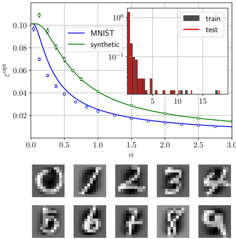
The image presents a line graph comparing the performance of MNIST and synthetic datasets, a histogram showing the distribution of training and testing data, and a grid of sample images. The line graph plots epsilon-opt (εopt) against alpha (α), showing a decreasing trend for both datasets. The histogram displays the frequency of data points, and the image grid shows examples of handwritten digits.
### Components/Axes
**Main Chart:**
* **X-axis:** α (alpha), ranging from 0.0 to 3.0 in increments of 0.5.
* **Y-axis:** εopt (epsilon-opt), ranging from 0.00 to 0.10 in increments of 0.02.
* **Legend (Top-Left):**
* Blue line: MNIST
* Green line: synthetic
**Histogram (Top-Right Inset):**
* **X-axis:** Values ranging from approximately 0 to 18.
* **Y-axis:** Frequency, on a logarithmic scale from 10^-1 to 10^0 to 10^1 (100).
* **Legend (Top-Right of Inset):**
* Dark Gray bars: train
* Red bars: test
**Image Grid (Bottom):**
* A 2x5 grid displaying sample images of handwritten digits (0-9).
### Detailed Analysis
**Line Graph:**
* **MNIST (Blue):** The blue line represents the MNIST dataset. It starts at approximately εopt = 0.10 at α = 0.0 and decreases to approximately εopt = 0.015 at α = 3.0. The data points are marked with blue circles.
* **Synthetic (Green):** The green line represents the synthetic dataset. It starts at approximately εopt = 0.105 at α = 0.0 and decreases to approximately εopt = 0.02 at α = 3.0. The data points are marked with white circles with error bars.
**Histogram:**
* **Train (Dark Gray):** The training data is represented by dark gray bars. The frequency is low, with most values concentrated between approximately 10 and 18.
* **Test (Red):** The testing data is represented by red bars. The frequency is highest between approximately 1 and 5, with a rapid decrease as the value increases.
**Image Grid:**
* The grid displays ten images of handwritten digits, representing the numbers 0 through 9.
### Key Observations
* Both MNIST and synthetic datasets show a decreasing trend in εopt as α increases.
* The synthetic dataset generally has a slightly higher εopt value than the MNIST dataset for the same α value.
* The histogram shows that the test data is more concentrated at lower values than the training data.
### Interpretation
The line graph suggests that as the value of alpha (α) increases, the error (εopt) decreases for both the MNIST and synthetic datasets. This could indicate that a higher alpha value leads to better model performance. The synthetic dataset appears to have a slightly higher error rate compared to the MNIST dataset across the range of alpha values. The histogram indicates a different distribution between the training and testing datasets, which could affect the model's generalization performance. The image grid provides a visual representation of the data being used, which are handwritten digits.