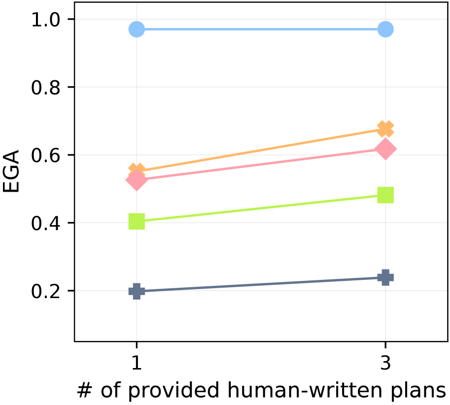
## Line Chart: EGA vs. Number of Provided Human-Written Plans
### Overview
The image is a line chart plotting a metric called "EGA" against the number of provided human-written plans. The chart displays five distinct data series, each represented by a different color and marker shape, showing how the EGA metric changes when the number of plans increases from 1 to 3.
### Components/Axes
* **X-Axis (Horizontal):**
* **Label:** "# of provided human-written plans"
* **Scale:** Categorical with two discrete points: "1" and "3".
* **Y-Axis (Vertical):**
* **Label:** "EGA"
* **Scale:** Linear, ranging from 0.2 to 1.0, with major tick marks at 0.2, 0.4, 0.6, 0.8, and 1.0.
* **Data Series (Lines & Markers):** There are five distinct lines. A legend is not visible in the provided image, so series are identified by their visual properties.
* **Background:** White with light gray horizontal grid lines aligned with the y-axis ticks.
### Detailed Analysis
The chart plots data points at two x-axis values: 1 and 3. The approximate EGA values for each series are as follows:
1. **Light Blue Line (Circle Markers):**
* **Trend:** Nearly flat, showing a very slight decrease.
* **Value at x=1:** ~0.97
* **Value at x=3:** ~0.97
* **Position:** This is the highest line on the chart, positioned near the top.
2. **Orange Line ('X' Markers):**
* **Trend:** Clear upward slope.
* **Value at x=1:** ~0.55
* **Value at x=3:** ~0.67
* **Position:** Starts as the second-highest line at x=1 and remains the second-highest at x=3.
3. **Pink Line (Diamond Markers):**
* **Trend:** Clear upward slope.
* **Value at x=1:** ~0.52
* **Value at x=3:** ~0.61
* **Position:** Starts just below the orange line at x=1 and remains just below it at x=3.
4. **Light Green Line (Square Markers):**
* **Trend:** Clear upward slope.
* **Value at x=1:** ~0.40
* **Value at x=3:** ~0.48
* **Position:** This is the fourth-highest line at both data points.
5. **Gray Line (Plus '+' Markers):**
* **Trend:** Slight upward slope.
* **Value at x=1:** ~0.20
* **Value at x=3:** ~0.23
* **Position:** This is the lowest line on the chart.
### Key Observations
* **Universal Non-Decreasing Trend:** All five data series show either an increase or stability in EGA as the number of provided human-written plans increases from 1 to 3. No series shows a decrease.
* **Performance Stratification:** There is a clear and consistent hierarchy in EGA values across the series that is maintained at both data points. The blue series performs best, followed by orange, pink, green, and gray.
* **Varying Rates of Improvement:** The magnitude of improvement (slope) differs between series. The orange and pink lines show the most pronounced gains, while the blue line is essentially static and the gray line shows minimal improvement.
* **Ceiling Effect:** The top-performing (blue) series is already near the maximum possible EGA value of 1.0 at x=1, leaving little room for improvement.
### Interpretation
The data suggests a positive correlation between the quantity of human-written plans provided (increasing from 1 to 3) and the resulting EGA metric for most of the evaluated methods or models. This implies that access to more human-generated planning examples generally aids performance.
The consistent performance hierarchy indicates that the underlying methods have fundamentally different capabilities, with one (blue) operating at a near-perfect level regardless of the small increase in plan count. The varying slopes suggest that some methods (orange, pink) are more effective at leveraging additional planning data than others (gray, blue). The blue series' plateau is a classic ceiling effect, indicating its performance is already saturated. This chart would be crucial for evaluating which planning-augmented approach is most effective and how sensitive each is to the volume of provided human guidance.