\n
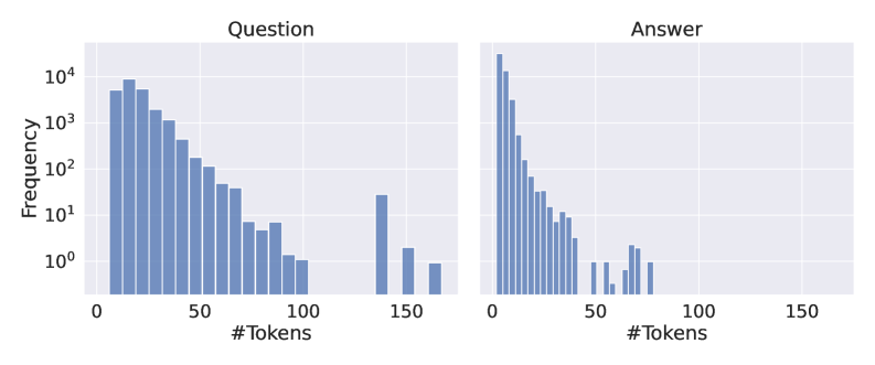
## Histograms: Token Frequency Distribution for Question and Answer
### Overview
The image presents two histograms displayed side-by-side. Both histograms depict the frequency distribution of the number of tokens. The left histogram represents the distribution for "Question" data, and the right histogram represents the distribution for "Answer" data. Both histograms use a logarithmic scale on the y-axis (Frequency).
### Components/Axes
* **X-axis Label (Both Histograms):** "#Tokens" - Represents the number of tokens. The scale ranges from 0 to 150, with markings at increments of 25.
* **Y-axis Label (Both Histograms):** "Frequency" - Represents the number of occurrences of a given number of tokens. The scale is logarithmic, ranging from 10⁰ (1) to 10⁴ (10,000).
* **Title (Left Histogram):** "Question"
* **Title (Right Histogram):** "Answer"
* **Histogram Type:** Bar chart representing frequency distribution.
* **Color:** All bars are a shade of blue.
### Detailed Analysis
**Question Histogram:**
The Question histogram shows a decreasing frequency as the number of tokens increases. The highest frequency occurs between 0 and 25 tokens, approximately at a frequency of 5000. The frequency decreases steadily until around 75 tokens, where it drops more rapidly. There are smaller peaks around 125 and 150 tokens, indicating some questions have a significantly higher token count.
Approximate Data Points (reading from the graph):
* 0-25 Tokens: Frequency ≈ 5000
* 25-50 Tokens: Frequency ≈ 1500
* 50-75 Tokens: Frequency ≈ 500
* 75-100 Tokens: Frequency ≈ 150
* 100-125 Tokens: Frequency ≈ 50
* 125-150 Tokens: Frequency ≈ 20
**Answer Histogram:**
The Answer histogram also shows a decreasing frequency with increasing tokens, but the distribution is more concentrated towards lower token counts. The peak frequency is between 0 and 25 tokens, approximately at a frequency of 8000. The frequency drops off more quickly than in the Question histogram. There are smaller peaks around 50 and 75 tokens, but they are much less pronounced than those in the Question histogram.
Approximate Data Points (reading from the graph):
* 0-25 Tokens: Frequency ≈ 8000
* 25-50 Tokens: Frequency ≈ 2000
* 50-75 Tokens: Frequency ≈ 500
* 75-100 Tokens: Frequency ≈ 100
* 100-125 Tokens: Frequency ≈ 20
* 125-150 Tokens: Frequency ≈ 5
### Key Observations
* Answers generally have fewer tokens than questions. This is evident from the more concentrated distribution of the Answer histogram towards lower token counts.
* Both distributions are right-skewed, meaning they have a long tail extending towards higher token counts.
* The logarithmic scale on the y-axis emphasizes the differences in frequency at lower token counts.
* The Question histogram has more variability in token counts, as indicated by the broader distribution and the presence of peaks at higher token counts.
### Interpretation
The data suggests that questions tend to be longer and more variable in length than answers. This is likely because questions require more context and detail to be fully formed, while answers can be more concise and direct. The right-skewed distributions indicate that while most questions and answers are relatively short, there are some outliers with a significantly higher number of tokens. This could be due to complex questions or detailed answers. The use of a logarithmic scale highlights the prevalence of shorter questions and answers, while still allowing us to observe the distribution of longer ones. The difference in distributions between questions and answers could be used to inform the design of natural language processing models, such as those used for question answering systems. For example, models could be optimized to handle the longer and more variable lengths of questions.