## Histograms: Token Frequency Distribution for Questions and Answers
### Overview
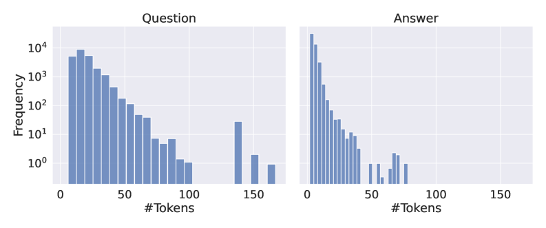
The image displays two side-by-side histograms on a shared logarithmic y-axis. The left histogram is titled "Question" and the right is titled "Answer." Both charts visualize the frequency distribution of token counts (likely from a text dataset), showing how many questions or answers contain a specific number of tokens. The overall visual impression is of two right-skewed distributions, with the "Answer" distribution being significantly more concentrated at the lower end of the token count scale.
### Components/Axes
* **Chart Titles:** "Question" (left chart), "Answer" (right chart).
* **X-Axis (Both Charts):** Labeled "#Tokens". The axis has major tick marks at 0, 50, 100, and 150. The scale appears linear.
* **Y-Axis (Shared, Left Side):** Labeled "Frequency". The axis uses a **logarithmic scale** (base 10). Major tick marks and labels are present at 10⁰ (1), 10¹ (10), 10² (100), 10³ (1000), and 10⁴ (10000).
* **Data Series:** Both histograms use vertical blue bars to represent frequency counts for binned token ranges. No separate legend is present, as the chart titles define the two series.
* **Spatial Layout:** The two histograms are placed horizontally adjacent, sharing the same y-axis scale for direct comparison. The "Question" chart occupies the left half of the image, and the "Answer" chart occupies the right half.
### Detailed Analysis
**1. "Question" Histogram (Left Chart):**
* **Trend:** The distribution is strongly right-skewed. Frequency is highest for questions with a low token count and decreases as the token count increases.
* **Data Points (Approximate from visual inspection):**
* The peak frequency occurs in the first few bins (approximately 0-20 tokens), with the tallest bar reaching near 10⁴ (10,000).
* There is a steady, roughly exponential decay in frequency as token count increases from ~20 to ~100 tokens.
* A notable gap exists in the data between approximately 100 and 140 tokens, where no bars are visible (frequency likely 0 or 1).
* A small cluster of bars reappears between approximately 140 and 170 tokens, with frequencies between 10⁰ (1) and 10¹ (10). The highest bar in this cluster is near 150 tokens with a frequency of ~20-30.
* **Range:** Token counts span from near 0 to approximately 170.
**2. "Answer" Histogram (Right Chart):**
* **Trend:** This distribution is also right-skewed but is dramatically more concentrated at the very low end of the token scale compared to the "Question" distribution.
* **Data Points (Approximate from visual inspection):**
* The peak frequency is extremely high for the very first bin (likely 0-5 tokens), with the bar exceeding the 10⁴ (10,000) mark.
* Frequency drops off very sharply. By the 20-token mark, the frequency has fallen to around 10² (100).
* The decay continues steeply. By 50 tokens, frequencies are in the single digits (10⁰ to 10¹).
* There are a few sparse, very low-frequency bars (frequency ~1-3) scattered between 50 and 80 tokens.
* No visible bars exist beyond approximately 80 tokens.
* **Range:** Token counts are concentrated between 0 and ~80, with the vast majority below 50.
### Key Observations
1. **Fundamental Difference in Length:** The most striking observation is the profound difference in typical length between questions and answers in this dataset. Answers are overwhelmingly shorter.
2. **Logarithmic Scale Necessity:** The use of a logarithmic y-axis is critical. It allows the visualization of both the extremely high-frequency short tokens and the very low-frequency long tails on the same chart. On a linear scale, the bars for token counts above ~30 would be nearly invisible.
3. **Question Length Variability:** Questions exhibit much greater variability in length, with a significant number extending beyond 100 tokens and a small but distinct group around 150 tokens.
4. **Answer Conciseness:** The answer distribution suggests a dataset where responses are highly concise, often just a few words or a single phrase, with very few lengthy explanations.
### Interpretation
This data strongly suggests the underlying text corpus comes from a **question-answering (QA) system or dataset where brevity in responses is either enforced or naturally occurs**. The pattern is characteristic of:
* **Factoid QA:** Where answers are specific entities (names, dates, numbers).
* **Multiple-Choice or Short-Answer Datasets:** Where responses are limited to a word or phrase.
* **Technical Support Logs:** Where answers might be commands, codes, or brief confirmations.
The long tail in the question distribution indicates that while most queries are simple, there is a subset of complex, detailed questions. The near absence of long answers implies the system or dataset is not designed for, or does not contain, explanatory, essay-style, or conversational responses. The gap in the question histogram around 100-140 tokens could be an artifact of the data collection or a characteristic of the specific domain (e.g., a maximum input length for a form that is rarely hit). The small cluster of longer questions (~150 tokens) might represent a specific category of complex queries that are handled differently. Overall, the visualization efficiently communicates a core characteristic of the dataset: **questions are variable and can be complex, but answers are consistently and remarkably brief.**