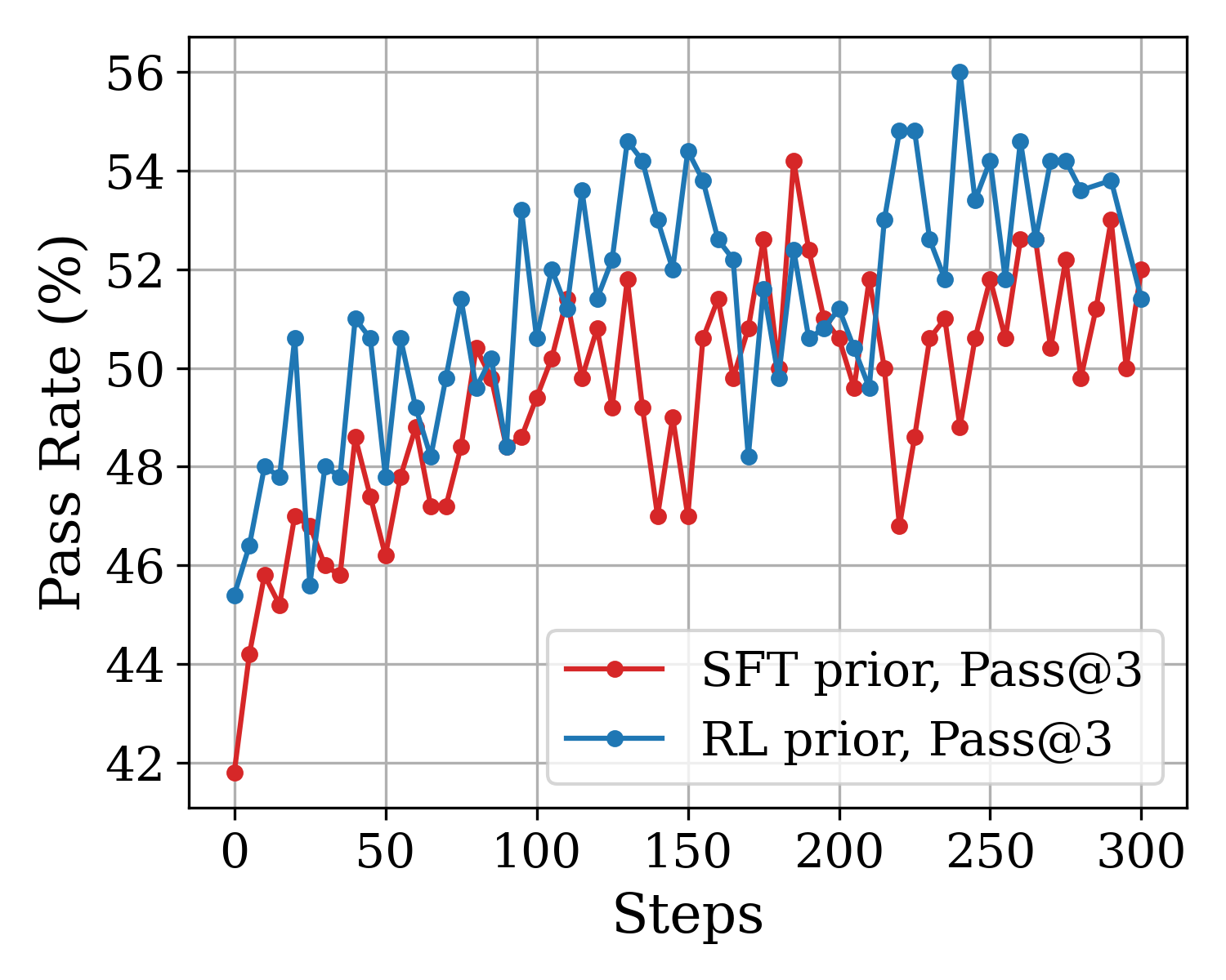
## Line Chart: Pass Rate vs. Steps for SFT and RL Priors
### Overview
This image is a 2D line chart comparing the performance of two different machine learning models or methodologies—labeled as "SFT prior" and "RL prior"—over a series of training or evaluation steps. The performance is measured by a "Pass Rate (%)" metric. The chart displays two highly volatile data series that generally trend upward over time, with the "RL prior" consistently outperforming the "SFT prior" for the majority of the recorded steps.
### Components/Axes
**Component Isolation & Spatial Grounding:**
* **Main Chart Area:** Occupies the majority of the image, featuring a light gray grid on a white background. The grid lines correspond to the major ticks on both axes.
* **Y-Axis (Left):**
* **Title:** "Pass Rate (%)" (Oriented vertically, reading bottom to top).
* **Scale:** Ranges from 42 to 56.
* **Markers/Ticks:** Major gridlines and labels are placed at intervals of 2: `42, 44, 46, 48, 50, 52, 54, 56`.
* **X-Axis (Bottom):**
* **Title:** "Steps" (Centered below the axis).
* **Scale:** Ranges from 0 to 300.
* **Markers/Ticks:** Major gridlines and labels are placed at intervals of 50: `0, 50, 100, 150, 200, 250, 300`.
* **Legend (Bottom-Right):** Located inside the main chart area, positioned in the lower right quadrant (spanning roughly from step 120 to 300, and pass rate 42 to 46). It contains two entries:
* `[Red Line with circular marker]` : "SFT prior, Pass@3"
* `[Blue Line with circular marker]` : "RL prior, Pass@3"
### Detailed Analysis
**Trend Verification & Data Extraction:**
Both data series consist of discrete data points connected by straight lines. There appears to be a data point plotted every 5 steps (60 points total per line). Due to the high density and volatility, approximate values (`~`) are extracted at major grid intervals and significant inflection points (peaks/valleys) to accurately reconstruct the chart's behavior.
**1. RL prior, Pass@3 (Blue Line)**
* *Visual Trend:* The blue line starts at a moderate pass rate, rises sharply within the first 20 steps, and then enters a highly volatile oscillation pattern. It generally maintains a higher baseline than the red line, frequently peaking above 54%, but experiences occasional sharp drops.
* *Key Data Points (Approximate ±0.5%):*
* Step 0: ~45.4% (Starting point)
* Step 20: ~50.6% (Initial peak)
* Step 50: ~47.8%
* Step 75: ~51.4%
* Step 95: ~53.2%
* Step 100: ~50.6%
* Step 130: ~54.6% (Major peak)
* Step 150: ~54.4%
* Step 170: ~48.2% (Significant valley/drop)
* Step 200: ~51.2%
* Step 220: ~54.8%
* Step 240: ~56.0% (Absolute maximum peak on the chart)
* Step 250: ~54.2%
* Step 300: ~51.4% (Ending point)
**2. SFT prior, Pass@3 (Red Line)**
* *Visual Trend:* The red line starts at the lowest point on the chart. It exhibits a steep initial climb similar to the blue line but generally oscillates at a lower tier (mostly between 46% and 52%). It has a few distinct, sharp spikes that briefly surpass the blue line.
* *Key Data Points (Approximate ±0.5%):*
* Step 0: ~41.8% (Starting point, absolute minimum)
* Step 20: ~47.0%
* Step 50: ~46.2%
* Step 80: ~50.4%
* Step 100: ~49.4%
* Step 130: ~51.8%
* Step 150: ~47.0% (Valley)
* Step 185: ~54.2% (Absolute maximum peak for this series)
* Step 200: ~50.6%
* Step 220: ~46.8% (Deep valley)
* Step 250: ~51.8%
* Step 290: ~53.0% (Late peak)
* Step 300: ~52.0% (Ending point)
### Key Observations
* **Performance Gap:** The RL prior (blue) demonstrates a clear advantage over the SFT prior (red) for the vast majority of the 300 steps. The blue line is visibly shifted upward relative to the red line.
* **Volatility:** Both metrics are incredibly noisy. A pass rate might jump or drop by 4% to 6% within a span of just 5 to 10 steps (e.g., the blue line dropping from ~52% at step 165 to ~48% at step 170, then back up to ~51% at step 175).
* **Crossovers:** While RL is generally better, the SFT prior does occasionally spike higher than the RL prior at specific intervals (most notably around step 185, and briefly near step 290).
* **Convergence:** Towards the end of the chart (steps 250-300), the two lines appear to entangle more frequently, suggesting the performance gap may be narrowing as the number of steps increases.
### Interpretation
* **Contextual Meaning:** The chart likely represents the evaluation of Large Language Models (LLMs) on a coding or reasoning benchmark. "Pass@3" means the model is considered successful if the correct answer is generated within 3 attempts. "SFT" stands for Supervised Fine-Tuning, and "RL" stands for Reinforcement Learning.
* **Data Implications:** The data strongly suggests that using a Reinforcement Learning prior provides a better starting point (Step 0 is ~3.6% higher) and maintains a higher average performance ceiling throughout the training/evaluation process compared to a Supervised Fine-Tuning prior.
* **Reading Between the Lines (Peircean Investigative):** The extreme step-to-step volatility (the "sawtooth" pattern) is highly indicative of a small evaluation dataset or a small batch size during these steps. If the evaluation set were large, the pass rate would likely smooth out. The fact that both models trend upward indicates that whatever process is occurring over these "Steps" (likely further training, optimization, or a search process) is generally effective at improving the Pass@3 rate, despite the high variance. The RL prior's massive spike to 56% at step 240 shows its peak potential, but its inability to maintain that level suggests instability in the model's generation consistency.