## ROC Curve: MUSE Performance
### Overview
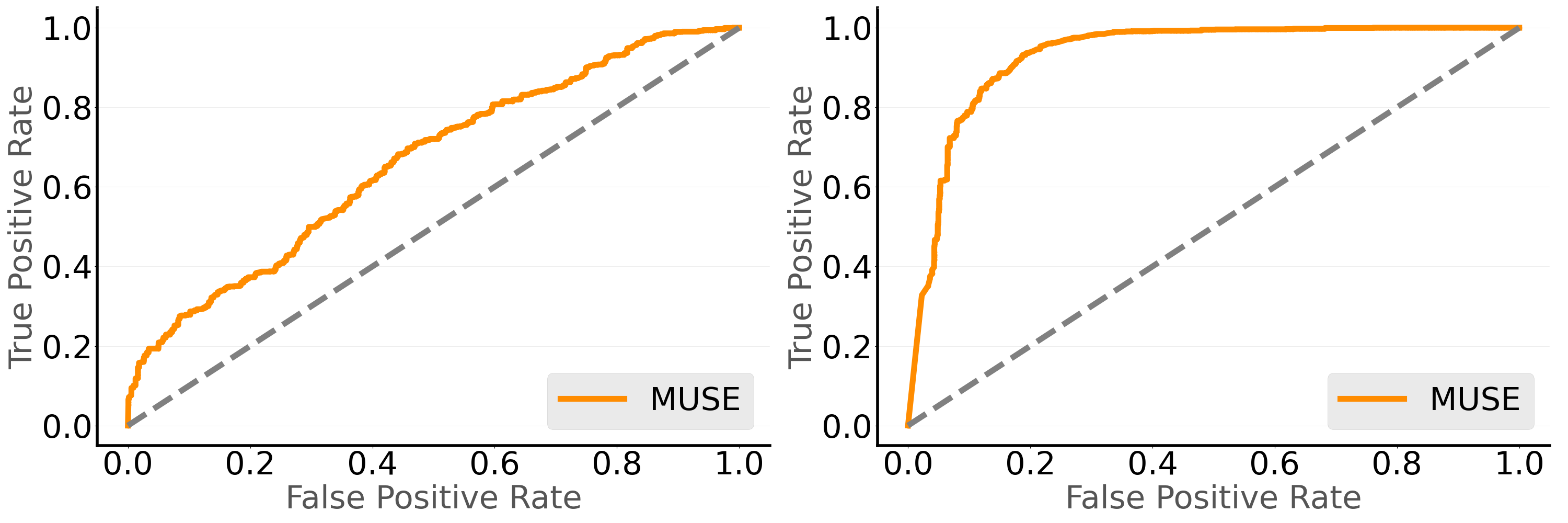
The image presents two Receiver Operating Characteristic (ROC) curves, both evaluating the performance of a model labeled "MUSE". The ROC curves plot the True Positive Rate against the False Positive Rate. The left chart shows a more gradual curve, while the right chart shows a steeper curve, indicating better performance. A dashed diagonal line represents the performance of a random classifier.
### Components/Axes
* **X-axis (False Positive Rate):** Ranges from 0.0 to 1.0 in both charts, with tick marks at intervals of 0.2.
* **Y-axis (True Positive Rate):** Ranges from 0.0 to 1.0 in both charts, with tick marks at intervals of 0.2.
* **Legend:** Located in the bottom-right corner of each chart. It identifies the orange curve as "MUSE".
* **Data Series:**
* **MUSE (Orange):** Represents the performance of the MUSE model.
* **Random Classifier (Dashed Gray):** Represents the performance of a random classifier.
### Detailed Analysis
**Left Chart:**
* **MUSE (Orange):** The curve starts at (0.0, 0.0) and gradually increases.
* At False Positive Rate = 0.2, True Positive Rate ≈ 0.35
* At False Positive Rate = 0.4, True Positive Rate ≈ 0.55
* At False Positive Rate = 0.6, True Positive Rate ≈ 0.75
* At False Positive Rate = 0.8, True Positive Rate ≈ 0.85
* At False Positive Rate = 1.0, True Positive Rate = 1.0
* **Random Classifier (Dashed Gray):** A straight line from (0.0, 0.0) to (1.0, 1.0).
**Right Chart:**
* **MUSE (Orange):** The curve rises sharply initially and then plateaus.
* At False Positive Rate = 0.05, True Positive Rate ≈ 0.7
* At False Positive Rate = 0.2, True Positive Rate ≈ 0.95
* At False Positive Rate = 0.4, True Positive Rate ≈ 0.98
* At False Positive Rate = 0.6, True Positive Rate ≈ 0.99
* At False Positive Rate = 1.0, True Positive Rate = 1.0
* **Random Classifier (Dashed Gray):** A straight line from (0.0, 0.0) to (1.0, 1.0).
### Key Observations
* The MUSE model performs significantly better in the right chart compared to the left chart.
* In the right chart, the MUSE model achieves a high True Positive Rate with a very low False Positive Rate.
* Both charts include a random classifier line for comparison.
### Interpretation
The ROC curves illustrate the discriminatory power of the MUSE model under two different conditions or configurations. The right chart indicates a superior model performance, as it quickly achieves a high True Positive Rate while maintaining a low False Positive Rate. This suggests that the MUSE model in the right chart is much better at correctly identifying positive cases while minimizing false alarms compared to the MUSE model in the left chart. The dashed line representing a random classifier serves as a baseline, and the MUSE model clearly outperforms this baseline in both scenarios, but especially in the right chart.