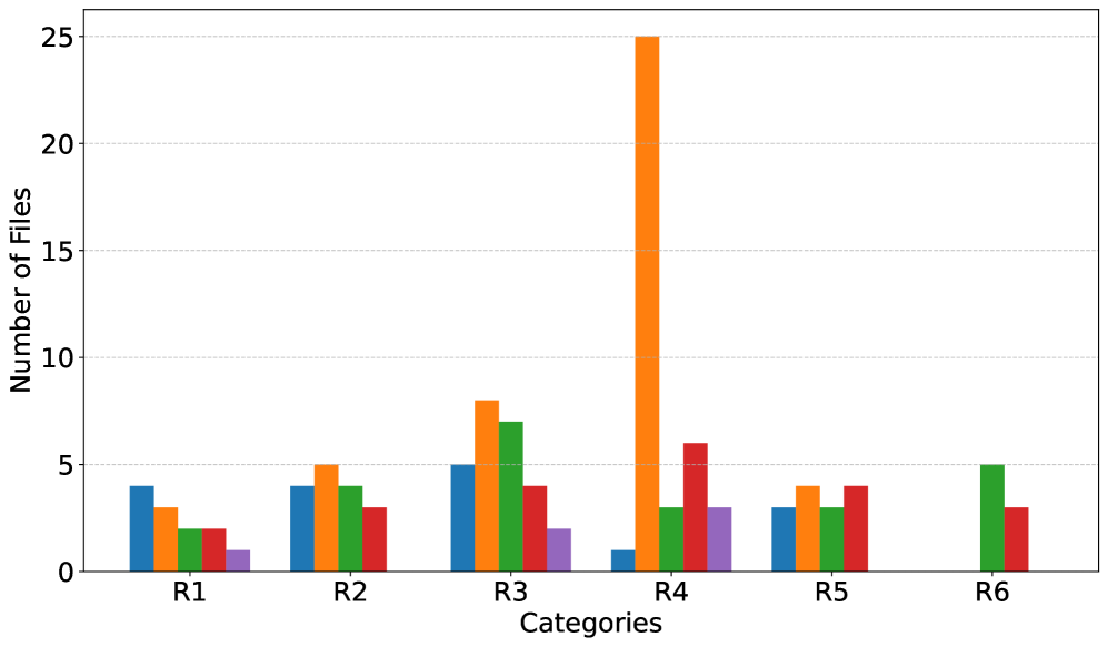
## Bar Chart: Number of Files Across Categories
### Overview
The chart displays a grouped bar visualization comparing the number of files across six categories (R1–R6). Each category contains five bars in distinct colors (blue, orange, green, red, purple), with a vertical legend on the right mapping colors to categories. The y-axis ranges from 0 to 25, labeled "Number of Files."
### Components/Axes
- **X-axis**: Labeled "Categories," with discrete labels R1–R6.
- **Y-axis**: Labeled "Number of Files," scaled from 0 to 25 in increments of 5.
- **Legend**: Vertical legend on the right, associating colors with categories:
- Blue
- Orange
- Green
- Red
- Purple
- **Bars**: Each category (R1–R6) has five bars, one for each color in the legend.
### Detailed Analysis
- **R1**:
- Blue: ~4
- Orange: ~3
- Green: ~2
- Red: ~2
- Purple: ~1
- **R2**:
- Blue: ~4
- Orange: ~5
- Green: ~4
- Red: ~3
- Purple: ~2
- **R3**:
- Blue: ~5
- Orange: ~8
- Green: ~7
- Red: ~4
- Purple: ~2
- **R4**:
- Blue: ~1
- Orange: ~25 (outlier)
- Green: ~3
- Red: ~6
- Purple: ~3
- **R5**:
- Blue: ~3
- Orange: ~4
- Green: ~3
- Red: ~4
- Purple: ~0
- **R6**:
- Blue: ~0
- Orange: ~0
- Green: ~5
- Red: ~3
- Purple: ~0
### Key Observations
1. **R4 Outlier**: The orange bar in R4 (~25) is significantly higher than all other bars, suggesting an anomaly or exceptional case.
2. **Purple Consistency**: Purple bars are consistently the lowest across all categories, often near zero.
3. **Green Peaks**: Green bars peak in R3 (~7) and R6 (~5), indicating higher values in these categories.
4. **Blue Trends**: Blue bars are highest in R3 (~5) and R1/R2 (~4), with a sharp drop in R4 (~1).
### Interpretation
The chart highlights variability in file counts across categories and data series. The R4 outlier (orange bar) warrants investigation, as it deviates drastically from other values. The purple series appears negligible, possibly indicating a minor or inactive metric. Green and blue series show moderate consistency, with R3 and R6 having notable green values. The data suggests potential imbalances or errors in R4, while other categories exhibit more uniform distributions.