# Technical Document Extraction: Reliability Diagram (Calibration Curve)
## 1. Component Isolation
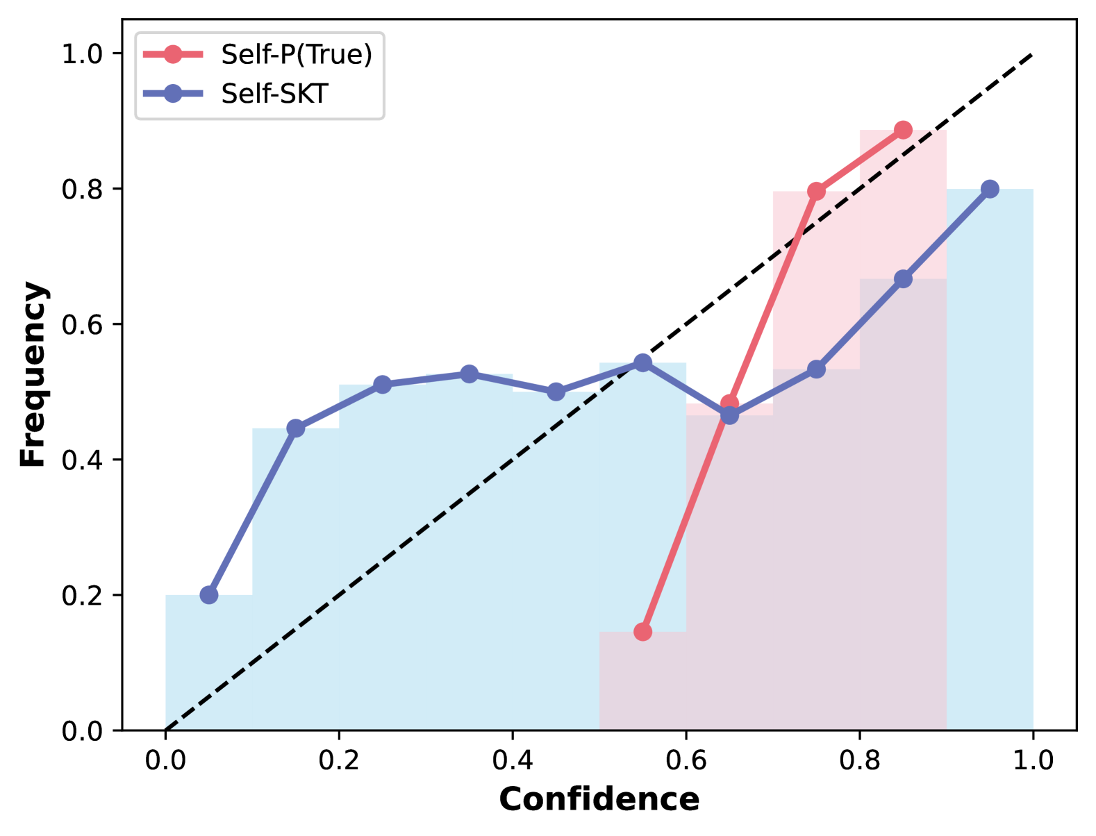
* **Header/Legend:** Located in the top-left quadrant. Contains two labeled data series with corresponding color-coded markers.
* **Main Chart Area:** A 2D plot featuring a dashed diagonal line, two colored line plots with circular markers, and two sets of semi-transparent histograms (bars).
* **Axes:**
* **X-axis (Horizontal):** Labeled "Confidence" ranging from 0.0 to 1.0.
* **Y-axis (Vertical):** Labeled "Frequency" ranging from 0.0 to 1.0.
---
## 2. Metadata and Labels
* **X-axis Title:** Confidence
* **Y-axis Title:** Frequency
* **X-axis Markers:** 0.0, 0.2, 0.4, 0.6, 0.8, 1.0
* **Y-axis Markers:** 0.0, 0.2, 0.4, 0.6, 0.8, 1.0
* **Legend [Top-Left]:**
* **Red Line/Circle:** `Self-P(True)`
* **Blue Line/Circle:** `Self-SKT`
* **Reference Line:** A black dashed diagonal line representing perfect calibration (where Confidence = Frequency).
---
## 3. Data Series Analysis
### Series A: Self-P(True) (Red Line & Pink Bars)
* **Trend Verification:** This series starts at a mid-range confidence (~0.55). It shows a sharp upward slope, crossing the perfect calibration line around Confidence 0.7, and ending near the top-right. It represents a model that is "under-confident" at lower values and becomes more calibrated at higher confidence levels.
* **Data Points (Approximate):**
| Confidence | Frequency |
| :--- | :--- |
| 0.55 | 0.15 |
| 0.65 | 0.48 |
| 0.75 | 0.80 |
| 0.85 | 0.89 |
* **Histogram (Pink):** Concentrated in the high confidence range (0.5 to 0.9).
### Series B: Self-SKT (Blue Line & Light Blue Bars)
* **Trend Verification:** This series spans the entire x-axis. It starts above the diagonal (over-confident/high frequency for low confidence), flattens out significantly between 0.2 and 0.6 confidence, and then slopes upward, ending below the diagonal (under-confident).
* **Data Points (Approximate):**
| Confidence | Frequency |
| :--- | :--- |
| 0.05 | 0.20 |
| 0.15 | 0.45 |
| 0.25 | 0.51 |
| 0.35 | 0.53 |
| 0.45 | 0.50 |
| 0.55 | 0.55 |
| 0.65 | 0.47 |
| 0.75 | 0.54 |
| 0.85 | 0.67 |
| 0.95 | 0.80 |
* **Histogram (Light Blue):** Distributed across the entire range from 0.0 to 1.0, with a notable peak/plateau between 0.1 and 0.6.
---
## 4. Comparative Summary
* **Calibration:** The `Self-P(True)` (Red) model is more closely aligned with the perfect calibration line at high confidence levels (0.7-0.9) compared to `Self-SKT`.
* **Confidence Distribution:** `Self-SKT` (Blue) provides predictions across the full spectrum of confidence, whereas `Self-P(True)` (Red) appears to only produce predictions with confidence scores greater than 0.5.
* **Reliability:** `Self-SKT` exhibits a "plateau" effect where increasing confidence from 0.2 to 0.6 does not result in a significant increase in actual frequency (accuracy), indicating poor calibration in that specific range.