## Diagram: Abstract Zonal Map
### Overview
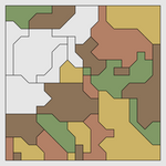
The image is a square, abstract diagram composed of irregular, interlocking polygonal regions filled with solid colors. It resembles a thematic map, zoning plan, or conceptual diagram representing different categories or areas. There are no textual labels, axes, legends, or numerical data present. The visual information is conveyed entirely through color, shape, and spatial arrangement.
### Components/Axes
* **Frame:** A thin, dark gray border encloses the entire diagram.
* **Regions:** The diagram is divided into approximately 25-30 distinct, irregular polygonal regions. They tessellate to fill the entire square frame without gaps.
* **Color Palette:** The regions are filled with a limited set of solid colors:
* White
* Light Gray
* Olive Green (a muted, brownish-green)
* Dark Green (a deeper, forest green)
* Brown (a medium, earthy brown)
* Tan (a light, sandy beige)
* Mustard Yellow (a dull, golden yellow)
* **Lines:** A network of thin, black lines overlays the colored regions. These lines appear to define boundaries or pathways. Some lines follow the edges of the colored regions, while others cut across them, creating a secondary layer of segmentation. The lines form a connected, maze-like network.
### Detailed Analysis
* **Spatial Distribution of Colors:**
* **Top-Left Quadrant:** Dominated by a large **white** region. Adjacent to it are smaller **light gray** and **olive green** regions.
* **Top-Right Quadrant:** Features a large **mustard yellow** region at the top, with **brown** and **tan** regions below it.
* **Center:** A complex intersection of multiple colors. A notable **dark green** region is present slightly right of center.
* **Bottom-Left Quadrant:** Contains a mix of **tan**, **brown**, and **olive green** regions.
* **Bottom-Right Quadrant:** Features a large **tan** region and a distinct **dark green** region in the corner.
* **Line Network:** The black lines are not uniformly distributed. They are denser in the central and lower portions of the diagram, creating smaller, more intricate subdivisions. In the upper sections, particularly over the large white and mustard yellow areas, the lines are sparser, defining larger cells.
* **Shape Characteristics:** The polygons are all irregular, with no perfect squares or circles. They have varied numbers of sides, creating an organic, non-geometric feel.
### Key Observations
1. **Absence of Key Information:** The most critical observation is the complete lack of a legend, labels, title, or any explanatory text. This makes definitive interpretation impossible.
2. **Color Repetition:** The same colors (e.g., brown, tan, olive green) are used in multiple, non-adjacent regions, suggesting they represent the same category or data class distributed across the map.
3. **Hierarchy of Segmentation:** There appears to be a two-level structure: the primary colored regions and the secondary subdivisions created by the black line network.
4. **Visual Weight:** The large white area in the top-left and the mustard yellow area in the top-right act as dominant visual anchors due to their size and contrast.
### Interpretation
This image is a data visualization whose meaning is entirely encoded in its visual grammar, but the key to decoding it (the legend) is missing. Based on its form, it could represent:
* **A Land Use or Zoning Map:** Colors could indicate different zones (residential, commercial, industrial, parkland). The black lines might represent property boundaries, roads, or utility lines.
* **A Conceptual or Network Diagram:** It could abstractly represent relationships between different entities (colored regions) and their connections or boundaries (black lines). The white area might signify an "unknown" or "unclassified" zone.
* **A Heatmap or Spatial Data Plot:** Without axis labels, it's impossible to confirm, but the varying region sizes and colors could represent the intensity or category of a measured variable across a two-dimensional space.
**The core takeaway is that the diagram communicates spatial relationships and categorical distribution through color and form, but its specific informational content is locked without the accompanying legend or metadata.** To extract factual data, the color-to-category mapping is essential. The black line network adds a layer of complexity, suggesting either finer-grained data or a separate system of boundaries overlaid on the primary categories.