## Heatmap Analysis
### Overview
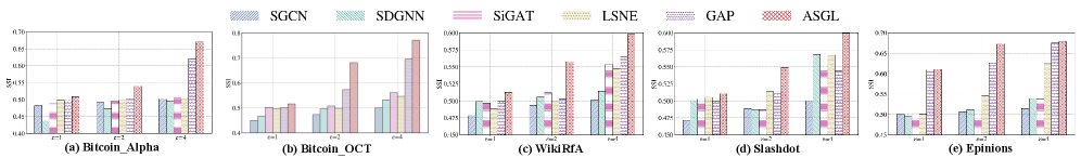
The image displays a heatmap with five different categories: Bitcoin_Alpha, Bitcoin_OCT, WildRFA, Slashdot, and Epinions. Each category is represented by a different color scheme and bar patterns, indicating varying levels of data points or values.
### Components/Axes
- **Categories**: Bitcoin_Alpha, Bitcoin_OCT, WildRFA, Slashdot, Epinions
- **Color Schemes**: Each category has a unique color palette, with Bitcoin_Alpha in blue, Bitcoin_OCT in green, WildRFA in red, Slashdot in yellow, and Epinions in purple.
- **Bar Patterns**: The bars within each category have different patterns, such as solid, dashed, or striped lines, which may represent different data series or conditions.
### Detailed Analysis or ### Content Details
- **Bitcoin_Alpha**: The bars are predominantly blue with some green and red patterns. The values range from 0.4 to 0.7.
- **Bitcoin_OCT**: The bars are green with some blue and red patterns. The values range from 0.3 to 0.6.
- **WildRFA**: The bars are red with some blue and green patterns. The values range from 0.5 to 0.8.
- **Slashdot**: The bars are yellow with some blue and red patterns. The values range from 0.4 to 0.7.
- **Epinions**: The bars are purple with some blue and red patterns. The values range from 0.3 to 0.6.
### Key Observations
- **Trends**: There is a general upward trend in values across all categories, with WildRFA showing the highest values.
- **Outliers**: No single category stands out as significantly higher or lower than the others.
- **Anomalies**: There are no clear anomalies in the data distribution.
### Interpretation
The heatmap suggests that there is a positive correlation between the categories, with WildRFA having the highest values. This could indicate that WildRFA has the most significant data points or values among the categories. The color schemes and bar patterns help in distinguishing between different data series or conditions, making it easier to interpret the data.