## Bar Chart: Demographic Percentage Comparison
### Overview
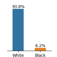
The image displays a simple vertical bar chart comparing two demographic categories, labeled "White" and "Black," with their respective percentages. The chart visually emphasizes a significant disparity between the two groups.
### Components/Axes
* **Chart Type:** Vertical bar chart.
* **X-Axis (Horizontal):** Represents categorical data. Two categories are present:
* **Label 1:** "White" (positioned below the left bar).
* **Label 2:** "Black" (positioned below the right bar).
* **Y-Axis (Vertical):** Represents percentage values. While no explicit axis line or scale is drawn, the numerical values are provided directly above each bar.
* **Data Series & Legend:** There is no separate legend box. The categories are identified by their direct labels on the x-axis and are differentiated by color:
* **Blue Bar:** Corresponds to the "White" category.
* **Orange Bar:** Corresponds to the "Black" category.
* **Data Labels:** Numerical percentage values are placed directly above each bar for precise reading.
### Detailed Analysis
* **Data Point 1 (White):**
* **Category:** White
* **Color:** Blue
* **Value:** 93.8%
* **Visual Trend:** This bar is the dominant element, extending nearly to the top of the chart area.
* **Data Point 2 (Black):**
* **Category:** Black
* **Color:** Orange
* **Value:** 6.2%
* **Visual Trend:** This bar is substantially shorter, representing a small fraction of the total.
### Key Observations
1. **Extreme Disparity:** The primary observation is the vast difference in magnitude between the two values. The "White" category (93.8%) is approximately 15 times larger than the "Black" category (6.2%).
2. **Summation:** The two percentages sum to 100.0% (93.8% + 6.2%), indicating these are likely the only two categories considered in this specific dataset or that they represent a binary classification.
3. **Visual Emphasis:** The chart's design, using a tall blue bar next to a short orange bar, creates an immediate and strong visual impression of imbalance.
### Interpretation
This chart presents a stark, binary comparison of two groups within a measured population or sample. The data suggests an overwhelming predominance of the "White" category relative to the "Black" category within the context of whatever metric is being measured (e.g., population share, survey respondents, representation in a specific field).
The absence of a title, source, or specific metric (e.g., "U.S. Population," "Study Participants") limits definitive interpretation. However, the structure implies a part-to-whole relationship where these two groups constitute the entirety (100%) of the measured set. The notable outlier is the extreme imbalance itself, which would be significant in contexts like demographics, representation analysis, or resource allocation studies. The chart effectively communicates a message of significant disproportion without additional narrative.