\n
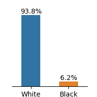
## Bar Chart: Racial Distribution
### Overview
The image presents a bar chart illustrating the distribution of two racial groups: White and Black. The chart uses vertical bars to represent the percentage of each group.
### Components/Axes
* **X-axis:** Represents the racial groups: "White" and "Black".
* **Y-axis:** Represents the percentage, with values ranging from 0% to approximately 100%. The scale is not explicitly marked, but can be inferred from the data labels.
* **Bars:** Two vertical bars, one blue representing "White" and one orange representing "Black".
* **Data Labels:** Percentage values are displayed above each bar.
### Detailed Analysis
* **White:** The blue bar for "White" extends to approximately 93.8%. The bar is significantly taller than the "Black" bar.
* **Black:** The orange bar for "Black" extends to approximately 6.2%. This bar is much shorter than the "White" bar.
### Key Observations
The chart demonstrates a significant disparity in the distribution of the two racial groups. The "White" group constitutes the vast majority (93.8%), while the "Black" group represents a small minority (6.2%).
### Interpretation
The data suggests a highly imbalanced racial composition within the population being represented. The large difference in percentages indicates a strong dominance of the "White" group and a limited representation of the "Black" group. This could be indicative of various socio-demographic factors, such as historical trends, migration patterns, or systemic inequalities. Without further context, it is difficult to determine the specific reasons for this distribution. The chart presents a factual representation of the racial distribution, but does not offer any explanation for the observed pattern.