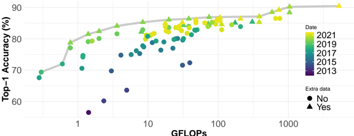
## Scatter Plot: Top-1 Accuracy vs. GFLOPS
### Overview
This image presents a scatter plot illustrating the relationship between GFLOPS (floating point operations per second) and Top-1 Accuracy (in percentage) for machine learning models across different years. The data points are color-coded by year and shaped by whether or not they include "extra data". A grey line represents a trendline through the data.
### Components/Axes
* **X-axis:** GFLOPS, ranging from approximately 0.5 to 1000, on a logarithmic scale. Axis label: "GFLOPS".
* **Y-axis:** Top-1 Accuracy (%), ranging from approximately 65% to 92%. Axis label: "Top-1 Accuracy (%)".
* **Color Legend (Top-Right):** Represents the year of the data point.
* 2021: Yellow
* 2019: Light Green
* 2017: Green
* 2015: Teal
* 2013: Purple
* **Shape Legend (Bottom-Right):** Indicates whether the data point includes "extra data".
* No: Circle
* Yes: Triangle
### Detailed Analysis
The plot shows a general trend of increasing Top-1 Accuracy with increasing GFLOPS. The grey trendline confirms this, sloping upwards from the bottom-left to the top-right.
**Data Point Analysis (Approximate values based on visual estimation):**
* **2013 (Purple):**
* Around 1 GFLOPS: ~70% Accuracy
* Around 10 GFLOPS: ~74% Accuracy
* Around 100 GFLOPS: ~78% Accuracy
* **2015 (Teal):**
* Around 1 GFLOPS: ~72% Accuracy
* Around 10 GFLOPS: ~78% Accuracy
* Around 100 GFLOPS: ~82% Accuracy
* **2017 (Green):**
* Around 1 GFLOPS: ~75% Accuracy
* Around 10 GFLOPS: ~80% Accuracy
* Around 100 GFLOPS: ~84% Accuracy
* **2019 (Light Green):**
* Around 1 GFLOPS: ~78% Accuracy
* Around 10 GFLOPS: ~82% Accuracy
* Around 100 GFLOPS: ~86% Accuracy
* **2021 (Yellow):**
* Around 10 GFLOPS: ~84% Accuracy
* Around 100 GFLOPS: ~88% Accuracy
* Around 1000 GFLOPS: ~91% Accuracy
**Shape Analysis:**
* **Circles (No Extra Data):** Predominantly represent data from earlier years (2013-2019). There is a cluster of circles around 10 GFLOPS with accuracy ranging from 74% to 82%.
* **Triangles (Yes Extra Data):** Primarily represent data from later years (2019-2021). Triangles generally exhibit higher accuracy for a given GFLOPS value compared to circles.
### Key Observations
* The trendline suggests diminishing returns: the increase in accuracy slows down as GFLOPS increase.
* Models with "extra data" (triangles) consistently achieve higher accuracy than those without (circles) for the same computational cost (GFLOPS).
* Accuracy has improved significantly over time, even for models with the same GFLOPS.
* There is a noticeable gap in data points between approximately 100 and 1000 GFLOPS, particularly for earlier years.
### Interpretation
The data demonstrates a clear correlation between computational power (GFLOPS) and model accuracy. However, the diminishing returns observed at higher GFLOPS values suggest that simply increasing computational resources is not a sustainable path to continuous improvement. The inclusion of "extra data" appears to be a significant factor in boosting accuracy, indicating the importance of data quality and quantity. The temporal trend shows that advancements in algorithms and model architectures, alongside increased computational power, have led to substantial gains in accuracy over the years. The gap in data points at higher GFLOPS values could indicate a limitation in the availability or cost of running models at that scale, or a point of diminishing returns where further increases in GFLOPS yield only marginal improvements in accuracy. The visualization suggests that the field is approaching a point where algorithmic innovation and data optimization are becoming more crucial than simply scaling up computational resources.