\n
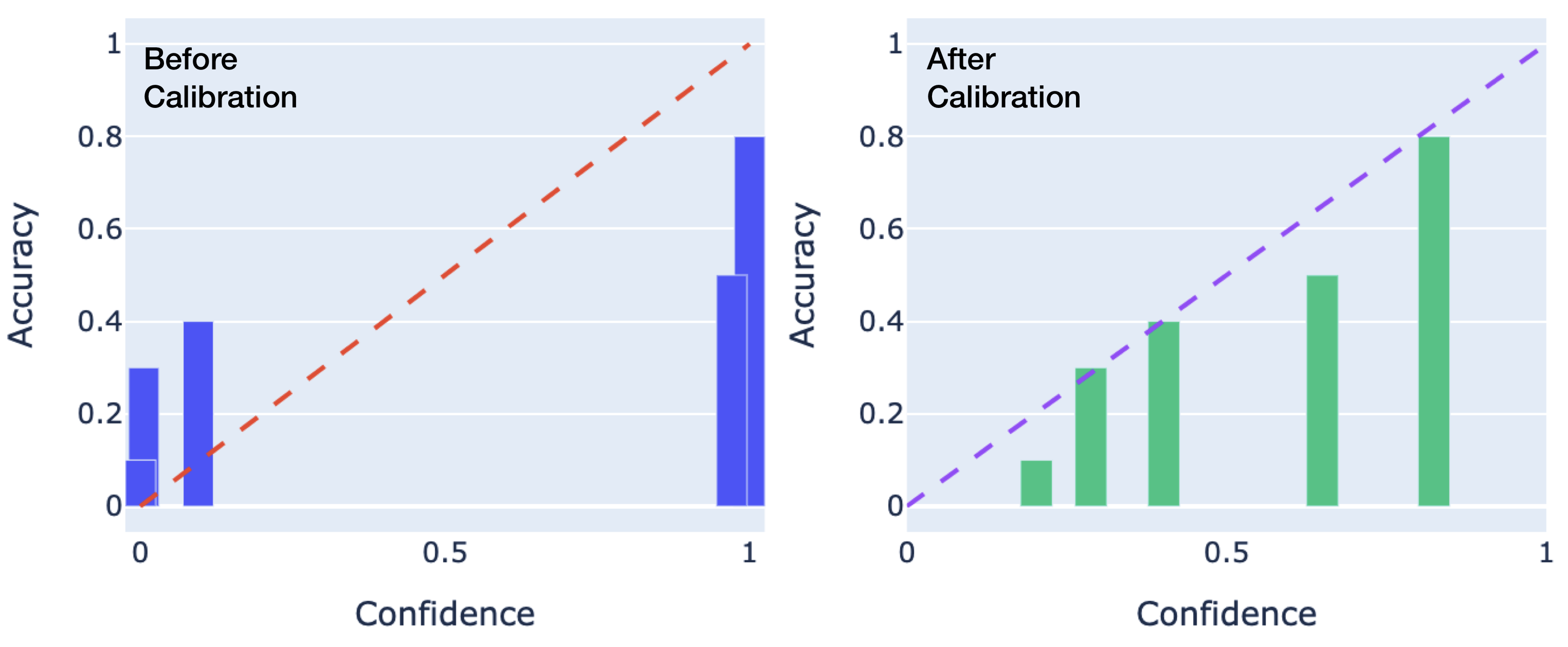
## Bar Charts: Accuracy vs. Confidence Before and After Calibration
### Overview
The image presents two bar charts side-by-side, comparing accuracy against confidence levels. The left chart shows data "Before Calibration," while the right chart shows data "After Calibration." Both charts share the same x and y-axis scales. A diagonal dashed line is overlaid on both charts, representing a perfect correlation between confidence and accuracy.
### Components/Axes
* **X-axis:** "Confidence" ranging from 0 to 1, with markers at 0, 0.5, and 1.
* **Y-axis:** "Accuracy" ranging from 0 to 1, with markers at 0, 0.2, 0.4, 0.6, 0.8, and 1.
* **Left Chart:** Title: "Before Calibration". Bars are blue.
* **Right Chart:** Title: "After Calibration". Bars are green.
* **Overlaid Line:** A dashed red line is present on both charts, representing the line y=x (perfect confidence/accuracy correlation).
### Detailed Analysis or Content Details
**Left Chart (Before Calibration):**
The chart contains three blue bars.
* **Bar 1:** Located at approximately Confidence = 0, Accuracy ≈ 0.08.
* **Bar 2:** Located at approximately Confidence = 0.5, Accuracy ≈ 0.25.
* **Bar 3:** Located at approximately Confidence = 1, Accuracy ≈ 0.85.
The bars show a general upward trend, but the accuracy does not consistently match the confidence. The dashed red line (y=x) is significantly above the first two bars, indicating poor calibration.
**Right Chart (After Calibration):**
The chart contains three green bars.
* **Bar 1:** Located at approximately Confidence = 0, Accuracy ≈ 0.1.
* **Bar 2:** Located at approximately Confidence = 0.5, Accuracy ≈ 0.3.
* **Bar 3:** Located at approximately Confidence = 1, Accuracy ≈ 0.5.
The bars also show an upward trend, but the accuracy is still below the dashed red line, though closer than before calibration.
### Key Observations
* The "After Calibration" chart shows a clear improvement in the correlation between confidence and accuracy compared to the "Before Calibration" chart.
* Before calibration, the model was overconfident in its predictions at lower confidence levels (Confidence = 0 and 0.5).
* Even after calibration, the model still exhibits some degree of miscalibration, particularly at higher confidence levels (Confidence = 1).
* The dashed line serves as a visual benchmark for ideal calibration.
### Interpretation
The data demonstrates the effect of calibration on a model's confidence and accuracy. Before calibration, the model's accuracy is significantly lower than its confidence, indicating a tendency to make predictions with unwarranted certainty. Calibration aims to align confidence with actual accuracy. The "After Calibration" chart shows that calibration has improved this alignment, but the model is not perfectly calibrated. This suggests that further calibration or a different model architecture might be necessary to achieve optimal performance. The charts highlight the importance of calibration in machine learning, as a well-calibrated model provides more reliable and trustworthy predictions. The data suggests that the calibration process has moved the model closer to the ideal state (represented by the dashed line), but there is still room for improvement.