## Scatter Plot: A-mem vs Base
### Overview
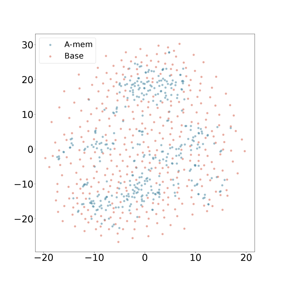
The image is a scatter plot showing the distribution of two datasets, labeled "A-mem" and "Base". The plot displays the data points in a two-dimensional space, with no explicit x or y axis labels. The data points are scattered across the plot, with some overlap between the two datasets.
### Components/Axes
* **X-axis:** Ranges from approximately -20 to 20, with tick marks at -20, -10, 0, 10, and 20. No label is provided.
* **Y-axis:** Ranges from approximately -20 to 30, with tick marks at -20, -10, 0, 10, 20, and 30. No label is provided.
* **Legend (Top-Left):**
* A-mem: Represented by light blue dots.
* Base: Represented by light red dots.
### Detailed Analysis
* **A-mem (Light Blue):** The light blue data points are scattered throughout the plot, with a higher concentration in the central region.
* **Base (Light Red):** The light red data points are also scattered throughout the plot, with a distribution similar to the "A-mem" data, but perhaps slightly more dispersed.
**Specific Data Point Analysis:**
It is impossible to provide exact coordinates for each point due to the nature of a scatter plot and the lack of gridlines. However, we can describe the general distribution:
* **A-mem:**
* Most points are concentrated within the range of x = -10 to 10 and y = -10 to 20.
* There are fewer points in the extreme corners of the plot.
* **Base:**
* Similar distribution to A-mem, but with slightly more points extending towards the edges of the plot.
* The density of points appears slightly lower than A-mem in the central region.
### Key Observations
* Both datasets ("A-mem" and "Base") exhibit a roughly similar distribution pattern.
* There is significant overlap between the two datasets, suggesting that they are not easily separable in this two-dimensional space.
* The central region of the plot appears to have a higher density of points for both datasets.
### Interpretation
The scatter plot visualizes the relationship between two datasets, "A-mem" and "Base". The overlapping distributions suggest that the two datasets share similar characteristics or are influenced by similar factors. Without further context or axis labels, it is difficult to determine the specific meaning of the plot. However, the visualization provides a basis for comparing the two datasets and identifying potential patterns or clusters. The plot suggests that a simple linear separation of the two datasets is unlikely to be effective.