\n
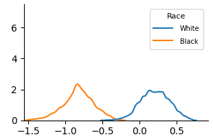
## Density Plot: Distribution Comparison by Race
### Overview
The image displays a kernel density estimate (KDE) plot comparing two probability distributions. The chart visualizes the distribution of an unspecified numerical variable across two groups labeled "White" and "Black." The plot shows two distinct, non-overlapping bell-shaped curves, indicating the variable's values are centered around different means for each group.
### Components/Axes
* **Chart Type:** Kernel Density Estimate (KDE) Plot.
* **X-Axis:**
* **Label:** Not explicitly labeled. Represents the value of the measured variable.
* **Scale:** Linear scale ranging from approximately -1.5 to 0.5.
* **Major Tick Marks:** Located at -1.5, -1.0, -0.5, 0.0, and 0.5.
* **Y-Axis:**
* **Label:** Not explicitly labeled. Represents probability density.
* **Scale:** Linear scale ranging from 0 to just above 6.
* **Major Tick Marks:** Located at 0, 2, 4, and 6.
* **Legend:**
* **Position:** Top-right corner of the plot area.
* **Title:** "Race"
* **Categories & Colors:**
* **White:** Represented by a blue line.
* **Black:** Represented by an orange line.
### Detailed Analysis
* **Distribution for "Black" (Orange Line):**
* **Trend:** The curve rises from near zero at x ≈ -1.5, peaks, and then declines back to near zero around x ≈ -0.2.
* **Peak (Mode):** The highest point of the density curve occurs at approximately **x = -0.8**. The peak density value is approximately **2.3** on the y-axis.
* **Spread:** The distribution appears roughly symmetric and unimodal, spanning a range of about 1.3 units on the x-axis (from -1.5 to -0.2).
* **Distribution for "White" (Blue Line):**
* **Trend:** The curve rises from near zero at x ≈ -0.4, peaks, and then declines back to near zero around x ≈ 0.7.
* **Peak (Mode):** The highest point of the density curve occurs at approximately **x = 0.2**. The peak density value is approximately **2.0** on the y-axis.
* **Spread:** The distribution appears roughly symmetric and unimodal, spanning a range of about 1.1 units on the x-axis (from -0.4 to 0.7).
* **Relationship Between Distributions:** The two distributions are clearly separated. The center of the "Black" distribution (peak at -0.8) is shifted significantly to the left (lower values) compared to the center of the "White" distribution (peak at 0.2). There is minimal overlap between the two curves, occurring only in the narrow region between x ≈ -0.4 and x ≈ -0.2.
### Key Observations
1. **Clear Separation:** The most prominent feature is the distinct separation between the two density curves, indicating a substantial difference in the central tendency of the measured variable between the two groups.
2. **Similar Shape & Spread:** Both distributions are unimodal and have a similar bell-like shape and width (spread), suggesting the variability of the variable within each group is comparable.
3. **Peak Density:** The peak density for the "Black" group (≈2.3) is slightly higher than for the "White" group (≈2.0), suggesting the data points for the "Black" group are slightly more concentrated around its mean.
4. **No Contextual Labels:** The chart lacks a title and axis labels, making it impossible to know what specific variable (e.g., test score, income index, physiological measurement) is being compared without external context.
### Interpretation
This chart demonstrates a **bimodal distribution at the group level**. The data suggests that the two populations ("White" and "Black") have systematically different average values for the underlying metric. The variable's distribution for the "Black" group is centered on negative values, while the distribution for the "White" group is centered on positive values.
The near-complete separation of the curves implies that knowing the value of the variable for a randomly selected individual would provide strong evidence to classify which group they belong to. The similar shapes of the distributions suggest that the *nature* of the variation within each group is alike, even though their *locations* on the scale differ.
**Critical Missing Information:** Without axis labels or a chart title, the real-world significance of this difference is unknown. The x-axis could represent anything from standardized test scores to a biological marker. The interpretation is purely statistical: a significant mean difference exists between the groups for this particular measure. To derive any meaningful conclusion, the context of what is being measured is essential.