\n
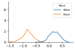
## Chart: Density Plot by Race
### Overview
The image presents a density plot comparing the distributions of values for two racial groups: White and Black. The x-axis represents the values being distributed, ranging from approximately -1.5 to 0.5. The y-axis represents the density, ranging from 0 to 6.
### Components/Axes
* **X-axis Title:** Not explicitly labeled, but represents a numerical value. Scale ranges from -1.5 to 0.5.
* **Y-axis Title:** Not explicitly labeled, but represents Density. Scale ranges from 0 to 6.
* **Legend:** Located in the top-right corner.
* **Label:** "Race"
* **Categories:**
* White (represented by a blue line)
* Black (represented by an orange line)
### Detailed Analysis
* **White (Blue Line):** The density for the White group starts at approximately 0 at -1.5, gradually increases to a peak density of approximately 2.0 around 0.2, and then decreases to approximately 0 at 0.5. The line exhibits a generally upward slope from -1.5 to 0.2, followed by a downward slope.
* **Black (Orange Line):** The density for the Black group starts at approximately 0 at -1.5, increases to a peak density of approximately 2.3 around -0.8, and then decreases to approximately 0 at 0.5. The line exhibits an upward slope from -1.5 to -0.8, followed by a downward slope.
Approximate Data Points (extracted visually):
| X-Value | White Density (approx.) | Black Density (approx.) |
|---|---|---|
| -1.5 | 0.0 | 0.0 |
| -1.2 | 0.2 | 0.6 |
| -1.0 | 0.5 | 2.2 |
| -0.8 | 0.8 | 2.0 |
| -0.6 | 1.2 | 1.0 |
| -0.4 | 1.6 | 0.4 |
| -0.2 | 1.9 | 0.1 |
| 0.0 | 1.7 | 0.0 |
| 0.2 | 2.0 | 0.0 |
| 0.4 | 0.5 | 0.0 |
| 0.5 | 0.0 | 0.0 |
### Key Observations
* The Black group has a higher density of values in the range of -1.2 to -0.6 compared to the White group.
* The White group has a higher density of values in the range of 0.0 to 0.4 compared to the Black group.
* Both distributions are unimodal (have one peak).
* The Black distribution is shifted to the left (more negative values) compared to the White distribution.
### Interpretation
The density plot suggests that the distributions of values for the White and Black groups are different. The Black group tends to have lower values than the White group. This could indicate a systematic difference between the two groups in the variable being measured. The difference in distributions could be due to a variety of factors, including socioeconomic status, access to resources, or historical discrimination. Further investigation would be needed to determine the underlying causes of this difference. The plot does not provide information about the nature of the variable being measured, only the relative distribution of values within each racial group. It is important to note that correlation does not equal causation, and this plot does not prove that race *causes* the observed differences.