\n
## Dual-Panel Line Chart: Training Metrics Over Steps
### Overview
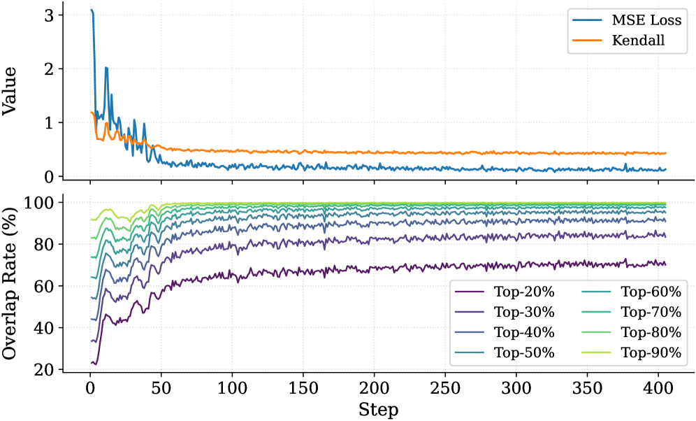
The image displays a two-panel vertical chart tracking machine learning training metrics over 400 steps. The top panel plots two loss/correlation metrics on a shared "Value" axis, while the bottom panel shows the "Overlap Rate (%)" for different top-percentage cohorts. The charts share a common x-axis labeled "Step".
### Components/Axes
* **X-Axis (Both Panels):** Labeled "Step". Linear scale from 0 to 400, with major tick marks every 50 steps.
* **Top Panel Y-Axis:** Labeled "Value". Linear scale from 0 to 3, with major tick marks at 0, 1, 2, and 3.
* **Bottom Panel Y-Axis:** Labeled "Overlap Rate (%)". Linear scale from 20 to 100, with major tick marks every 20%.
* **Top Panel Legend:** Located in the top-right corner. Contains two entries:
* `MSE Loss` (Blue line)
* `Kendall` (Orange line)
* **Bottom Panel Legend:** Located in the bottom-right corner. Contains eight entries, each corresponding to a colored line:
* `Top-20%` (Dark Purple)
* `Top-30%` (Purple)
* `Top-40%` (Blue-Purple)
* `Top-50%` (Blue)
* `Top-60%` (Teal)
* `Top-70%` (Green-Teal)
* `Top-80%` (Green)
* `Top-90%` (Light Green)
### Detailed Analysis
**Top Panel (Value vs. Step):**
* **MSE Loss (Blue Line):**
* **Trend:** Starts very high, exhibits high volatility in the first ~50 steps, then decays rapidly and stabilizes.
* **Key Points:** Initial peak ~3.0 at Step 0. By Step 50, value is ~0.5. From Step 100 onward, it fluctuates with low amplitude around a value of approximately 0.1 to 0.2.
* **Kendall (Orange Line):**
* **Trend:** Starts moderately high, shows a smooth, gradual decline, and stabilizes.
* **Key Points:** Initial value ~1.1 at Step 0. Declines steadily, crossing below 1.0 around Step 25. Reaches a stable plateau around Step 100, maintaining a value of approximately 0.4 to 0.5 for the remainder of the chart.
**Bottom Panel (Overlap Rate (%) vs. Step):**
* **General Trend for All Lines:** All eight lines follow a similar pattern: a rapid, steep increase in the first 25-50 steps, followed by a gradual deceleration, eventually reaching a stable plateau. The final plateau value is directly correlated with the "Top-X%" label (higher X% = higher plateau).
* **Specific Plateau Values (Approximate at Step 400):**
* `Top-90%` (Light Green): ~99%
* `Top-80%` (Green): ~97%
* `Top-70%` (Green-Teal): ~95%
* `Top-60%` (Teal): ~92%
* `Top-50%` (Blue): ~88%
* `Top-40%` (Blue-Purple): ~83%
* `Top-30%` (Purple): ~77%
* `Top-20%` (Dark Purple): ~70%
* **Initial Values (Approximate at Step 0):** All lines start between 20% and 40%, with `Top-20%` starting the lowest (~22%) and `Top-90%` starting the highest (~38%).
### Key Observations
1. **Inverse Relationship in Top Panel:** The MSE Loss (blue) decreases sharply while the Kendall metric (orange) also decreases, but at a much slower rate and to a lesser degree. They do not move in opposition.
2. **Stratified Convergence in Bottom Panel:** The overlap rates converge to distinct, stratified levels based on their cohort definition. The spacing between the final plateau values is relatively even.
3. **Phase Change:** Both panels show a clear "learning phase" (Steps 0-100) characterized by rapid change and volatility, followed by a "stable phase" (Steps 100-400) where metrics plateau with minor fluctuations.
4. **Volatility Correlation:** The period of highest volatility in the MSE Loss (Steps 0-50) corresponds precisely with the period of most rapid increase in all overlap rates.
### Interpretation
This chart visualizes the training dynamics of a machine learning model, likely one involved in ranking or selection tasks.
* **Top Panel Meaning:** The decreasing **MSE Loss** indicates the model's predictions are becoming more accurate on a mean squared error basis. The decreasing **Kendall** metric (likely Kendall's Tau, a rank correlation coefficient) is more nuanced. A decreasing Kendall's Tau could suggest the model's internal ranking is becoming *less* correlated with some initial or baseline ranking as it learns, or it could indicate a shift in the evaluation context. The fact it stabilizes at a positive value (~0.45) suggests a moderate positive rank correlation persists.
* **Bottom Panel Meaning:** The **Overlap Rate** measures consistency. It answers: "What percentage of the items the model selected as 'top' at an early step are still considered 'top' at the current step?" The rapid rise shows the model quickly settles on a stable set of top candidates. The stratified plateaus are logical: it's easier to maintain consistency for a broader set (Top-90%) than a narrow, elite set (Top-20%).
* **Overall Narrative:** The model undergoes a rapid initial learning phase (first 100 steps) where it drastically reduces error (MSE) and solidifies its selection criteria (rising Overlap Rates). Concurrently, its ranking behavior (Kendall) shifts from an initial state to a new, stable learned state. After Step 100, the model has largely converged, with only minor refinements occurring. The strong correlation between the volatility period and the rapid overlap increase suggests the model is making its most significant selection decisions early in training.