## Principal Component Analysis (PCA) of Expert Data
### Overview
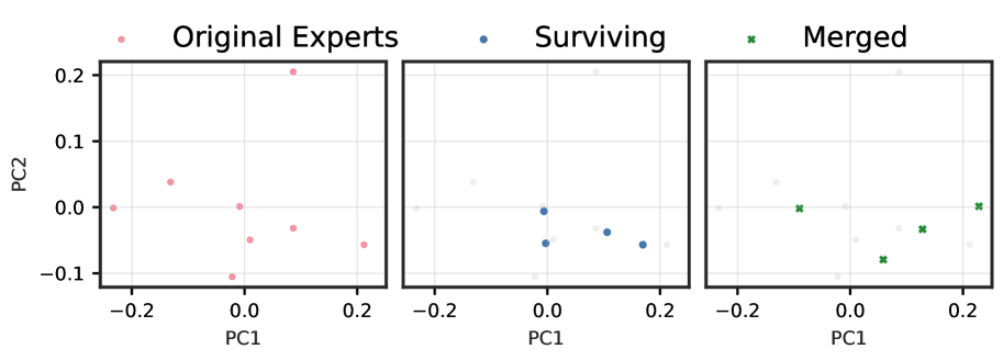
The image displays three separate PCA plots, each representing a different group of experts: Original Experts, Surviving Experts, and Merged Experts. The plots are used to visualize the principal components (PC1 and PC2) of the data, which are likely derived from a dataset related to expert opinions or performance metrics.
### Components/Axes
- **X-axis (PC1)**: Represents the first principal component, which captures the amount of variance in the data along the horizontal axis.
- **Y-axis (PC2)**: Represents the second principal component, which captures the amount of variance in the data along the vertical axis.
- **Legend**: The legend on the right side of each plot indicates the color coding for each group of experts.
- **Data Points**: Each data point is represented by a colored dot, corresponding to the group it belongs to.
### Detailed Analysis or ### Content Details
- **Original Experts**: The data points for Original Experts are colored in pink. They are spread across the entire range of PC1 and PC2, indicating a diverse set of opinions or performance metrics.
- **Surviving Experts**: The data points for Surviving Experts are colored in blue. They are more clustered towards the lower end of PC1 and PC2, suggesting a more homogeneous group with similar opinions or performance metrics.
- **Merged Experts**: The data points for Merged Experts are colored in green. They are also spread across the entire range of PC1 and PC2, similar to Original Experts, indicating a diverse set of opinions or performance metrics.
### Key Observations
- **Original Experts**: The spread of data points suggests a wide range of opinions or performance metrics among Original Experts.
- **Surviving Experts**: The clustering of data points towards the lower end of PC1 and PC2 indicates a more homogeneous group with similar opinions or performance metrics.
- **Merged Experts**: The spread of data points is similar to Original Experts, suggesting a diverse set of opinions or performance metrics among Merged Experts.
### Interpretation
The PCA plots provide insights into the distribution and clustering of expert opinions or performance metrics. The Original Experts have a wide range of opinions, while the Surviving Experts and Merged Experts have more homogeneous opinions. This could indicate that the Merged Experts have a more diverse set of opinions or performance metrics, which might be a result of the merging process. The plots also suggest that the first principal component (PC1) is the most significant in explaining the variance in the data, while the second principal component (PC2) captures a smaller portion of the variance.