## Charts: Probability vs. Injection Voltage ($V_{inj}$)
### Overview
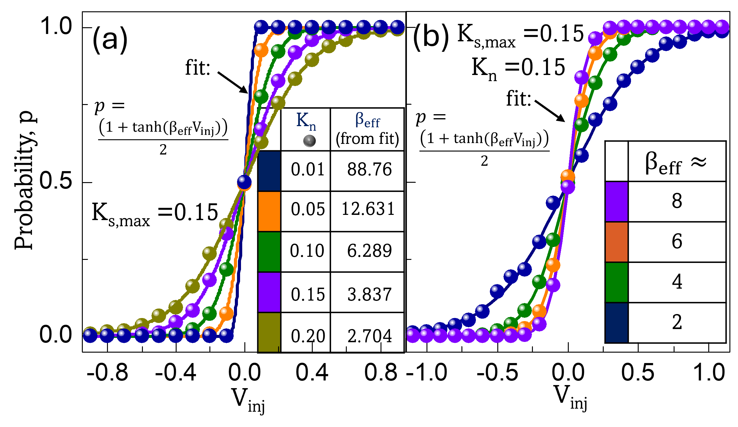
The image displays two side-by-side line charts, labeled (a) and (b). Both charts plot the probability ($p$) as a function of injection voltage ($V_{inj}$). The data in both charts follows a sigmoidal (S-shaped) curve, modeled by the equation $p = \frac{1 + \tanh(\beta_{eff}V_{inj})}{2}$. The charts illustrate how varying parameters ($K_n$ in chart (a) and $\beta_{eff}$ in chart (b)) affect the steepness of the probability transition.
### Components/Axes
* **Common Y-Axis:** "Probability, $p$", ranging from 0.0 to 1.0.
* **Chart (a) X-Axis:** "$V_{inj}$", ranging from -0.8 to 0.8.
* **Chart (b) X-Axis:** "$V_{inj}$", ranging from -1.0 to 1.0.
* **Equation:** Both charts display the same formula: $p = \frac{1 + \tanh(\beta_{eff}V_{inj})}{2}$.
---
### Detailed Analysis
#### Chart (a): Effect of $K_n$ on Probability
* **Constant:** $K_{s,max} = 0.15$.
* **Legend/Data Table:** Located in the center-right of the chart area. It maps colors to $K_n$ values and their corresponding $\beta_{eff}$ values derived from the fit.
| Color | $K_n$ | $\beta_{eff}$ |
| :--- | :--- | :--- |
| Dark Blue | 0.01 | 88.76 |
| Orange | 0.05 | 12.631 |
| Green | 0.10 | 6.289 |
| Purple | 0.15 | 3.837 |
| Olive/Brown | 0.20 | 2.704 |
* **Trend:** All curves are sigmoidal and intersect at $(0, 0.5)$. As $K_n$ increases (from 0.01 to 0.20), the $\beta_{eff}$ value decreases, and the slope of the curve at the center decreases (the transition becomes less sharp/more gradual). The Dark Blue curve is the steepest (approaching a step function), while the Olive curve is the shallowest.
#### Chart (b): Effect of $\beta_{eff}$ on Probability
* **Constants:** $K_{s,max} = 0.15$, $K_n = 0.15$.
* **Legend:** Located on the right side of the chart. It maps colors to $\beta_{eff}$ values.
| Color | $\beta_{eff}$ |
| :--- | :--- |
| Purple | $\approx 8$ |
| Orange | $\approx 6$ |
| Green | $\approx 4$ |
| Dark Blue | $\approx 2$ |
* **Trend:** All curves are sigmoidal and intersect at $(0, 0.5)$. As $\beta_{eff}$ increases (from 2 to 8), the slope of the curve at the center increases (the transition becomes sharper). The Purple curve is the steepest, while the Dark Blue curve is the shallowest.
---
### Key Observations
* **Symmetry:** All curves in both charts are symmetric around the origin $(0, 0.5)$.
* **Parameter Relationship:** In chart (a), there is an inverse relationship between $K_n$ and $\beta_{eff}$. As $K_n$ increases, the effective gain ($\beta_{eff}$) drops, resulting in a flatter curve.
* **Visual Consistency:** The colors used in the legends are consistent with the data points on the lines, though the values they represent differ between chart (a) and chart (b).
* **Transition Sharpness:** The parameter $\beta_{eff}$ acts as a gain control for the transition. Higher values of $\beta_{eff}$ force the system toward a binary state (0 or 1) more rapidly as $V_{inj}$ deviates from 0.
### Interpretation
The data demonstrates a system governed by a logistic function where the probability of an event is determined by an injection voltage ($V_{inj}$).
The parameter $\beta_{eff}$ functions as the "steepness" or "gain" factor. When $\beta_{eff}$ is high, the system behaves like a digital switch (a step function), where the probability jumps from 0 to 1 almost instantly at $V_{inj} = 0$. When $\beta_{eff}$ is low, the system behaves more probabilistically, with a wider range of $V_{inj}$ values resulting in intermediate probabilities between 0 and 1.
Chart (a) provides a practical application of this, showing how a physical parameter $K_n$ can be used to tune the system's sensitivity (the effective gain $\beta_{eff}$). Chart (b) isolates the gain parameter itself, confirming that $\beta_{eff}$ is the direct determinant of the transition's sharpness.